Aged To Perfection


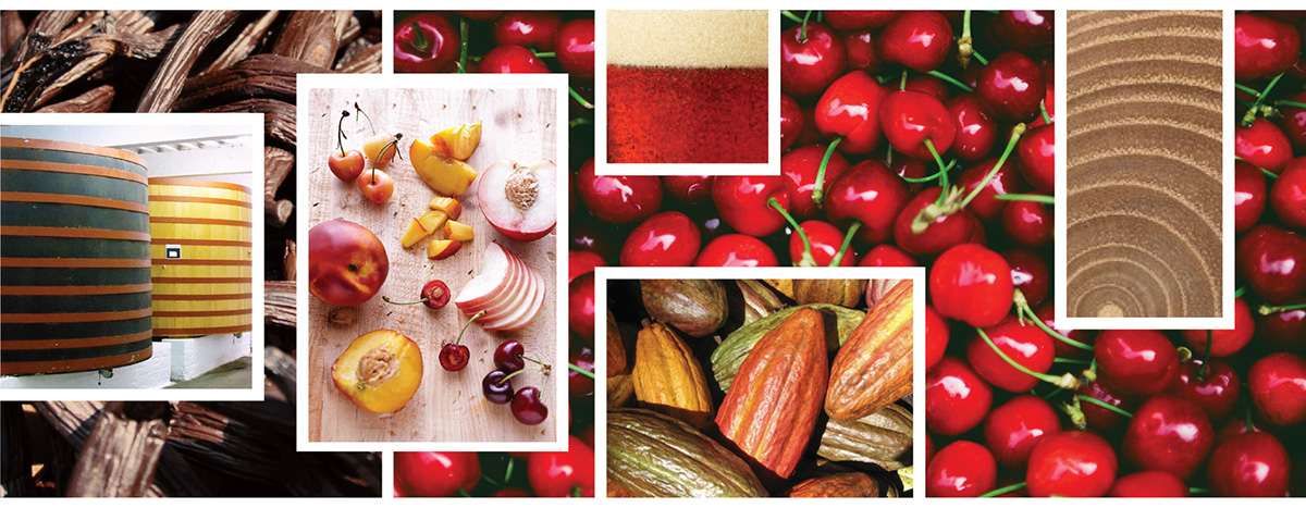
An experimental effort between U.S. importer, Artisanal Imports and award-winning Belgian brewery, Omer Vander Ghinste, Cuvée des Jabobins Rouge was originally released on draft only using an old recipe. This unblended old lambic ale is aged for a minimum of 18 months in 14 foot foeders, or oak barrels, and is robust in character with overtones of vanilla, dried cherry, stone fruit, and cocoa. Smooth, yet knocks your socks off bold. Not your typical sour ale.
Left of Sunset was commissioned to create an identity for Rouge on draft. Due to its popularity on tap, the Brewery began small production bottling, which immediately sold out on arrival to the U.S. market, early 2012. The Brewery has since expanded their facilities to accommodate higher production levels and an expanded product line of brews blended the Rouge. Left of Sunset developed the creative direction for the Jacobins brand, including bottle labels and packaging. On the shelf, it is a stand out amongst category beers.
ESSENTIALS
Brand Narrative, Visual Story, Art Direction, Logo Identity, Illustration, Lettering, Packaging, Product Photography, Point-of-Sale

PROCESS
We explored countless iterations of iconic Belgian beer motifs and lettering. It was concluded that the large foeders, imported from France, are unique to the aging process of this particular sour ale. We also discovered through discussions with the Brewery owner that Jacobins was named after an abbey, which lies on the Rue des Jacobins in Paris. The monastery was a meeting place during the French Revolution and due to their assistance, the monks became the name of a radical activist group, The Jacobins. This history inspired the brewery founder's son, Omer Rémi, who spent some time in the area during World War II.
Inspired by a vintage advertising poster from the Brewery portraying a monk carrying beer, we created an updated digitial, vector rendering based on the jovial monk for authenticity and paired it with a modified gothic style font indicative of the old world. Our mascot now happily graces point-of-sale materials, including custom glassware, bar mats, and t-shirts.
INSPIRATIONS
Architecture, Stone Fruit, Foeders, Old World Charm

Imageboard Samples


SKETCHES
A selection of studies and explorations on paper of beer motifs and lettering styles for 4 Pack Bottle Carton and Logo Identity.


