The positive rhythm of Finland
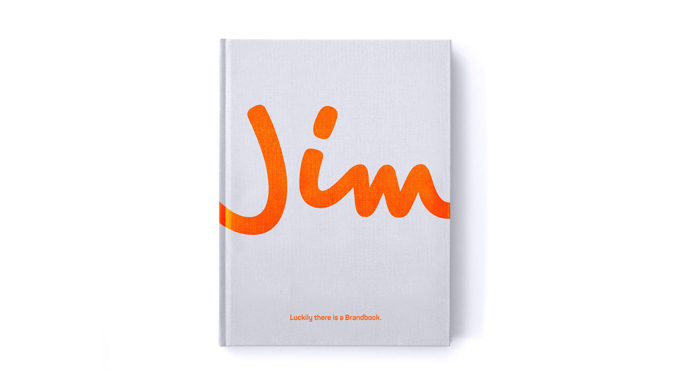
Working in partnership with Nelonen Media we embarked on a journey to refresh the Jim brand. The aim was to develop a comprehensive brand language that changes the brand perception of another life-style channel to a real competitor in the factual entertainment market.
The main consumer insight was that Jim’s target group – Finnish adults – are very comfortable in their everyday lives, and hence Jim as a natural part of the Finnish consumer’s entertainment day.
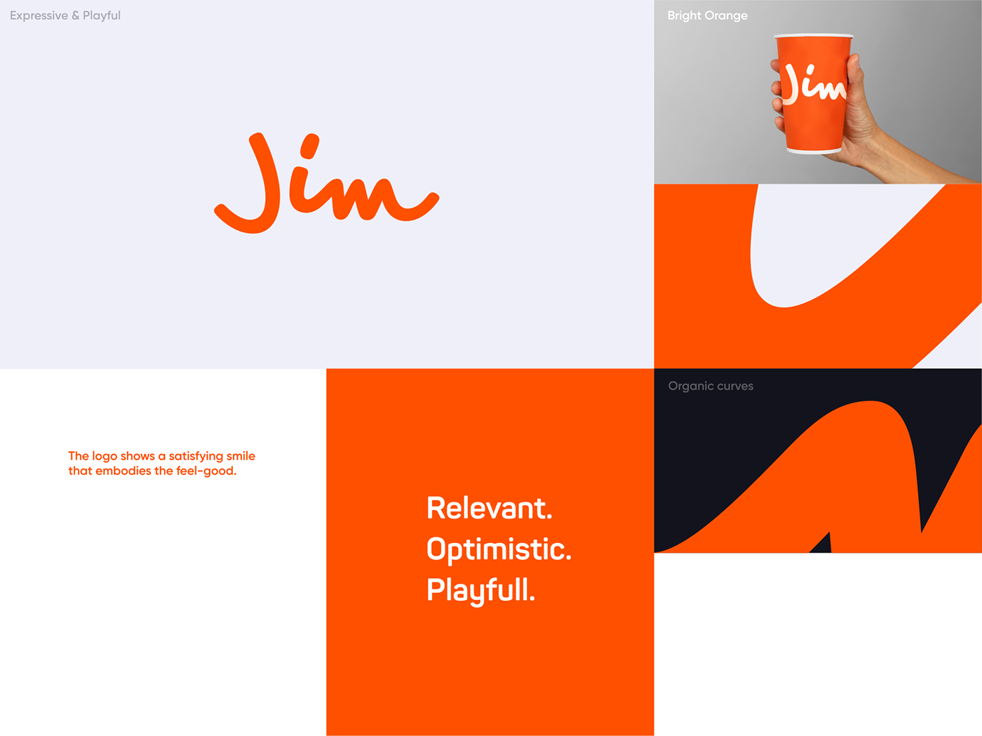
A playful mark of freedom
At the core of the new identity is an expressive and playful mark that embodies the feel-good of Jim. The brandmark has friendly curves which are used to create an organic brand language that fits the optimistic vibe of Jim.

The new Jim is modern, yet positive and easy to approach - just like the channel content itself.
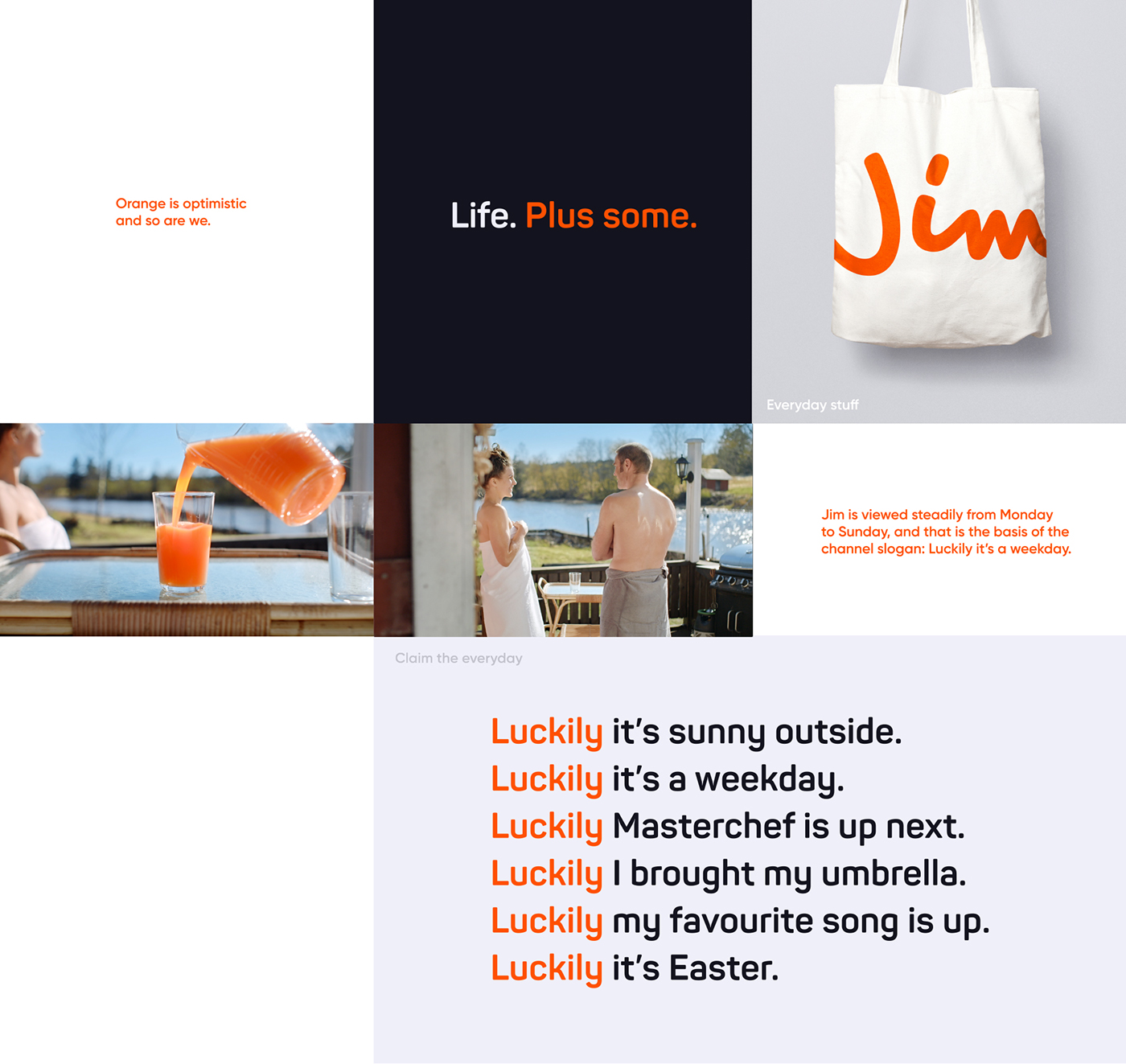
Claiming the Finn's everyday
Reflecting Jim's role as a brand, the idents add optimism to the world. We take a glimpse of daily life - add a positive twist to it, turning each ident into a 'luckily' moment. The orange represents the positive twist - focussing on the activity rather than the personality.

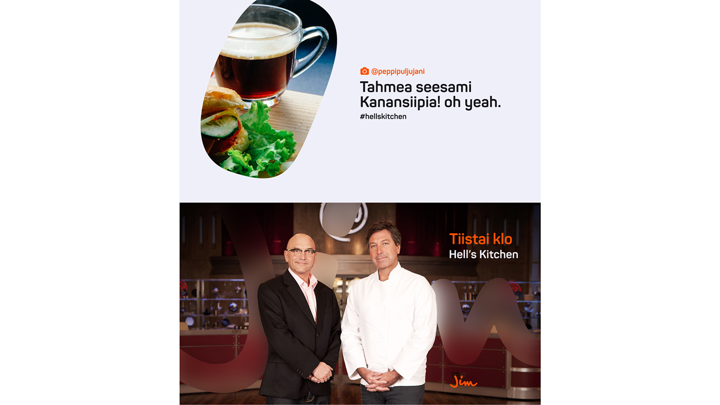
A window to Finland and beyond
The mark becomes a window to the Finnish everyday - making the identity relevant and adaptable. Imagery can be updated every season - to be relevant throughout the year.

UI - Consistent & playful.
Acting as a window, Jim uses a minimal- and playful UI system derived from the logo mark. By hovering over the logo crops, we create an easy and modern flow. The system contains a range of logo crops for different purposes.
Print inspired by magazine
A magazine inspired lay-out that adds some depth to the brand.