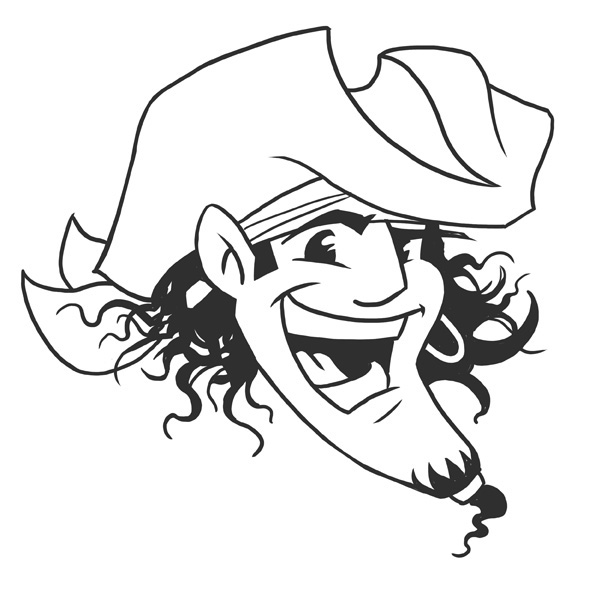
These illustrations were made for clients who asked for specific styles. These images usually don't matc with the material that can be seen in my portfolio http://www.doodle.nl . But since people seem interested in seeing them I created this section to show the flexible and client orientated way I work sometimes.
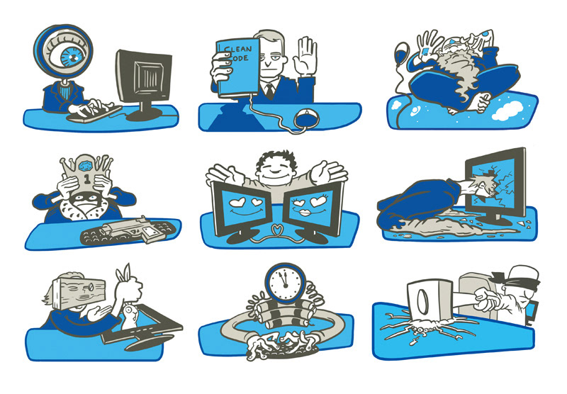
Illustrations for 42.nl, internet development. Character symbols for a card game, showing several ICT types.
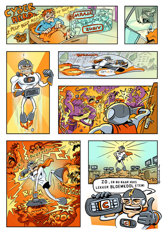
Comic page for ON2IT, an ICT company that asked me to make this for a retiring colleague.
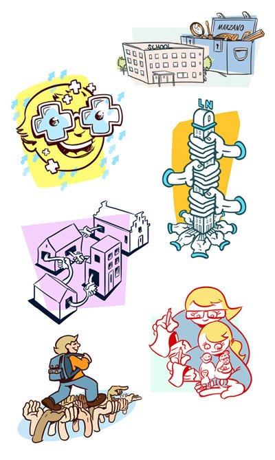
Pedagogics related illustration for a profession magazine.

Corporate characters for Sportcity.

Illustration for Ortec (alternative) about logistics and planning.
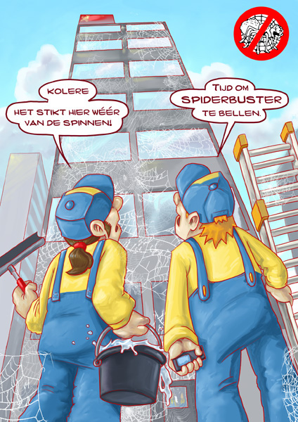
Card illustration for Spiderbuster, a biological termination company.
Visual identity design for a Dutch music festival.

Illustration for an article about caregiving.

Illustration in an anonymous style about forced marriage.

Christmas icons for decoration.
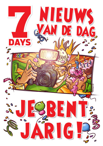
Birthday wish for newspaper 7days' members.

Illustration for an advertorial about studying abroad.
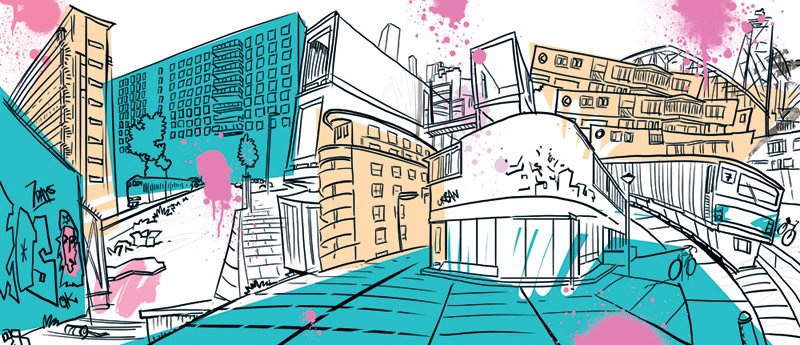
Background illustration for a spread design. Photo's of kids and graphic design were added.

Illustration for an article about outcome measurement.

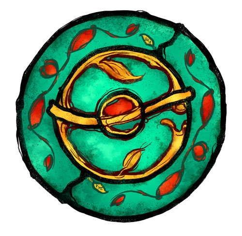
Sketch design for the cover of a boardgame about Antarctica.
Visual identity for folk band 'Eaden'.
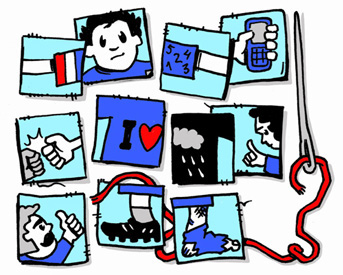
Illustration for a pedagogical article about 'sivil society'.


