This book was created for a self-initiated brief I wanted to explore the subject of Imposter Syndrome. Self-doubt prevails all, although it shouldn’t.
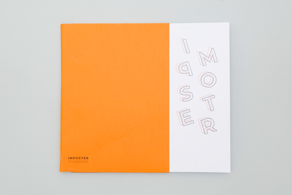
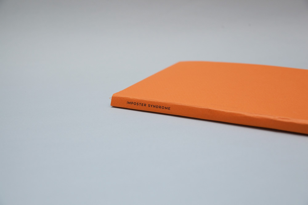
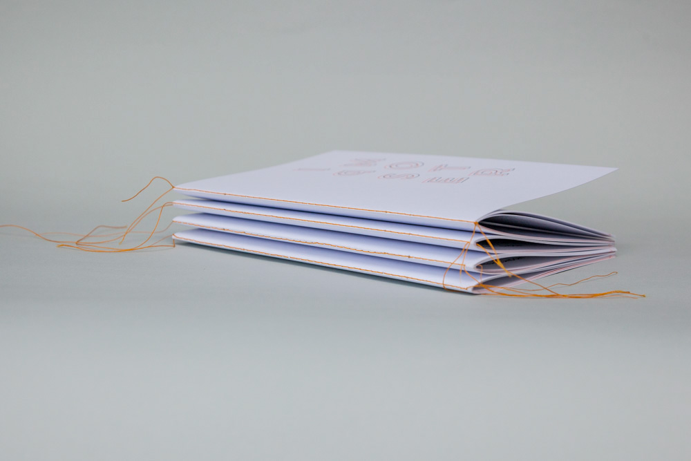
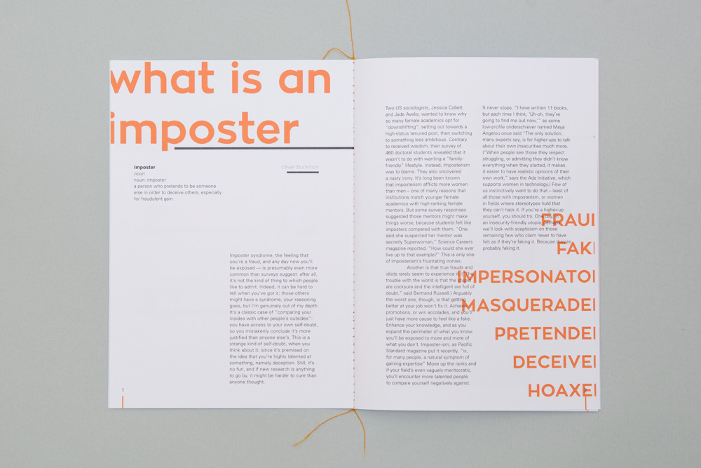
I wanted to make a “self-help” book that was more of an informative guide. Instead of being stuffed with information, it would be visually pleasing, with only necessary content. The thought behind the final piece was to convey the secrecy around confidence issues and self-doubt; which is often hidden. It affects up to 60% of the population both men and women, and can often be seen in the creative industries. Through the use of typography and colour, I hoped to show the inner struggle between the Imposter Syndrome and the personality, with the personality being conveyed through the use of the bright expressive orange, and the Imposter Syndrome, the black. The two colours overlap and clash throughout the publication fighting to be at the forefront. The use of the bright saddle stitch binding shows that ultimately who a person is is made up of both their flaws and their strengths. It’s packaged together in a bright orange sleeve, with the words “Imposter Syndrome” barely visible. A person’s weaknesses are only a very small part of who they are.
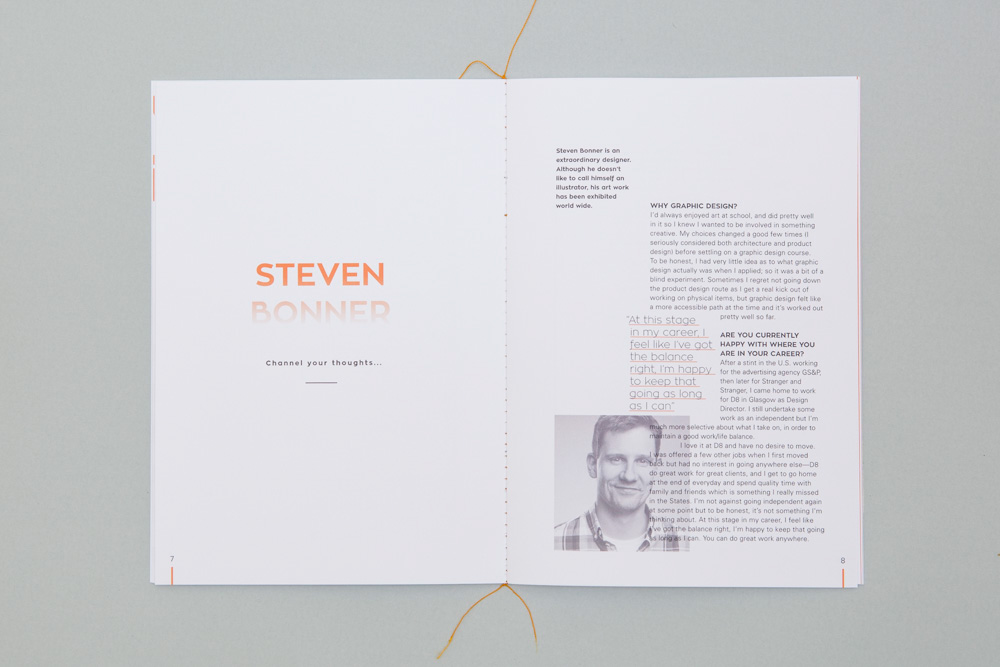
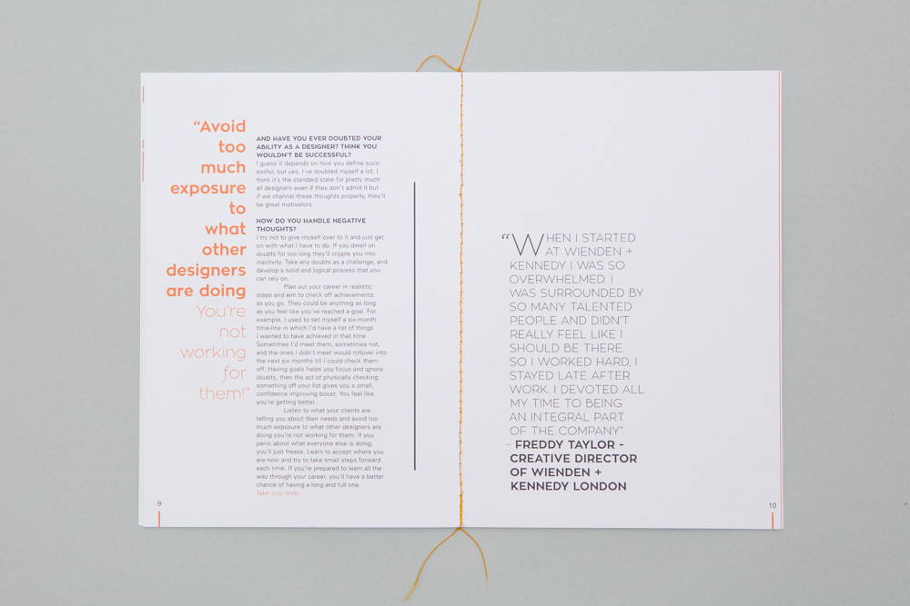
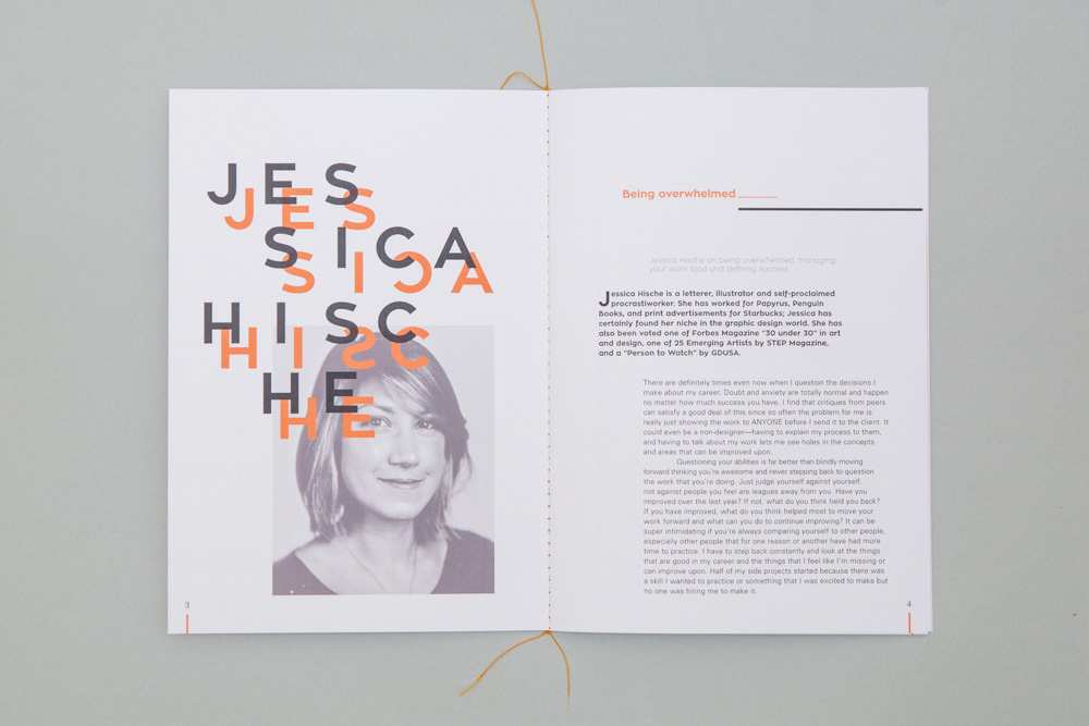
I sent emails to established designers and was lucky enough to hear back from Steven Bonner and Jessica Hicshe. They provided some invaluable advice that I featured in the editorial. What resonated with me is they both highlighted that success should not be centred around your career but who you are in life as a whole. A good mother, a friend and kind person. Just be your best self.