Brand Identity design for the "O" Yoga and Pilates Medicine School, based in England.
The source of inspiration for the Logo/Symbol design was the letter "O", from the Yoga school name,
The source of inspiration for the Logo/Symbol design was the letter "O", from the Yoga school name,
an abbreviation came from the word "Om" (or Ohm or Aum) which is a mystical Sanskrit sound of
Hindu origin, sacred and important in various Dharmic religions, and the classic yoga posture. Three
circles tangential to each other, equal thickness forming logo's final version.
_
Published in "Signs, Symbols & Pictograms" book.
Published in "Signs, Symbols & Pictograms" book.
Design Process


Logotype Color palette
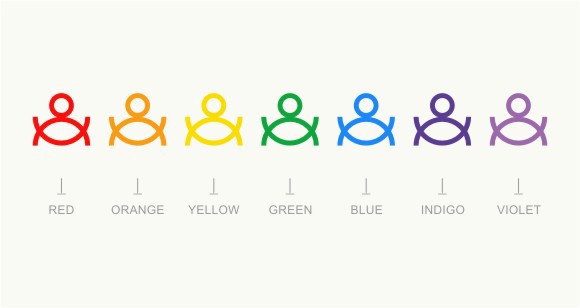
For the logo's color, I chose to use seven colors. Seven as the number of the Chakra, which are the centers of spiritual power, located on the midline of the human body.
Red - Root chakra, Orange - Sacral chakra, Yellow - Navel chakra, Green - Heart chakra, Blue - Throat chakra, Indigo - Third Eye chakra and Violet - Crown chakra.

"O" Identity


THANK YOU!

