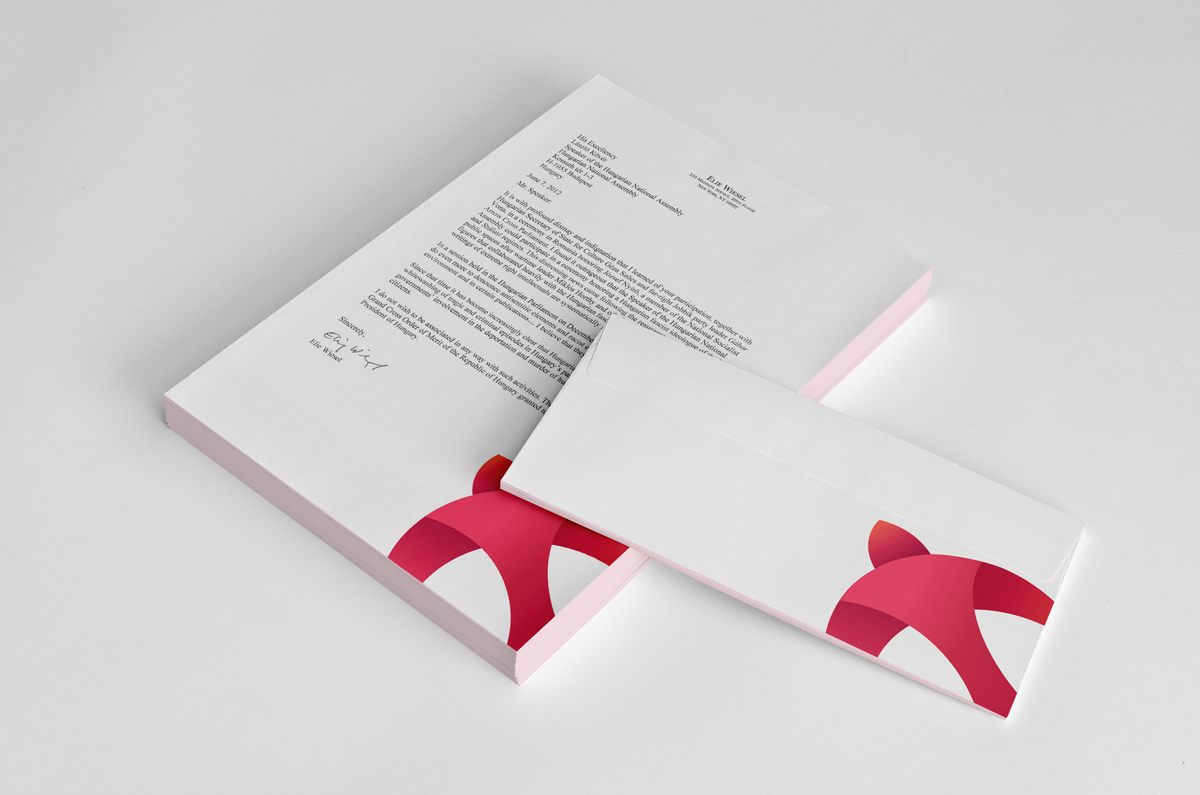
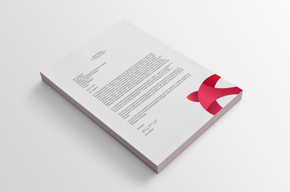
Saddled Branding
The aim for this logo was to weave in the famous Walsall football clubs bird icon into a web and print friendly logo that felt modern and likeable. I stepped away from the bright Walsall football red and decided to use gradients to give the brand a more softer and likeable feel.
Since the Walsall bird is so recognisable I wanted to use this as a major brand element. The logo works well as an artistic background piece and further reinforces the brand.