Frida Restaurant Rebranding
Frida is a family owned Mexican restaurant in Midtown Toronto that opened its doors in 2008 and quickly became a city favourite. The restaurant serves authentic Mexican food, with locally sourced ingredients, using traditional and daring recipes developed and curated by Chef Sergio.
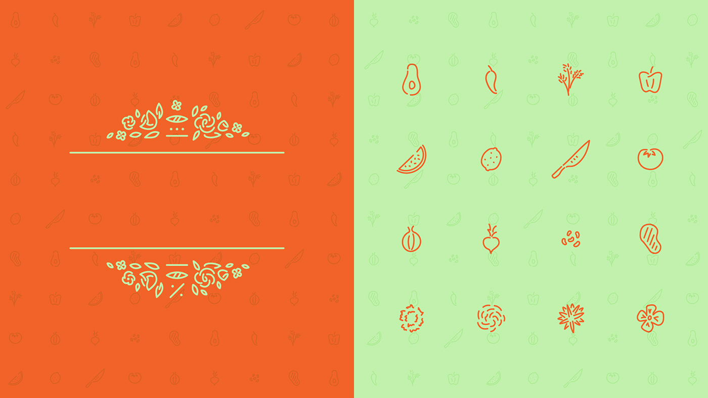
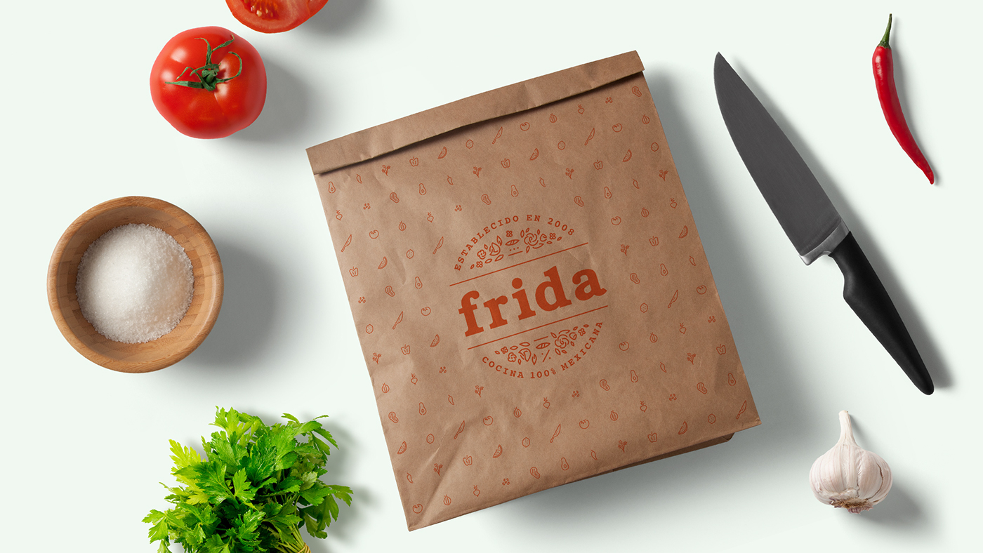
The restaurant takes its name from the famous iconic Mexican artist Frida Kahlo, which lends the opportunity for rich iconography to be infused into the brand. In early 2016, I was approached by Chef Sergio to update the food and drink menus, and after a few rounds of changes, the simplified and elegant menus were rolled out. Throughout the design process, new design elements were introduced and started being applied across brand materials, at which point the logo was revisited and updated. Using Kahlo’s flower paintings as inspiration, a crown of flowers was added to the top and bottom of the wordmark, which were enclosed by brand statements. The new symbol was then produced as a stamp and used on the new menus, takeout bags, and servers notebooks.
A new colour palette was explored and expanded from original orange-only to a 7-colour playful palette. The rich colours were mostly used on digital materials on full vibrancy, but in a more subdued manner on other materials, such as the paper stock of the menus.
DELIVERABLES
Logo, food and drink menus, social media promos, emailer.