Please play the audio while you scroll through the page.
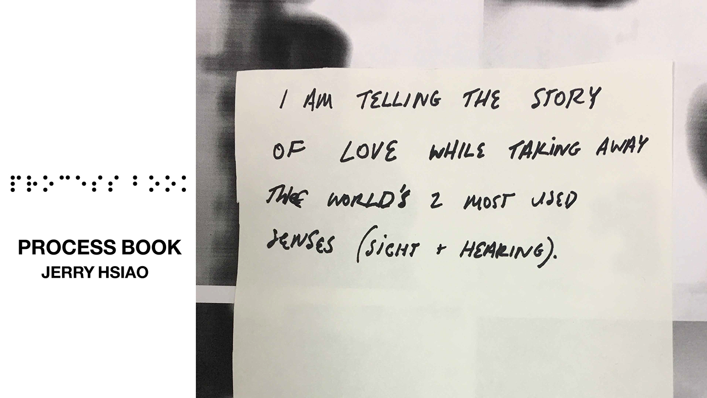
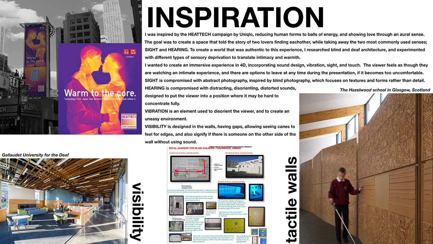
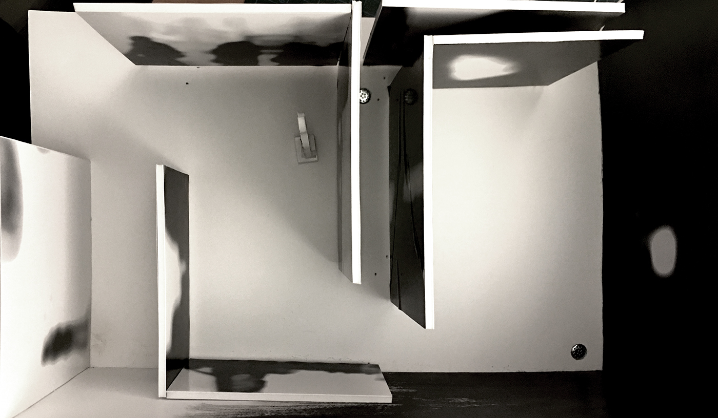
SIGHT + HEARING are two of the most used sense in day to day life, and when I was given the assignment of creating a 16’x26’x9’ room that would tell a unique story in a given neighbourhood, I decided to go in a completely different direction and rethink the concept of storytelling. I created the scenario of two star crossed lovers who were unable to see or hear eachother and had to find alternative ways to express their love.
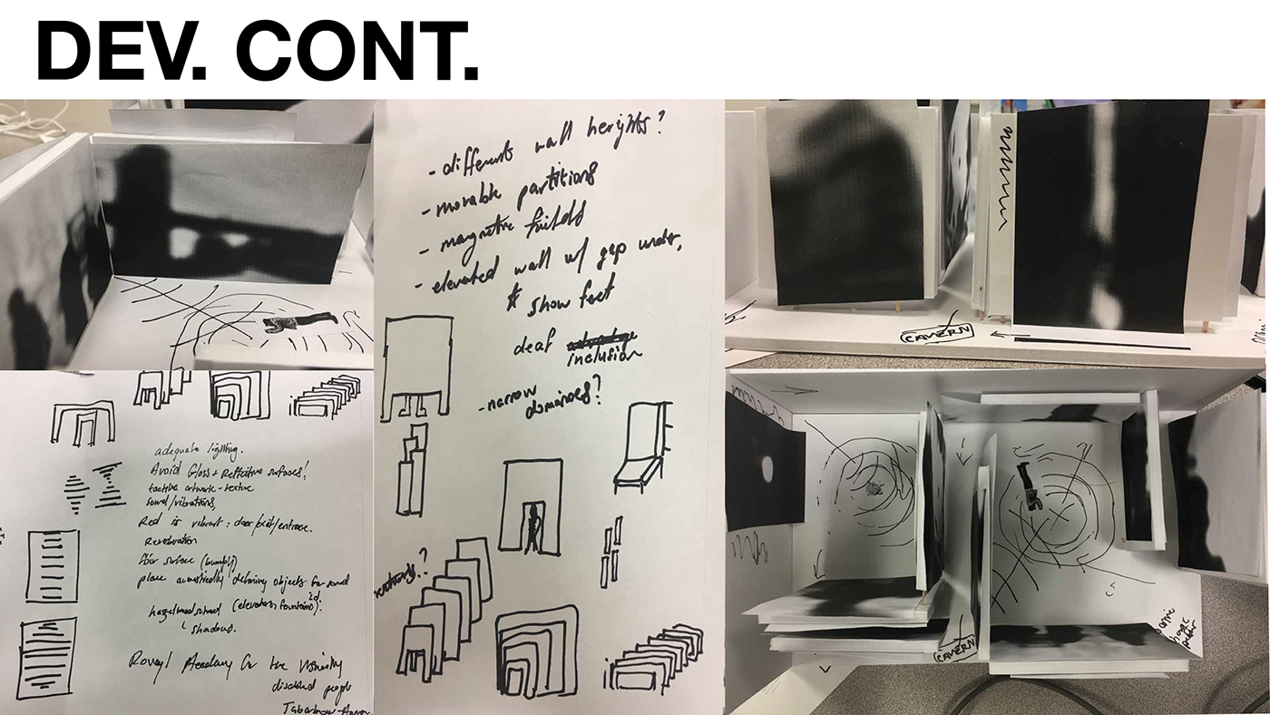
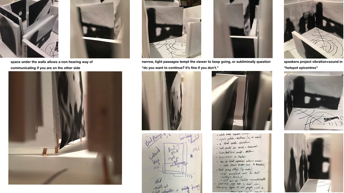
As you walk through the room, there are two “hot-spot” speakers that create vibration and generate the most amount of traffic in the layout and project a looped sound file representing the dissonance and discomfort when putting yourself in a vulnerable position. The audio file starts off quite calm, but quickly changes into a violent and uncomfortable clip, similar to the shift in the photographs on the walls. The audio also incorporates the photographs, by taking the .psd files and glitching them in audacity; creating a “running-saw” and “record scratch” sound clip.
The photographs are intimate pictures of people I love in my life, places I’ve been, and objects that have sentimental value to me. I distorted them and blurred them to the point where any other person may not be able to recognise what the pictures are of, but I will always be able to see key shapes that tell me who is in the photograph.
Seeing and Hearing everything is not always a blessing, there is a strength and advantage to deafness and blindness. Even when the world is crumbling around us, as long as we embrace each other in this moment, as long as we have love, nothing really matters.
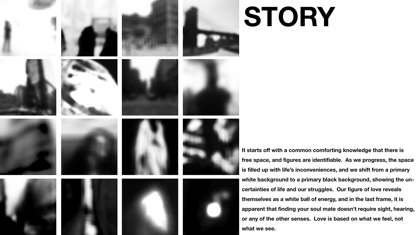


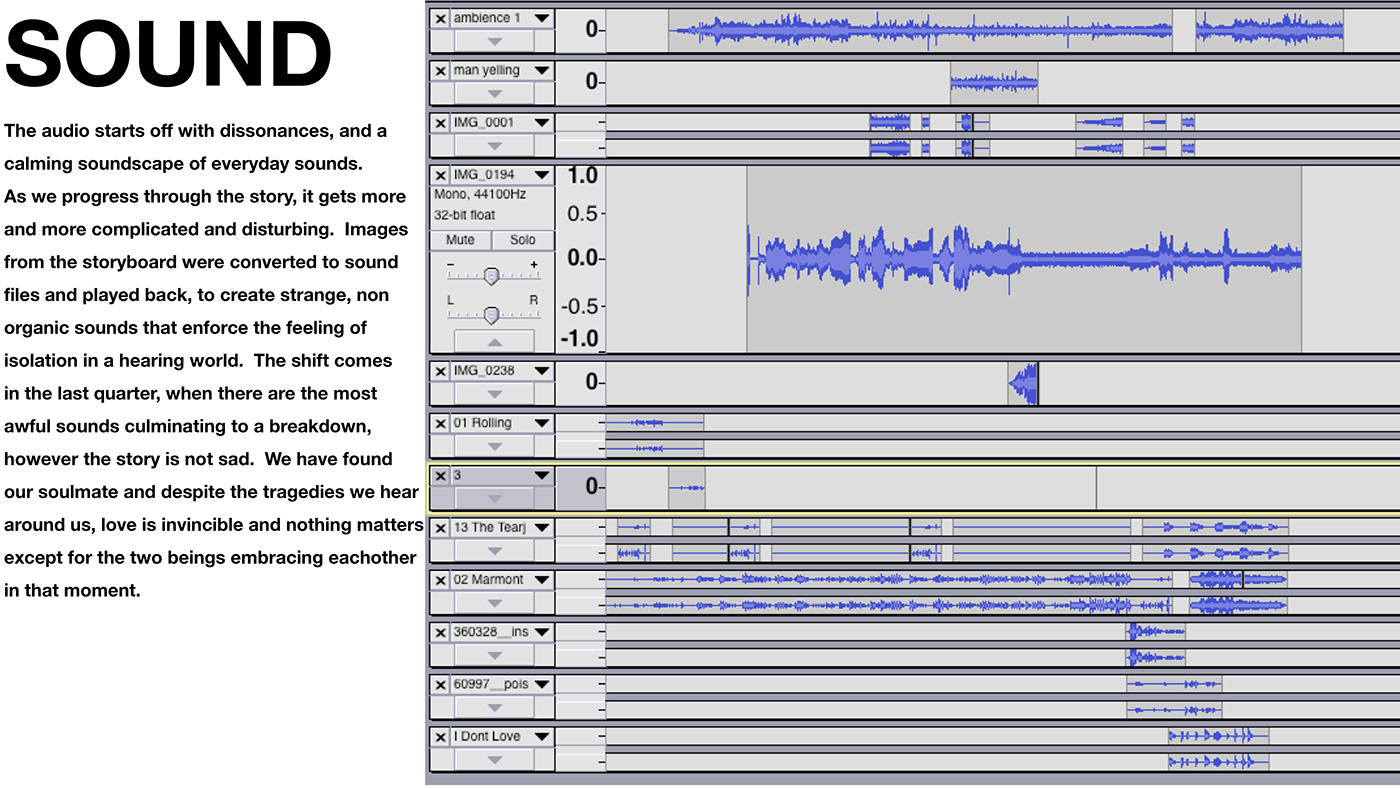


The images tell a story of leaving your comfort zone. I started with a predominantly white and open background with black foreground objects, and as we shift through the images, more and more black engulfs the screen, representing the unknown abyss we cannot see. The white shifts to symbolise energy in the relationship, and the last image is what I interpreted as a hug.
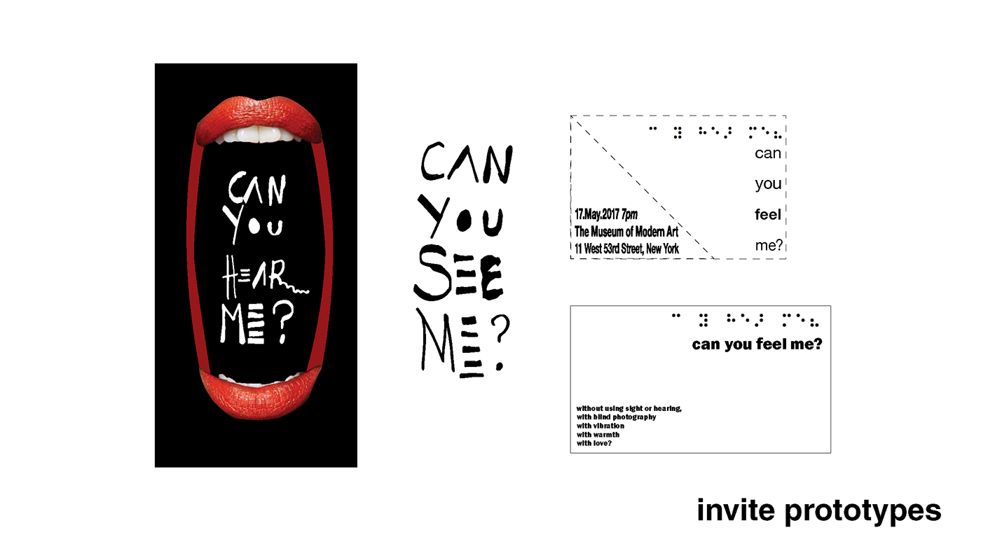
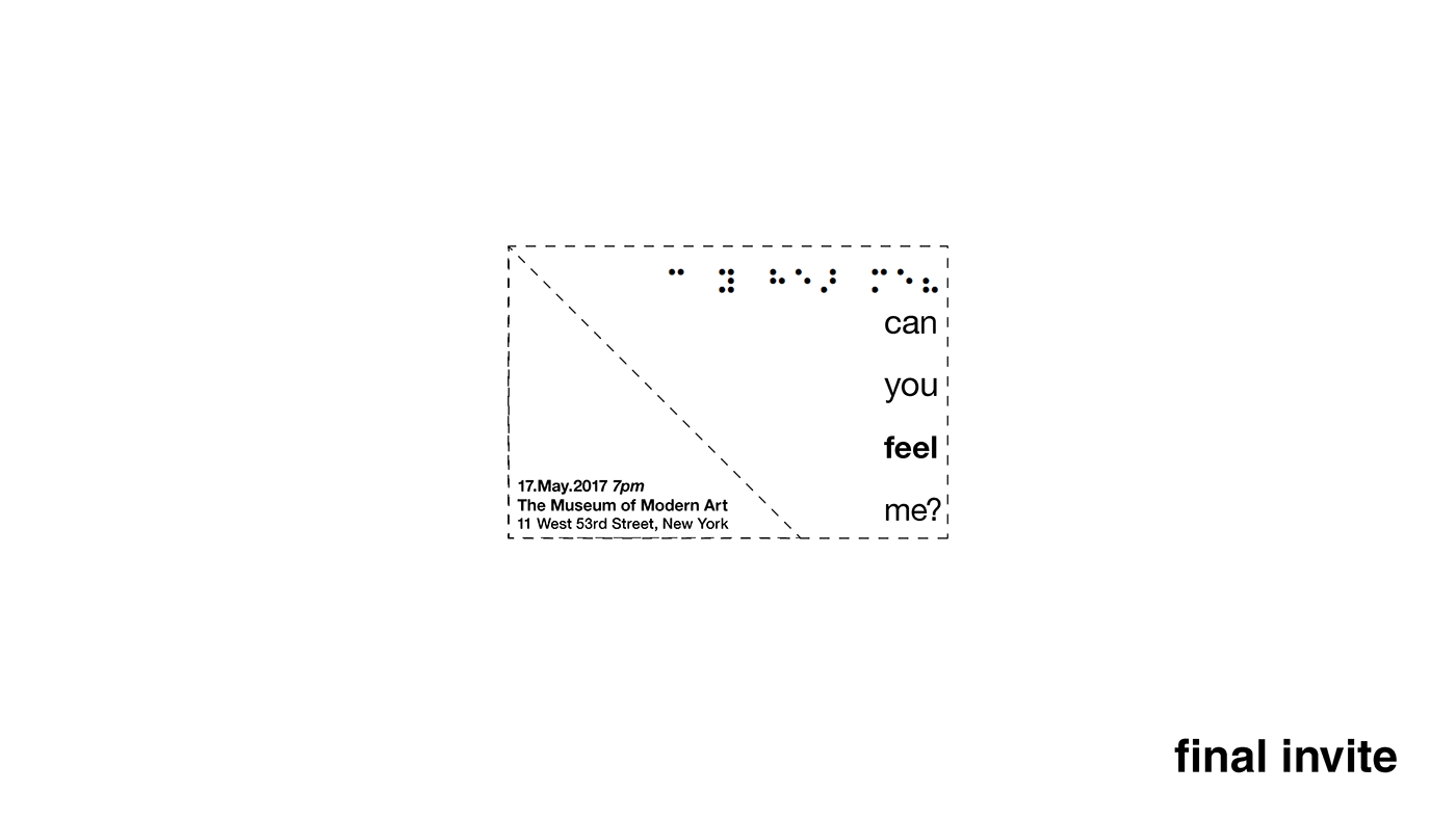
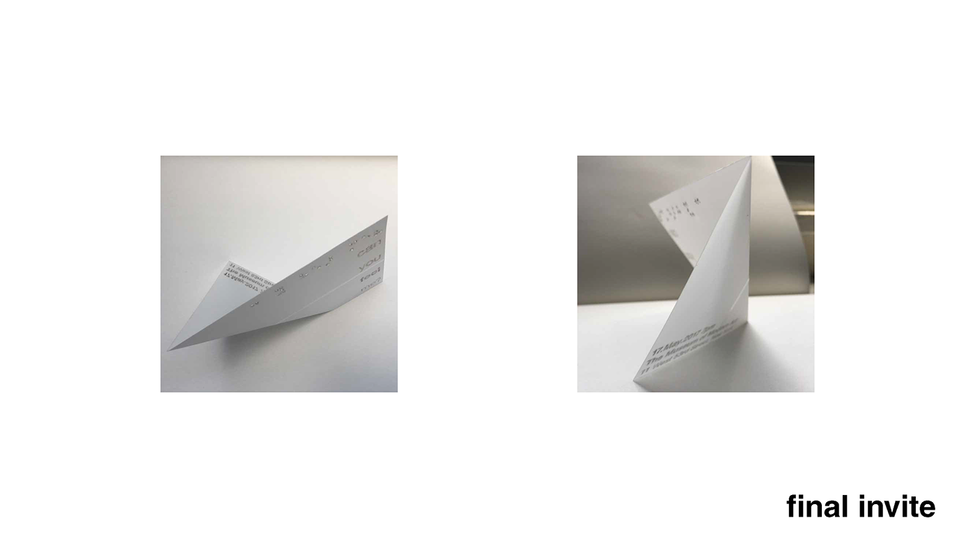
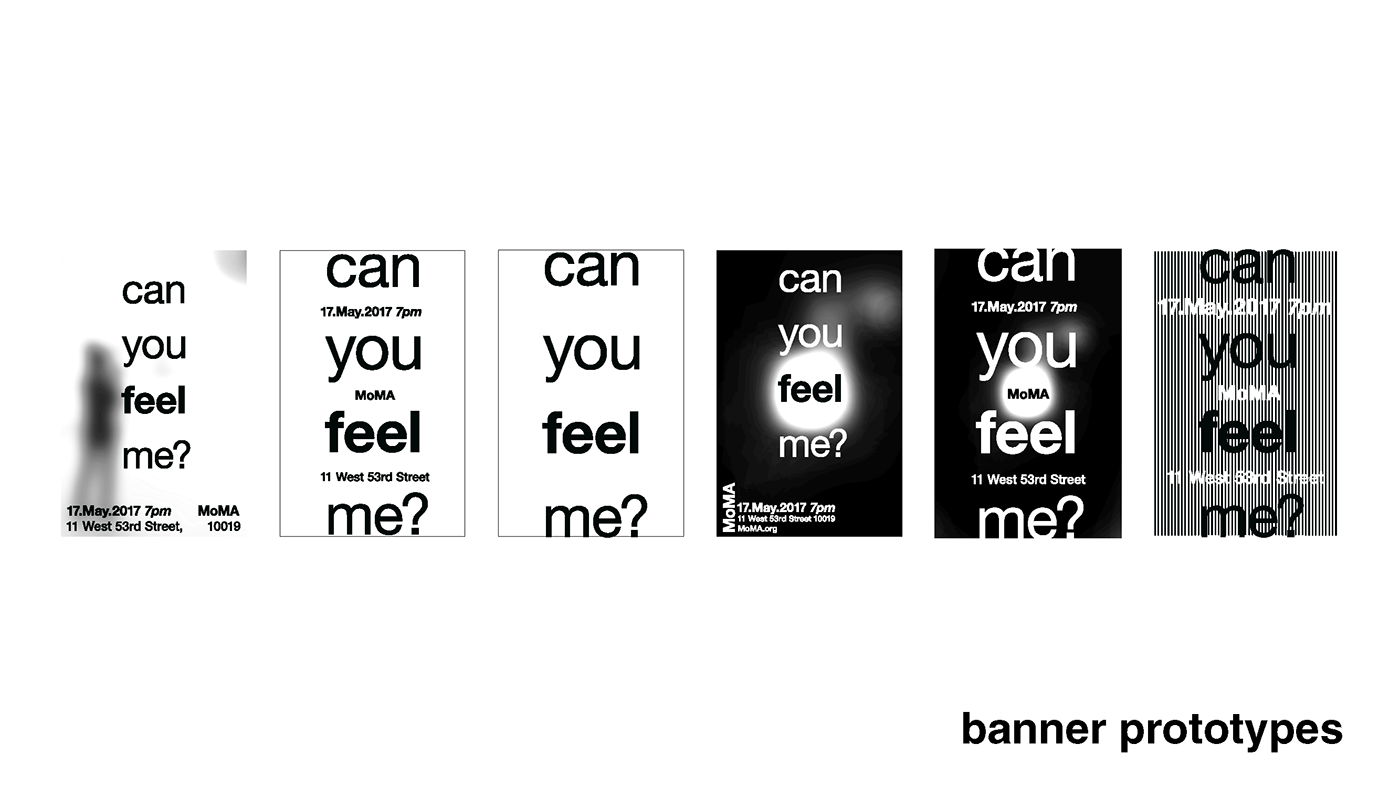
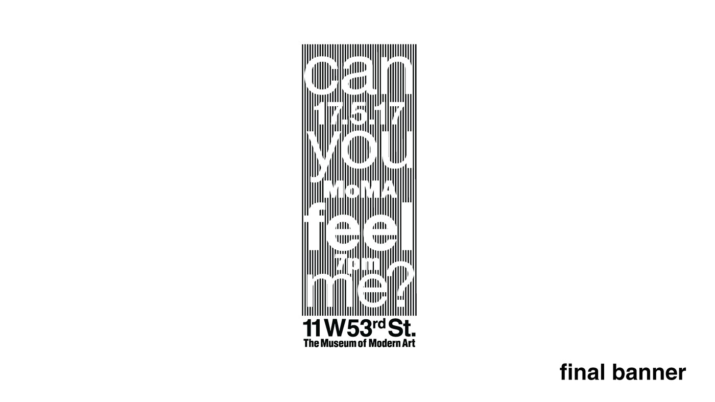
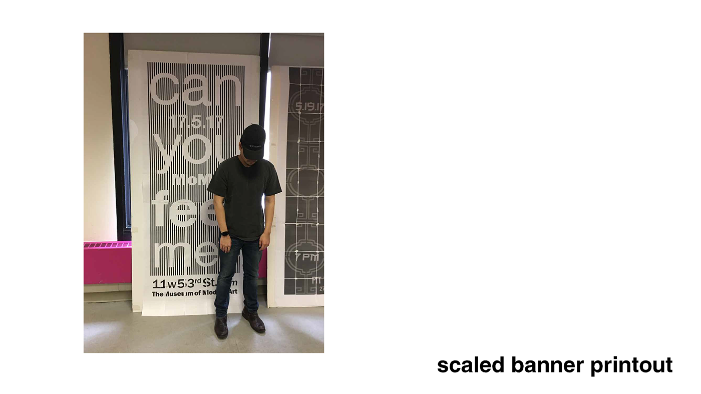
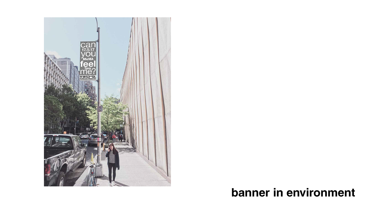
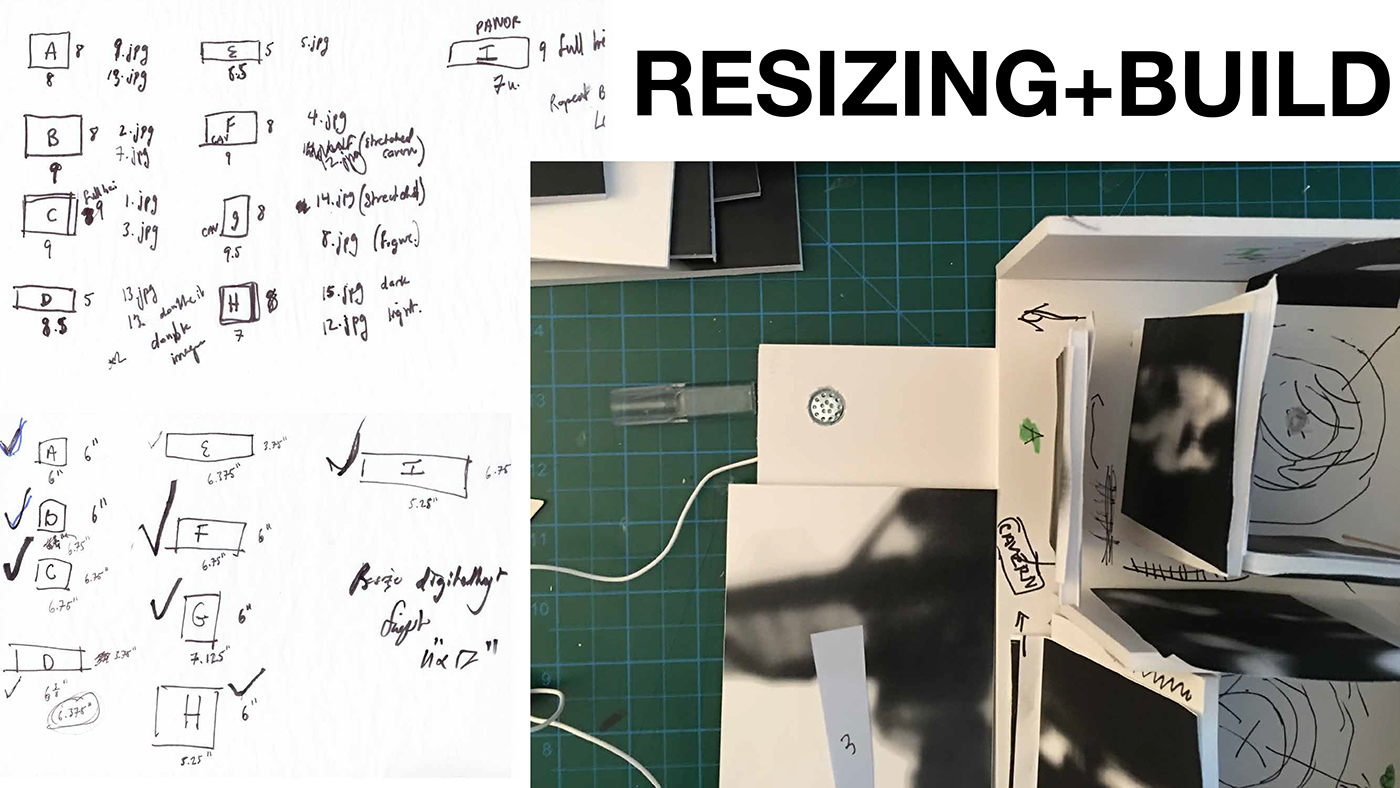
The second and third stage of this assignment was to create an invitation and banner that would be similar to the physical space. I at first chose a Basquiat-Warhol style and made a hand-drawn and hand crafted invitation before realising that the style that I chose had nothing to do with my project. I opted to not go for “sex selling” and went for a very subdued, almost alien card that felt more like a tool than an invite. The material is dura-lar translucent plastic, and the folding structure allows it to stand up independently. There is braille punched out, and the type is transferred/printed with alcohol to look ghosted in-between the plastic layers.