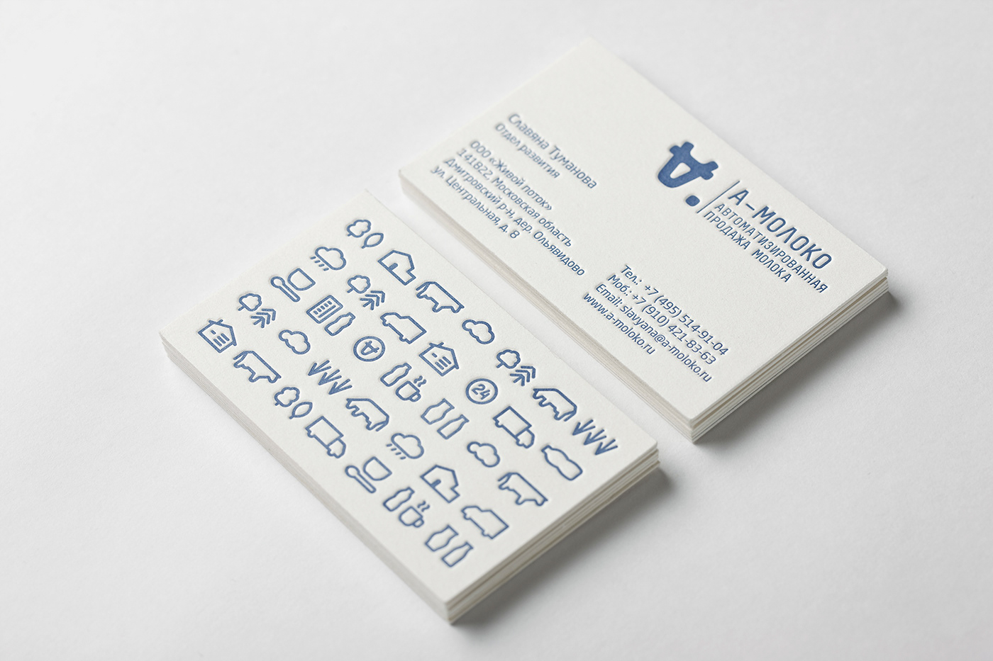

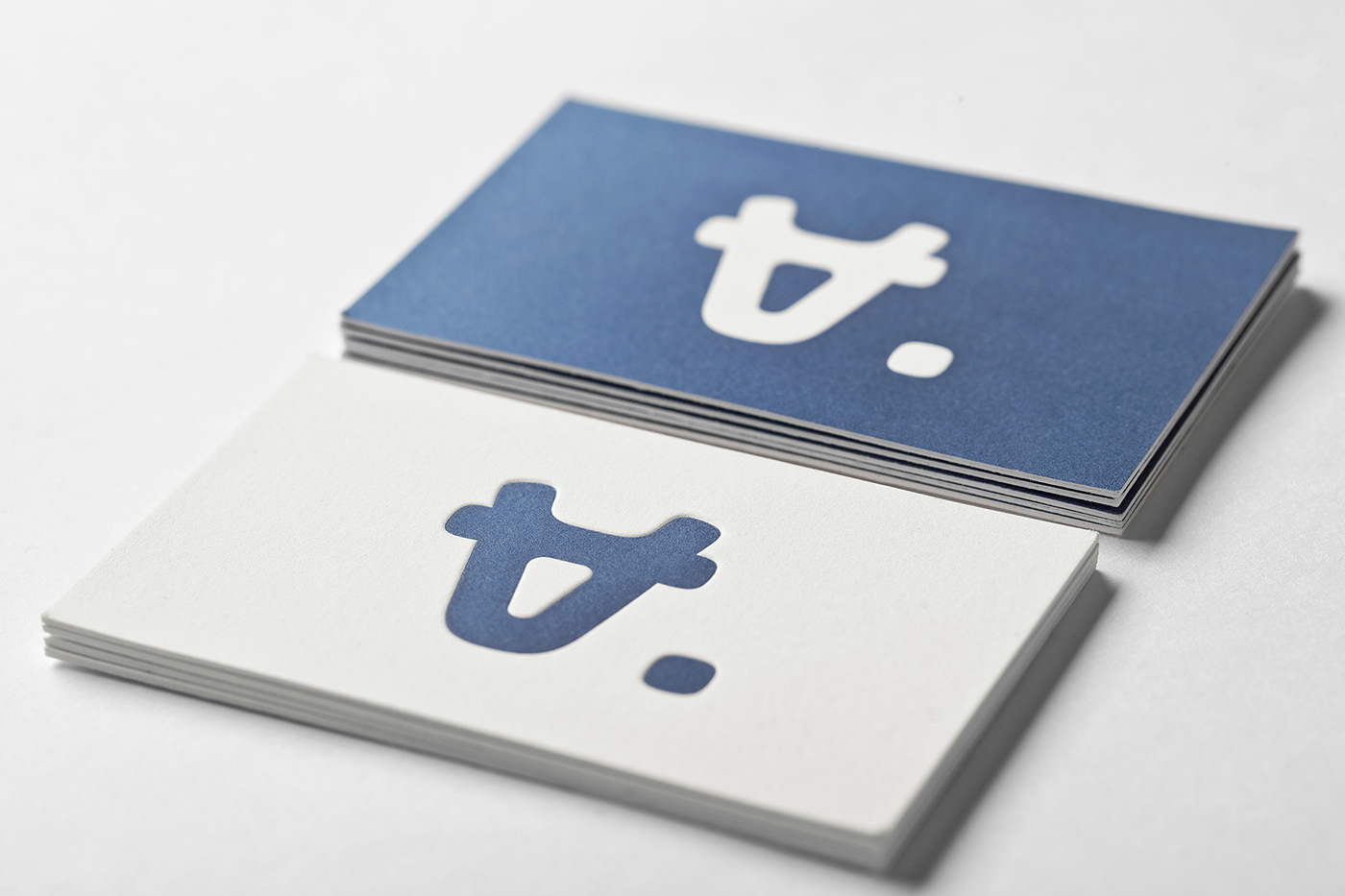

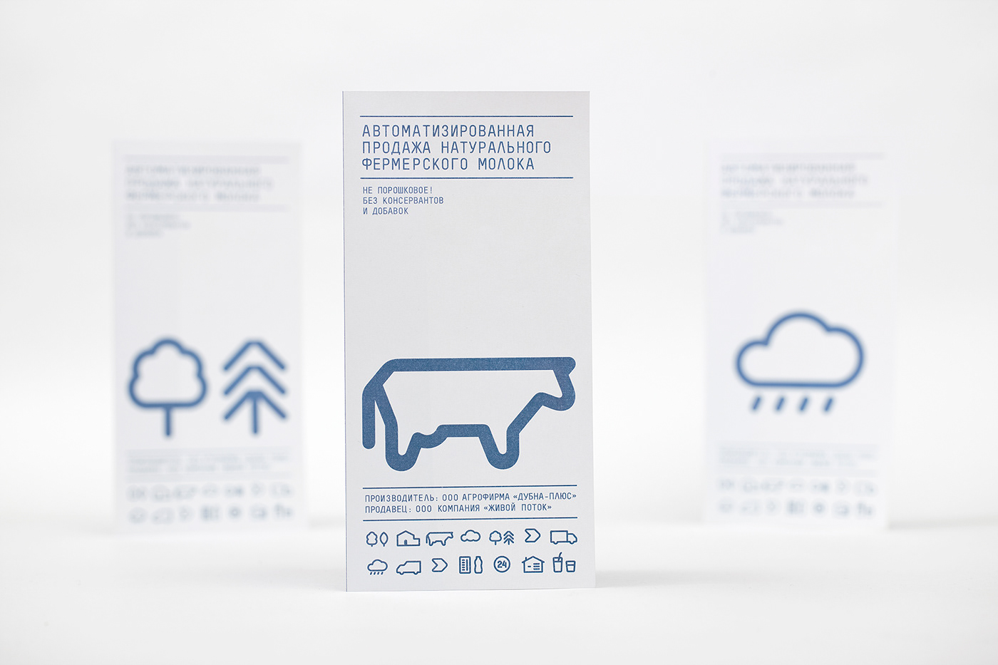
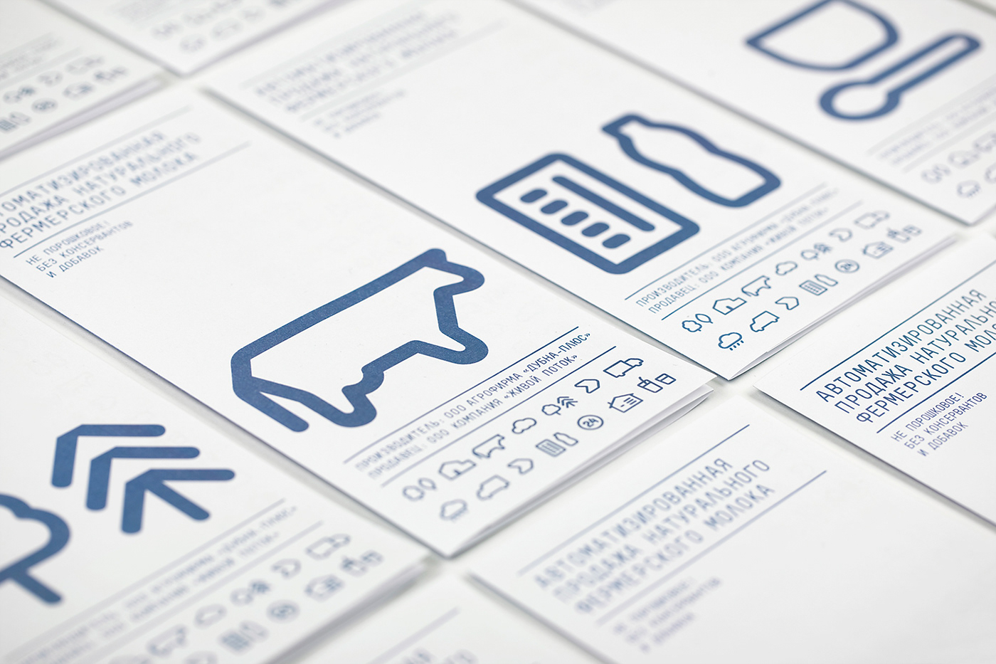
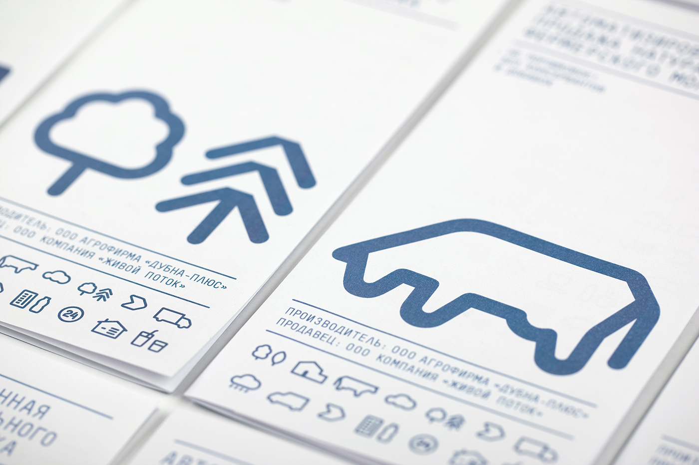
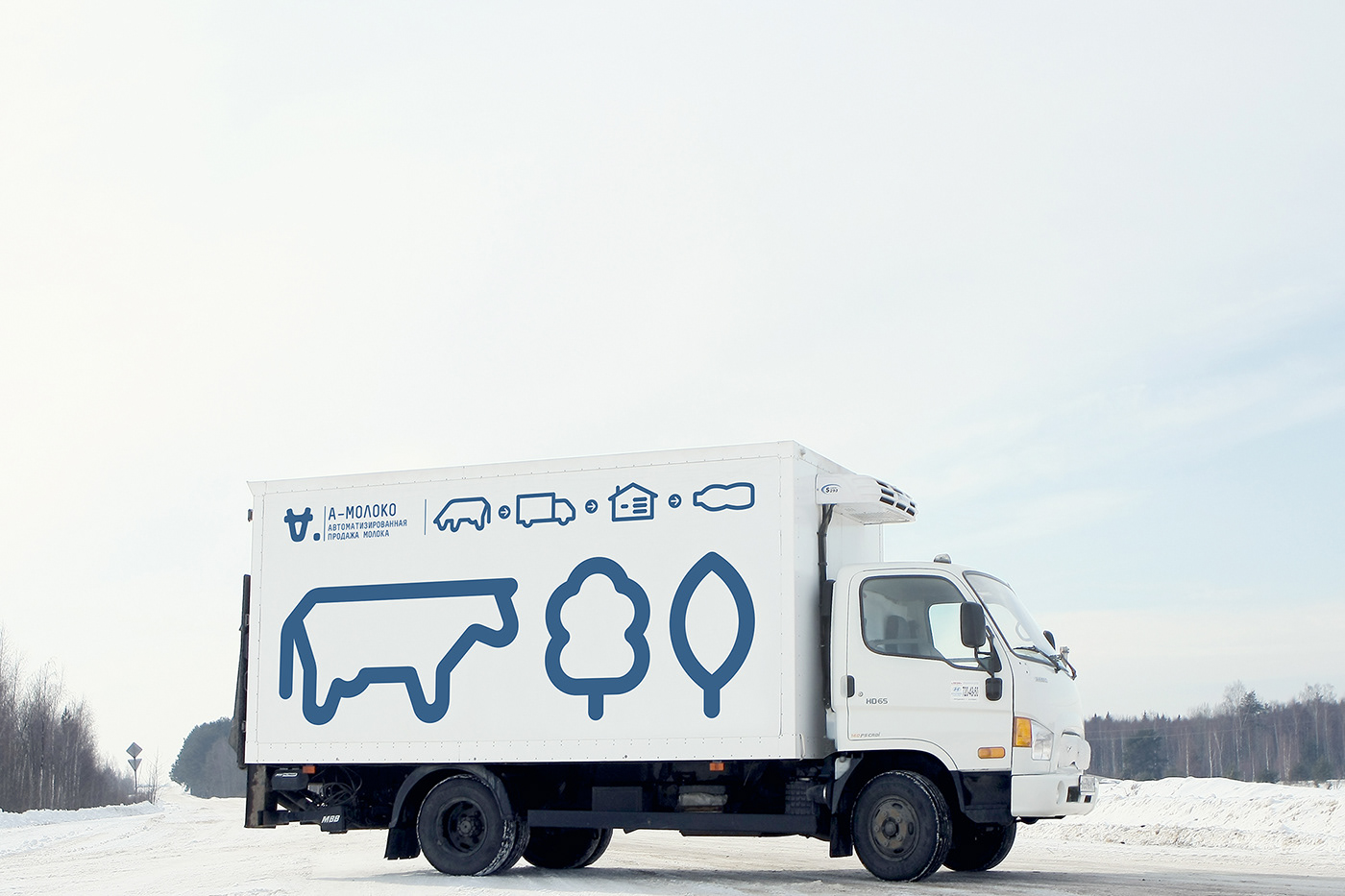
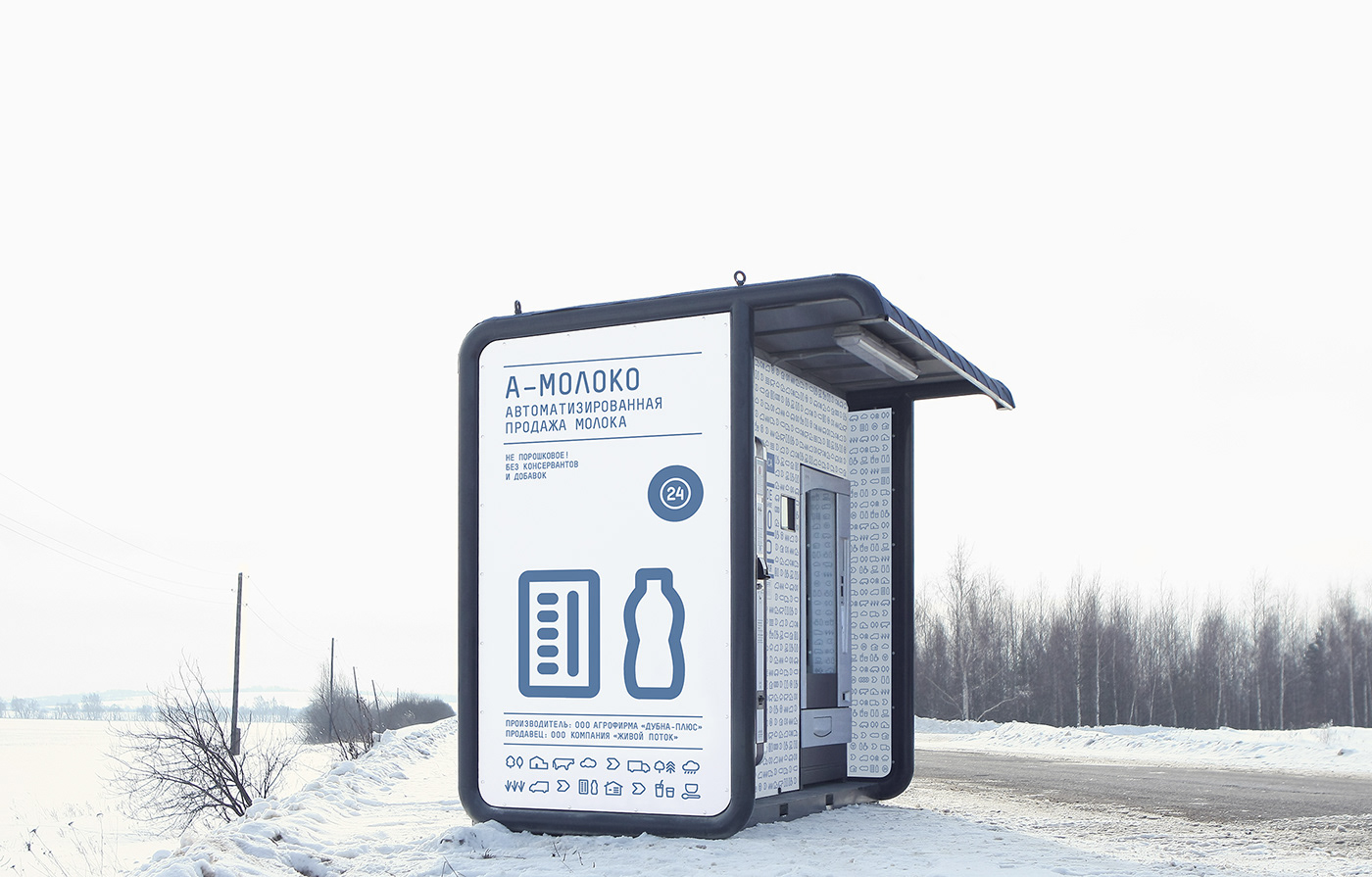
This visual identity was developed for a company, which sells milk through a chain of vending machines. The design concept of the logo is inspired by the business of the chain: Automated sale of farm-fresh milk and the company’s name, A-moloko, which has been developed by Ermolaev Bureau as well. The first letter “A”, which when turned upside down resembles the muzzle of a cow, was taken as the basis. The visual identity
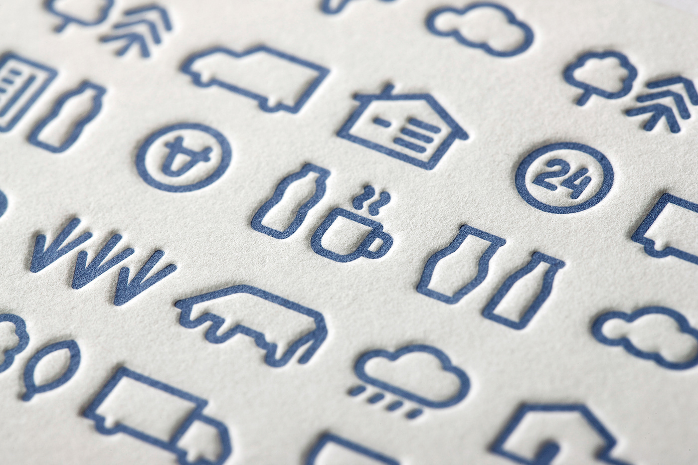
is built on a clear system of symbols, which describes the path of the milk from the cow
to the consumer. This visual language lends the blue and white appearance an emotionally appealing character.
is built on a clear system of symbols, which describes the path of the milk from the cow
to the consumer. This visual language lends the blue and white appearance an emotionally appealing character.


