Karja Pagar – craft bakery from Saaremaa
Family run bakery from Saaremaa is preserving the island’s rye bread making traditions. It needs to make a nationwide statement, without losing its heart.
Karja Pagar is an authentic family run craft bakery, located in Karja village on the island of Saaremaa. The business was founded in 1993 with the focus on baking white wheat bread and dark rye bread. Soon the product range grew and Karja’s breads’ popularity peaked among the islanders and spread all over the Estonia. Today their produce is sold across Estonia and is much sought after in big cities and small villages alike. While growing their business, Karja bakers are firmly keeping Saaremaa’s home bread traditions close to heart.


While investing into people, production and facilities, Karja bakery’s brand got lost in the ever-growing pool of competitors. The visual identity and packaging design didn’t embody the high value of craftsmanship and care that goes into Karja’s bread making. While the assortment was wide, the brand recognition was low and the product family didn’t form a well-recognised whole.
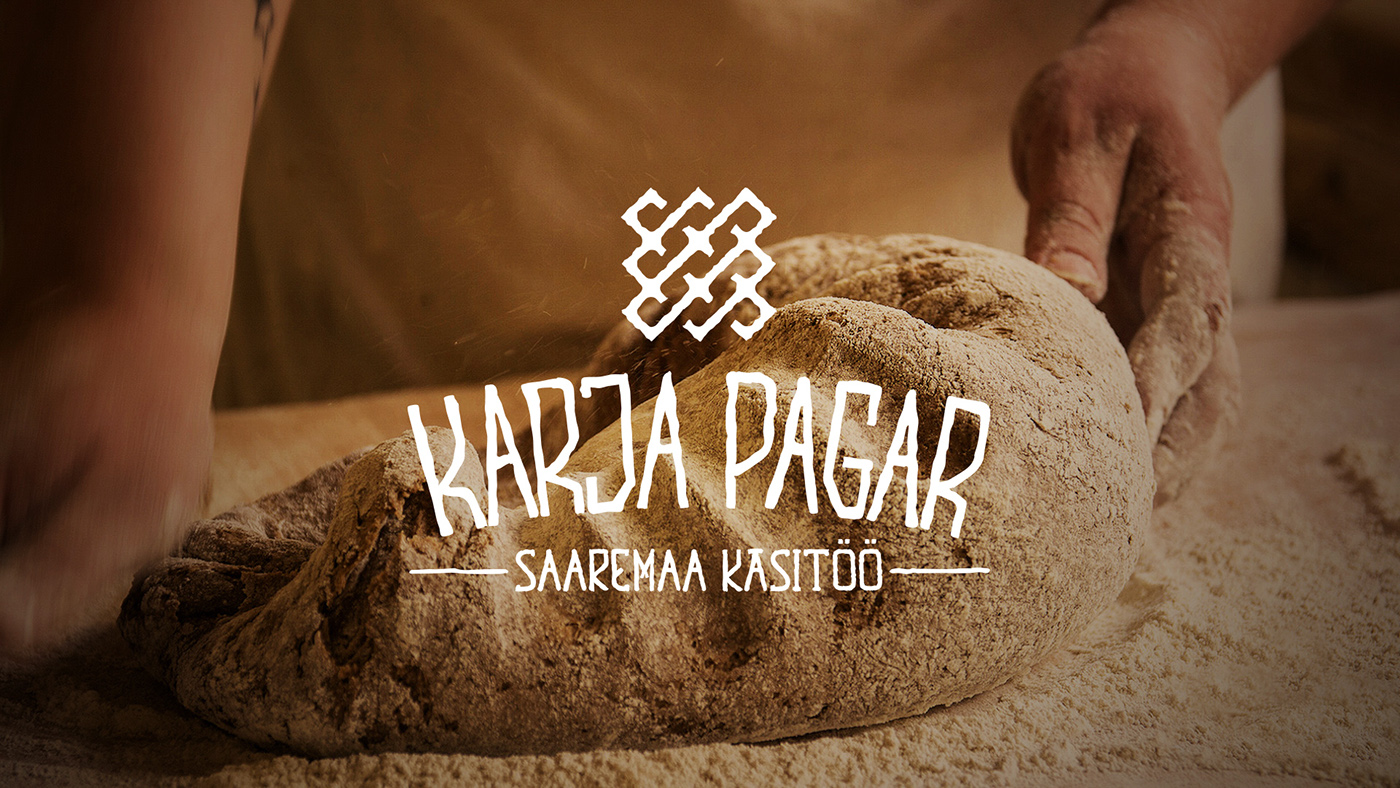
Each bread is given a pat on a back – literally
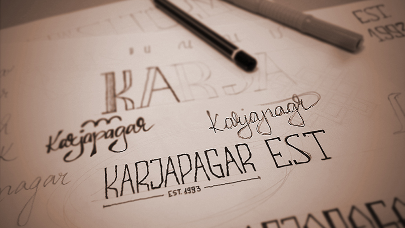
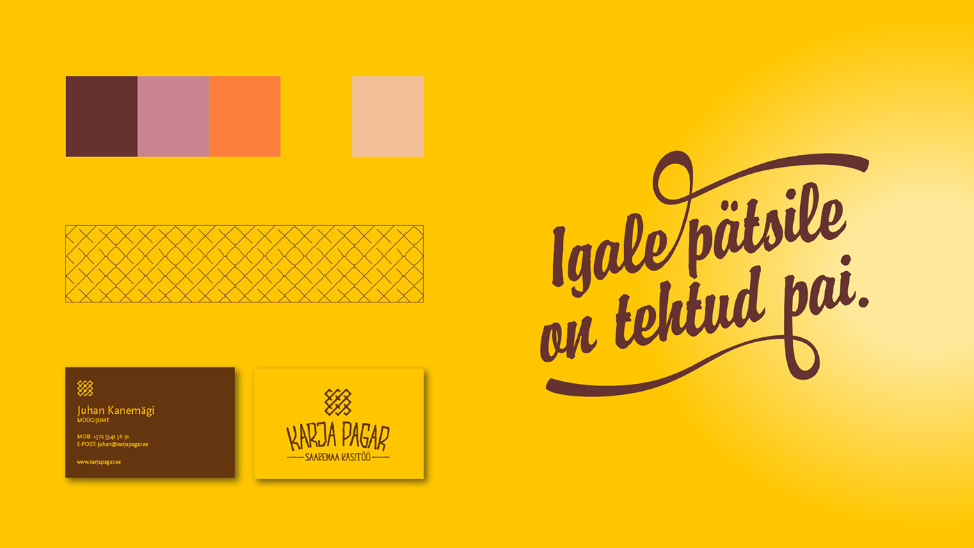
After researching the local history and the whereabouts, Karja’s identity was updated. The symbol created for the bakery is not that new – we based it on a medieval ceiling mural in the nearby 13th century Karja church. The bakers work hard to keep alive Saaremaa’s bread making traditions and this Celtic knot is a perfect mark for that. The identity is held together by a sunny colour palette, reflecting the warmth of the islanders and the autumn crop.


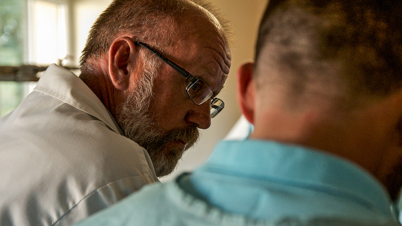
But most importantly – in the course of making, every loaf gets a few caring touches by a baker’s hand. There’s a writing on the package to testify this rare attention to product in today’s frantic world. Together with a clear, no fuss packaging system the Karja range stands nicely out against the competition now.
We kept in mind that albeit growing, it is still a small family business with limited resources. Together we figured out a cost and labour effective packaging solution. On one hand, it allows to invest more into high quality ingredients and the lovely staff. On the other, it sends out a clear message that it’s not the glitzy package that makes Karja special – it’s the bread inside that counts.


21,5% more bread
A recognisable identity and coherent story has helped Karja to attract new fans and successfully launch a couple of new products. Their signature products like Rukkileib (Rye Bread) are showing double-digit growth. Year-on-year, they are rolling out 7.800 kg more bread every month. For a petit bakery like this, it’s a substantial chunk of dough.


