
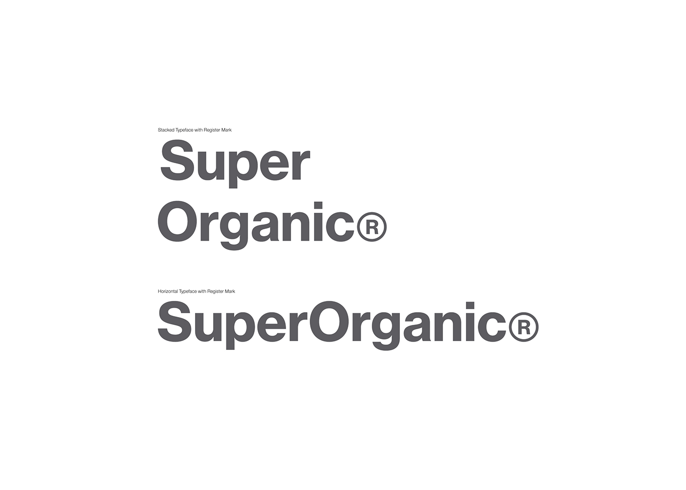
SuperOrganic®
SuperOrganic® is a new holding company that envisions to widely spread organic lifestyles through innovative and creative approaches.
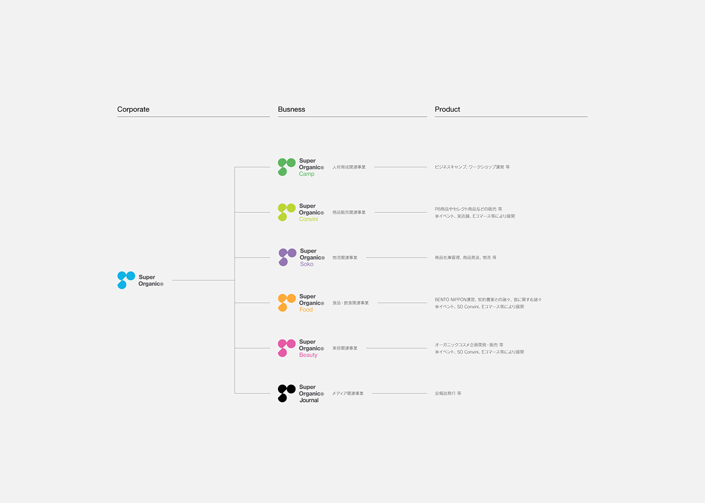
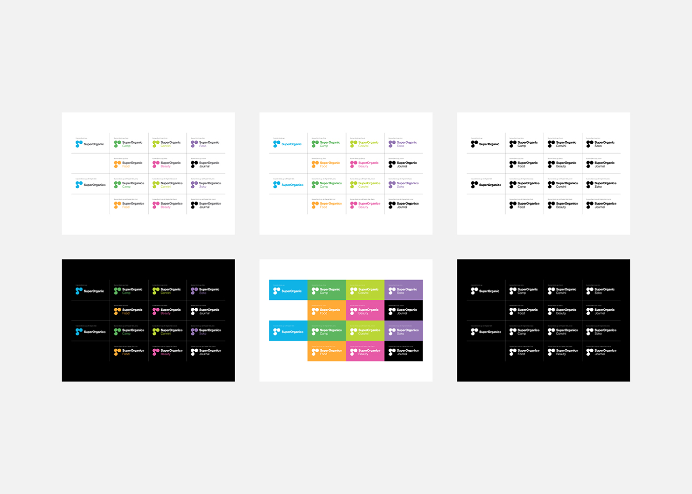
Its vision is the realization of a healthy global environment that enables children bearing the future to live in peacefulness, and diverse organisms to live in its original form as it was supposed to. Therefore, its business will be developed in the food domain as well as in various areas such as merchandising, beauty, awareness-raising activities, logistics, media, etc.
Its vision is the realization of a healthy global environment that enables children bearing the future to live in peacefulness, and diverse organisms to live in its original form as it was supposed to. Therefore, its business will be developed in the food domain as well as in various areas such as merchandising, beauty, awareness-raising activities, logistics, media, etc.
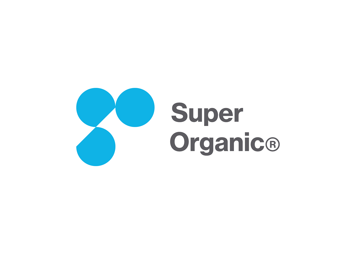
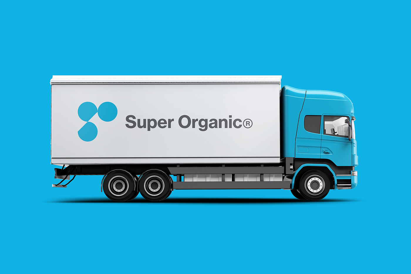
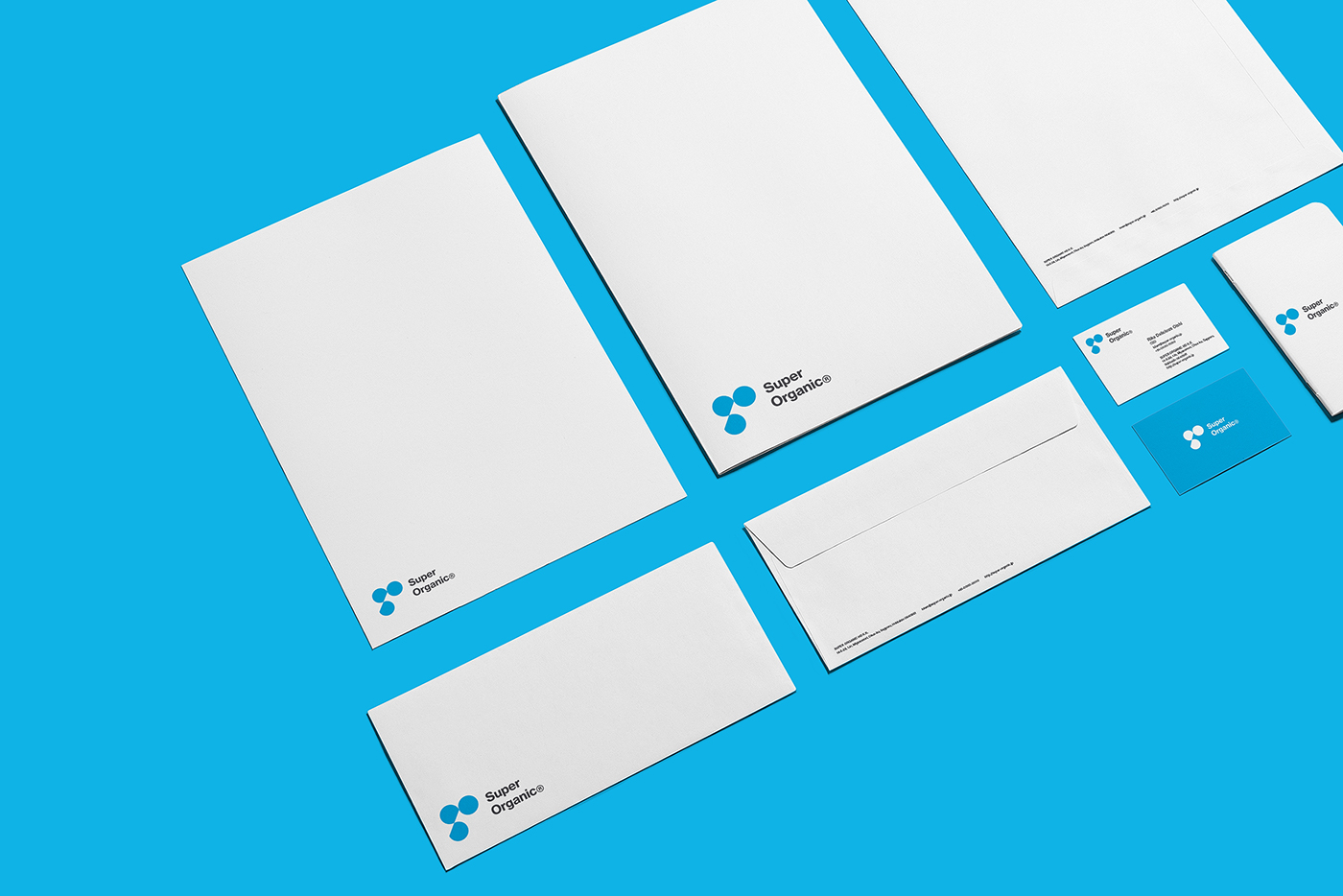
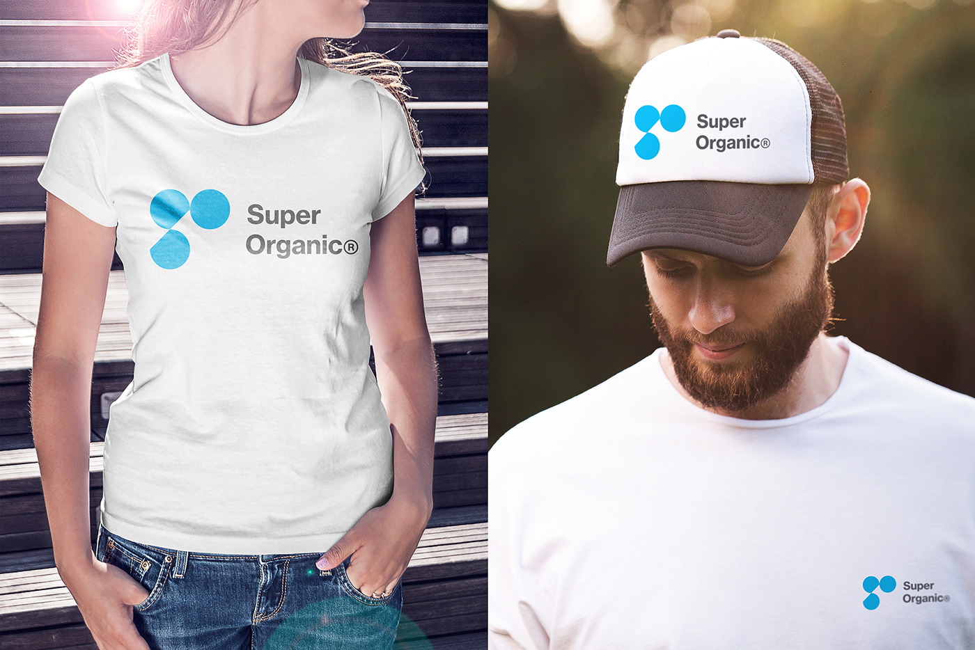
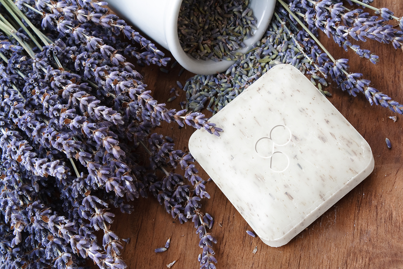
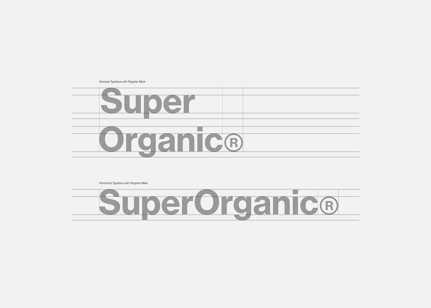
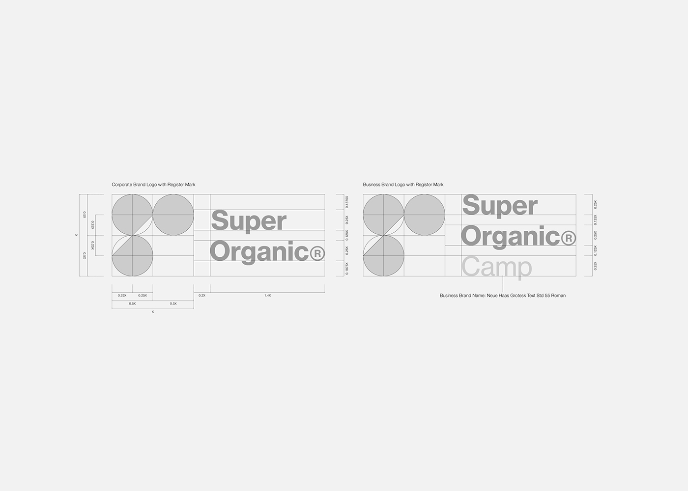
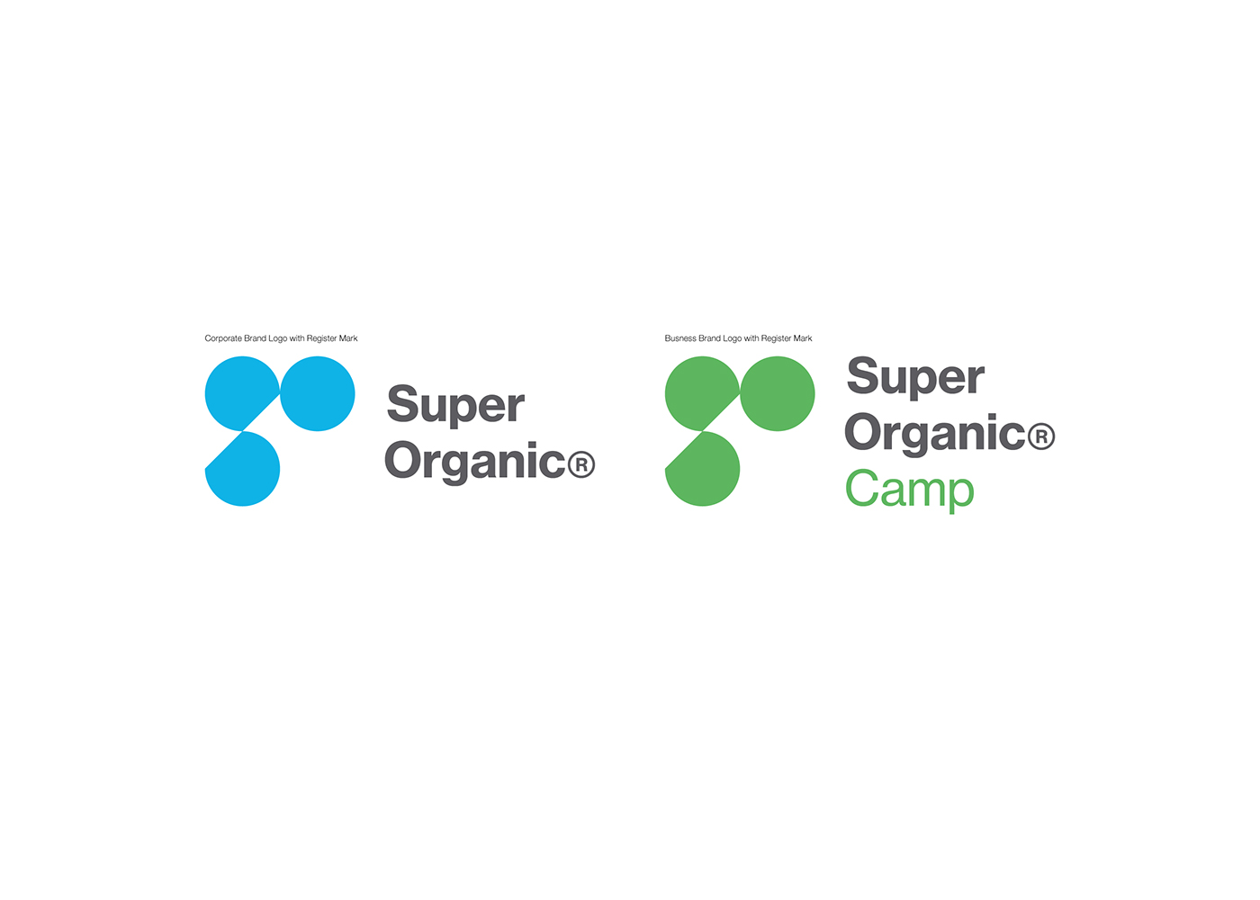
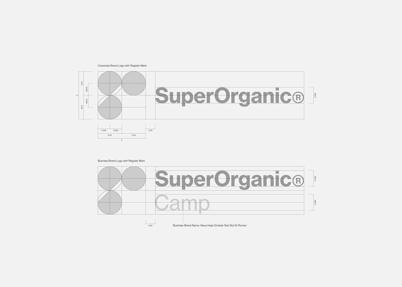
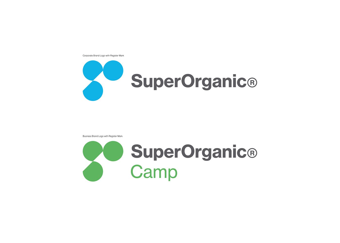
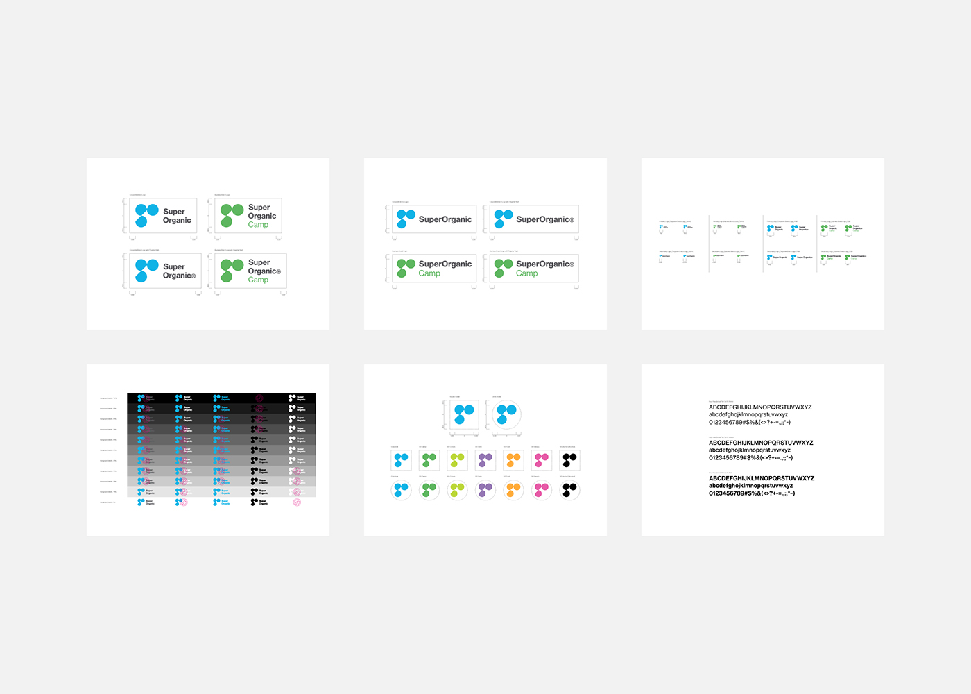
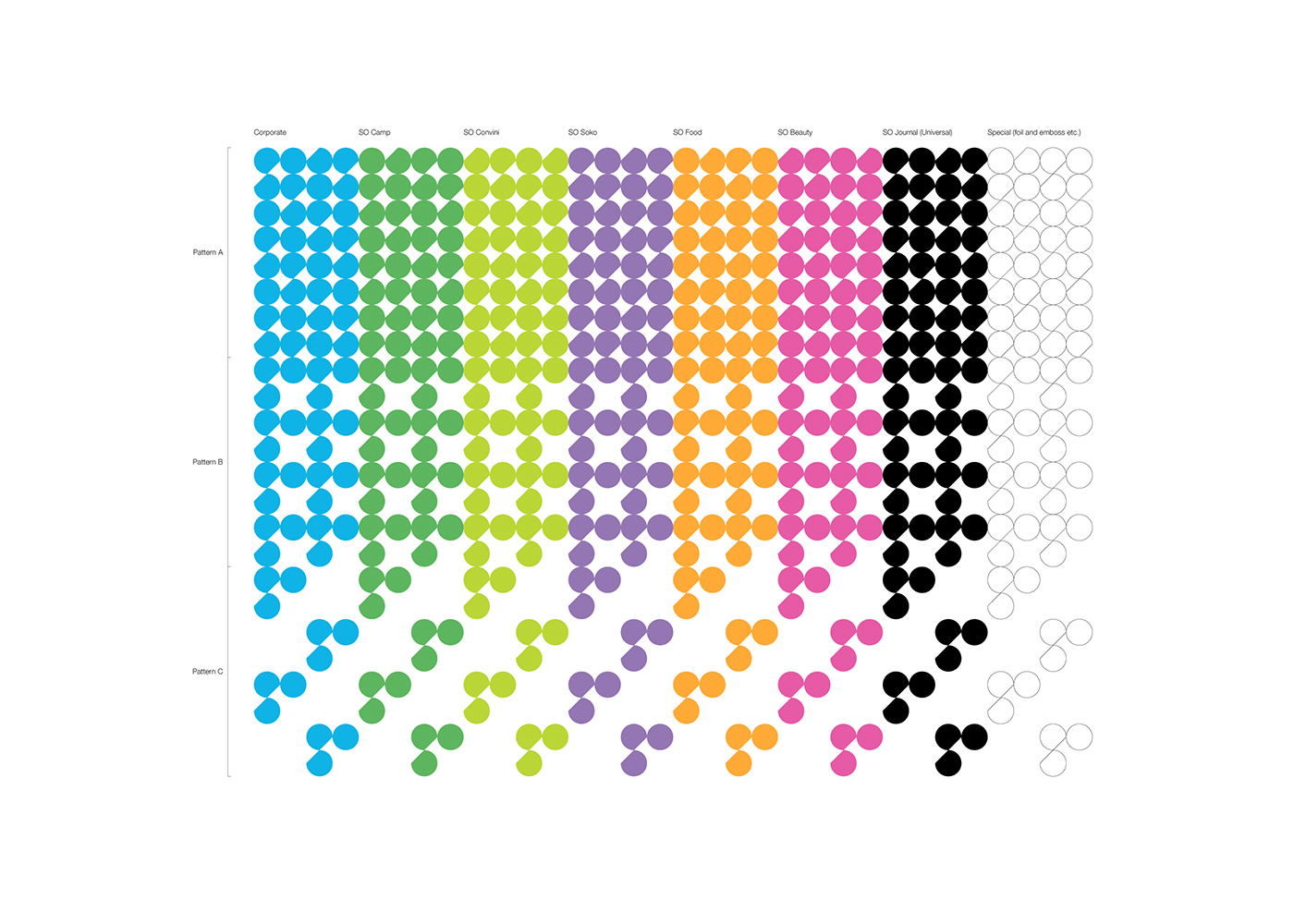
The symbol of SuperOrganic® geometrically represents the initials SO.
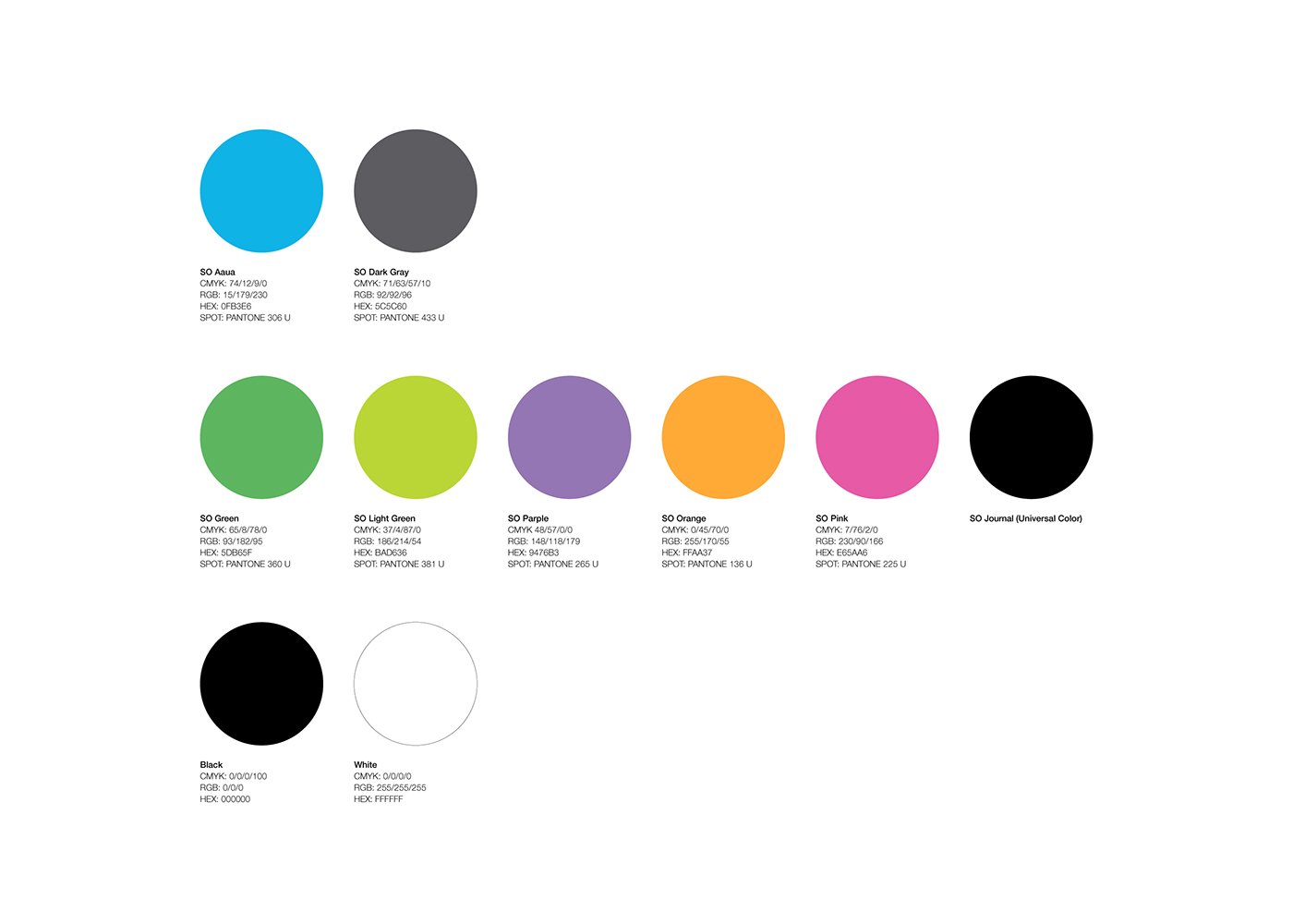
A circle that composes the symbol is a metaphor of beautiful water, air, and the blue earth itself which are the most important factors for the healthy life of human beings and organisms.
Considering the business area will further expand and the business activities will further diversify in the future, the logo was made with a very simple structure.


Client: SUPER ORGANIC HD K.K.
Art direction, Logo concept, Graphic design: Hiromi Maeo (enhanced Inc.)
Project management: Kayoko Tuchiya (Brilliant color internatinal)
Project management: Kayoko Tuchiya (Brilliant color internatinal)
2017, Sapporo/Tokyo, Japan


