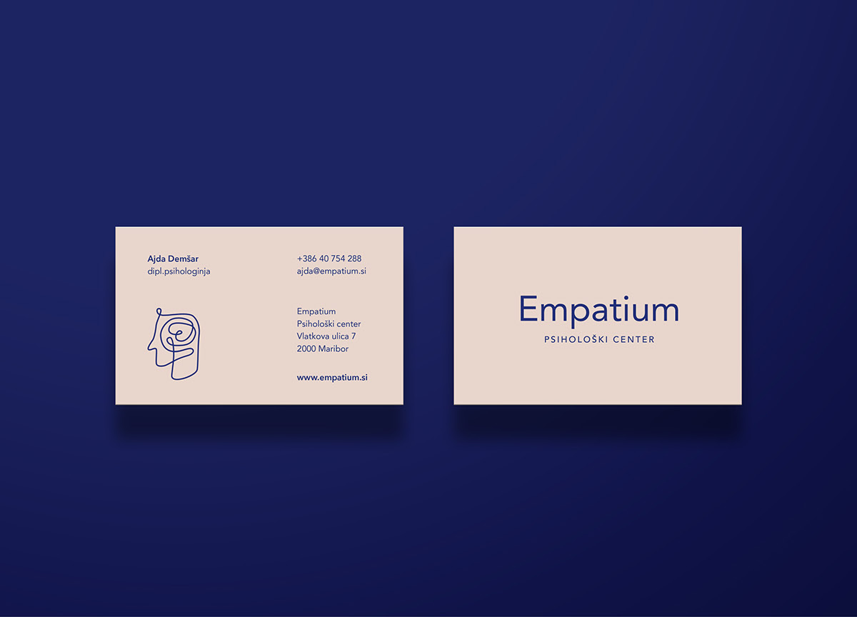
For the psychological center Empatium, we created the name and core logo. We found the newly coined Empatium, by joining the words “empatija” (empathy) and “um” (mind) together. The mind represents the area of operation of the psychologist-client. Furthermore, empathy is something that is inseparable from this occupation.
The logo is a line figure of the human head with the emphasis on the brain, that is shown as a node. We wanted to emphasize that the main focus of the occupation is the human and the happenings in the brain. However, we distanced ourselves from a fine definition of the field with which the psychologist will deal with, as she is at the beginning of her journey and we didn’t want the corporate identity to limit her.
In the work of a psychologist the most important attribute is empathy or the ability to really put oneself in the shoes of the others, so we included a stylized heart into this node. With this, we wanted to show the connection between the brain and feelings.
We set the core color as dark blue, as it represents trust, wiseness (association with the brain), calmness, and security in the psychology of colors. All these associations are appropriate for this field, as the success of therapy is conditioned by the trust and sense of security. As a contrast to the cold blue color, we chose a warm shade of soft pink color, that together with the blue gives a sense of calmness.