Case Study - Vulpes Viator logo

After moving onto bigger and better things, I realized that I needed to upgrade my own identity work.
Briefing
I have a bad habit of excluding a brief when starting personal design projects; so I wanted to make sure I had a clear outline this time around:
~ Vulpes Viator is the binomial nomenclature for "Traveller Fox," showing not only my own passion for change and exploration, but also my natural cunning and analytical thinking.
~ Since the popularity of foxes has increased since the 90's, and with several large companies using fox motifs, it's important to stand out.
~ The design has to match my own aesthetic. I like to keep things clean and modern, but not so clean that the piece seems untouchable. I prefer my work to feel "lived in," like my favorite spot on the couch on a rainy day.
~ After using redundant, unoriginal colors for years, the palette needs an update while continuing the "lived in" quality.
Sketching
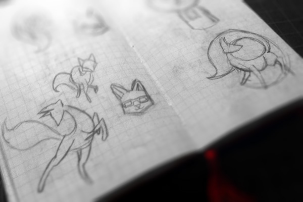
I always begin by sketching. Pencil and notebook. No substitutes.


Digital
I sent out sketch examples for peer review to help determine which were workable ideas. These two received the strongest response.

This first one has a bit of Norse influence. Inspired by the legends of Odin, a one-eyed traveller, I incorporated some of those aspects into a stylized seal of a fox; however this felt as if I was shoe-horning the concept. I was making it fit the design rather than using the principles in my brief to create something more original.

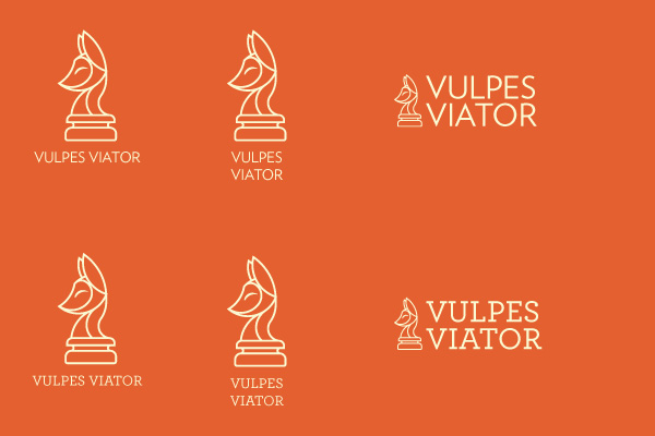
I decided to carry on with this fox-headed chess piece design, because it embodies those concepts of cleverness, strategic thinking, and forward movement I want to project.
Development
The concept was solid, but I realized the fox's proportions were off and the over all design needed some refinement.

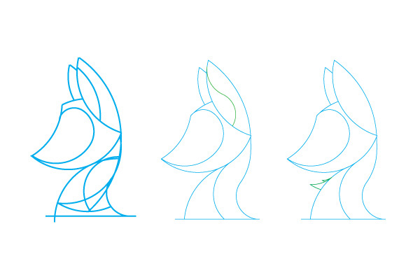
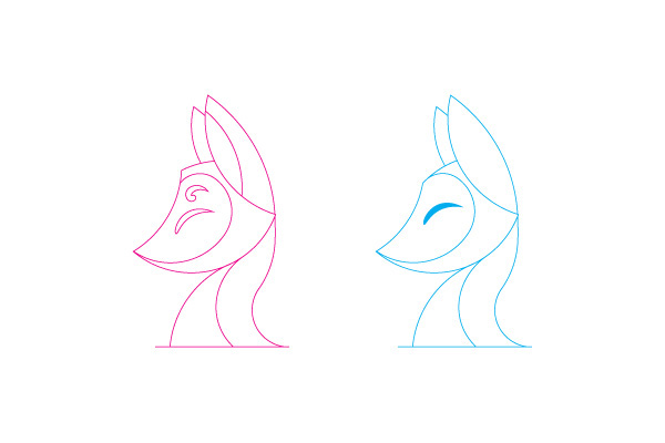
Once I streamlined the silhouette I tweaked the details in the ears, the slope of the forehead, and tufts of fur on the chest. (final concept in blue)

My color scheme was inspired by alchemy. There are four steps in the alchemical process (prepare, develop, improve, achieve) associated with four colors: black, white, yellow, red. I took this too literally in my previous logo, resulting in a color scheme I now feel is primary and obvious. This time around I softened the palette to give it a more rustic quality.
Though only two are included here, I experimented with a total of twelve typefaces because having options makes me happy. I eventually returned to my first choice: Archer Pro Medium (bottom).
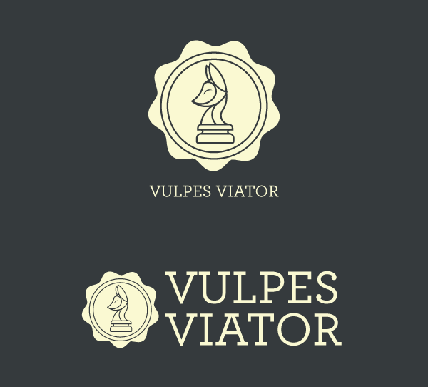
Final Result