Lantern Journal — Fall 2012: Work
Cover design/illustration
Cover design/illustration
I've had the privilege of designing the last three covers for literary/arts journal The Lantern (lanternjournal.org). The theme for the latest issue is: Work.
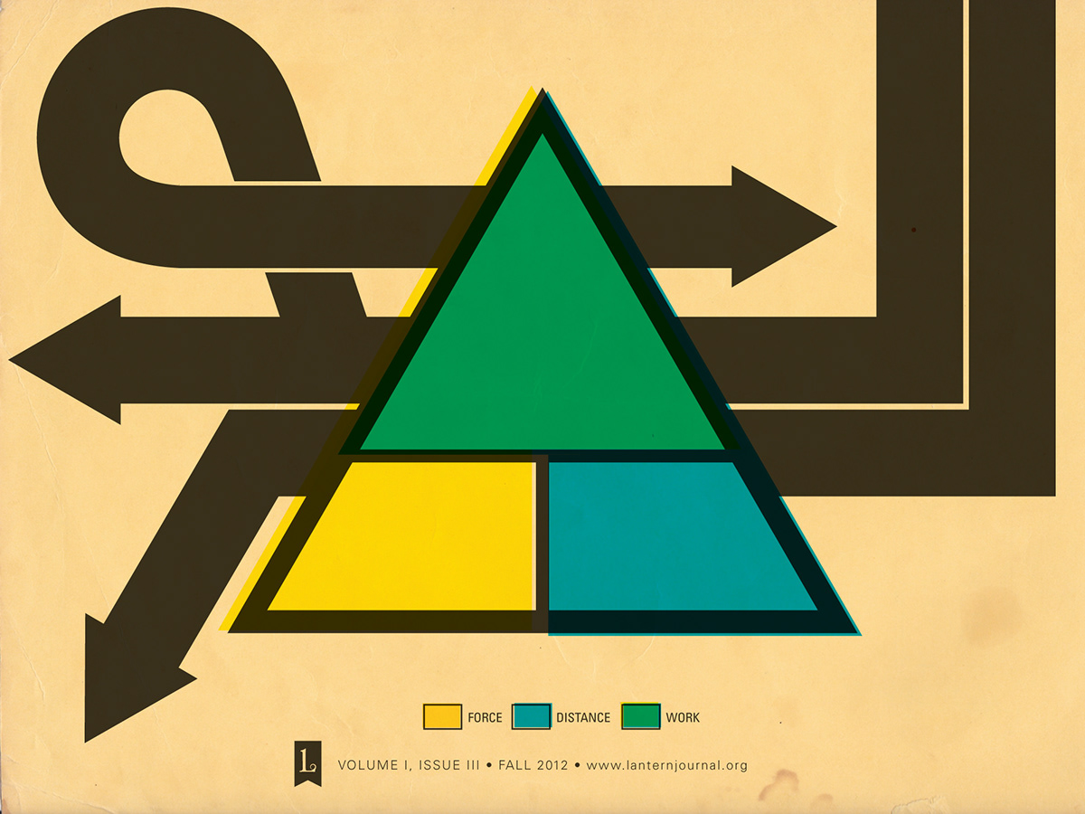
My cover artwork was inspired by the scientific definition of work (Work = Force * distance), and I used that as the basis for my illustration. I set it as the traditional "work" triangle but further represented the equation via color. Force is yellow, distance is cyan, and work is the force and distance layers multiplied over top of each other, thus the shade of green you see.
I was also inspired by freeway maps and off-ramps and briefly toyed with the idea of making a subway map of the cardiovascular system; however, I wasn't happy with my early results and shelved that idea for a later project. You can still see some of the leftovers from those attempts a la the arrows of this final design.
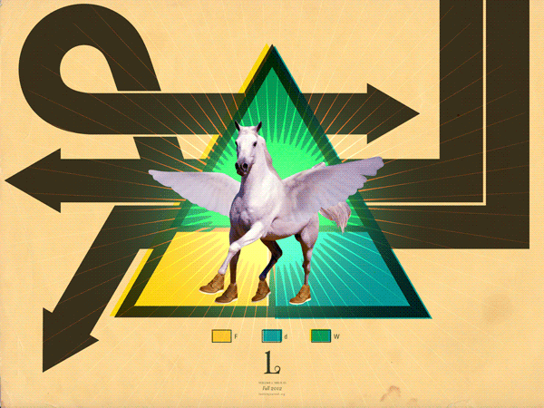
There's also a "fun" version of the cover I made that you can check out at the bottom of this post because fuck it: a Pegasus in Redwing boots. AMIRITE?!
My cover artwork was inspired by the scientific definition of work (Work = Force * distance), and I used that as the basis for my illustration. I set it as the traditional "work" triangle but further represented the equation via color. Force is yellow, distance is cyan, and work is the force and distance layers multiplied over top of each other, thus the shade of green you see.
I was also inspired by freeway maps and off-ramps and briefly toyed with the idea of making a subway map of the cardiovascular system; however, I wasn't happy with my early results and shelved that idea for a later project. You can still see some of the leftovers from those attempts a la the arrows of this final design.
There's also a "fun" version of the cover I made that you can check out at the bottom of this post because fuck it: a Pegasus in Redwing boots. AMIRITE?!
The final cover is actually slightly different to maintain consistent theme and identity from cover to cover.
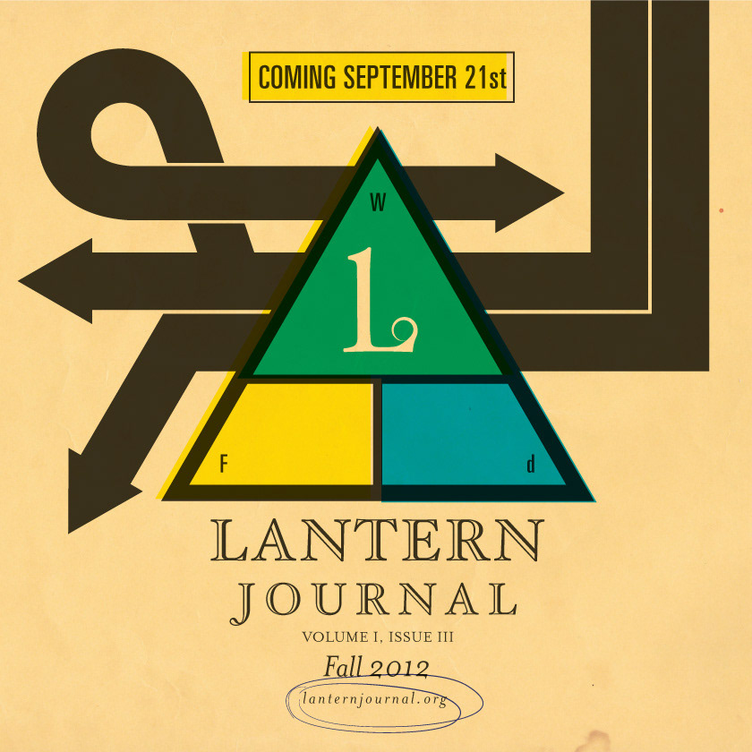
Web flyer.

Did I mention there is a animated GIF so powerful it could melt your face?

