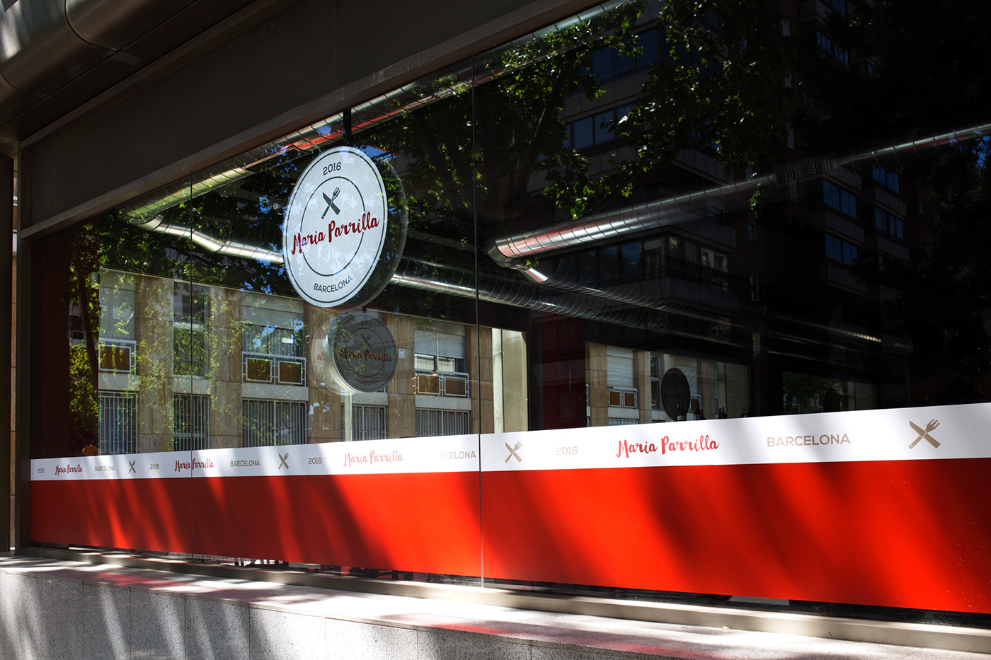
Maria Parrilla is a mediterranean cuisine restaurant focused on charcoal grilled food. Founded by La Tagliatella’s founding partners, Maria Parrilla has its first restaurant in Barcelona and is planning upcoming openings in Madrid and Pamplona.
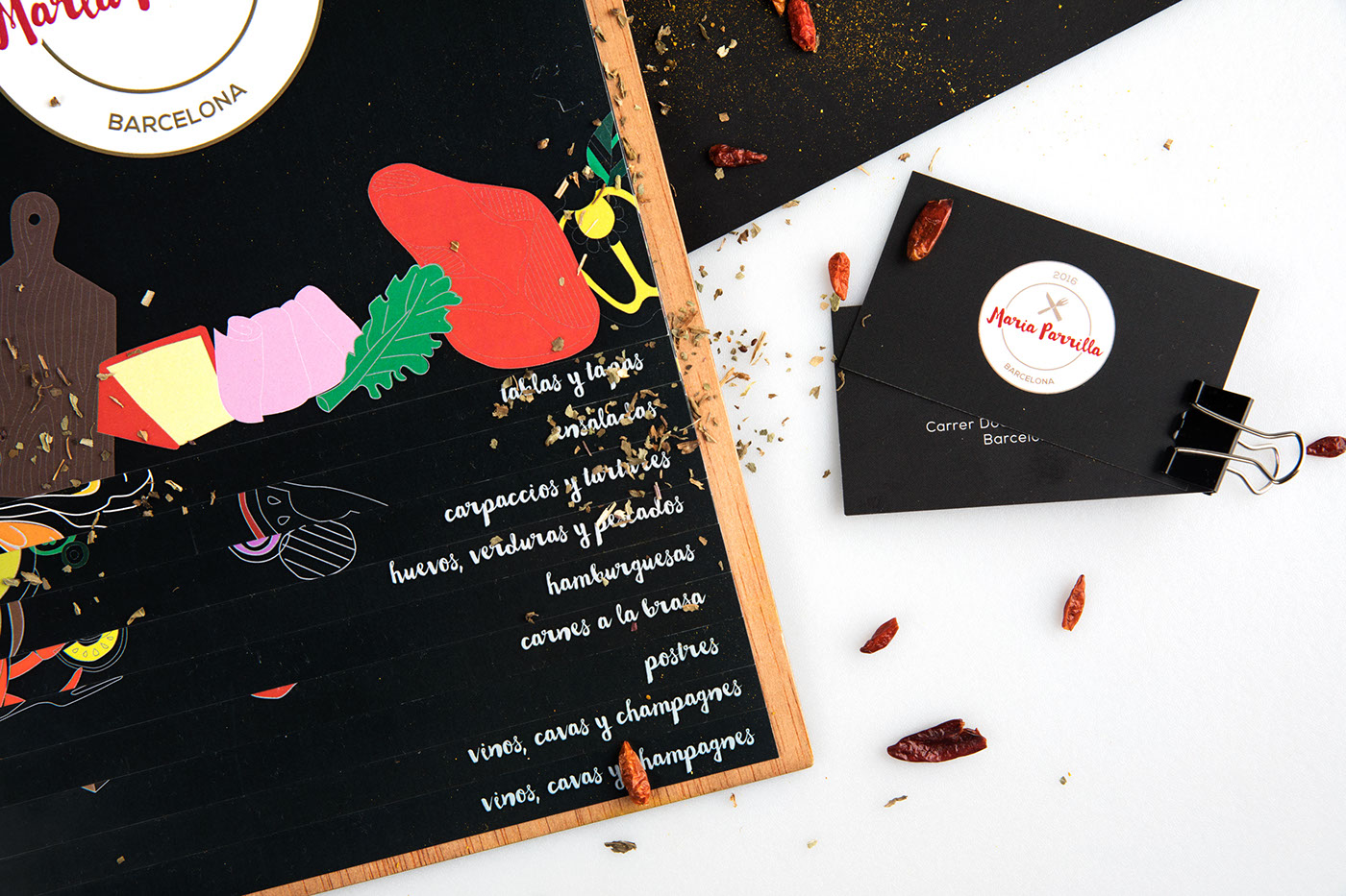
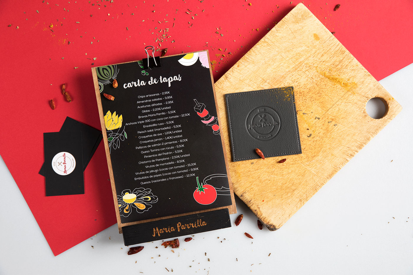
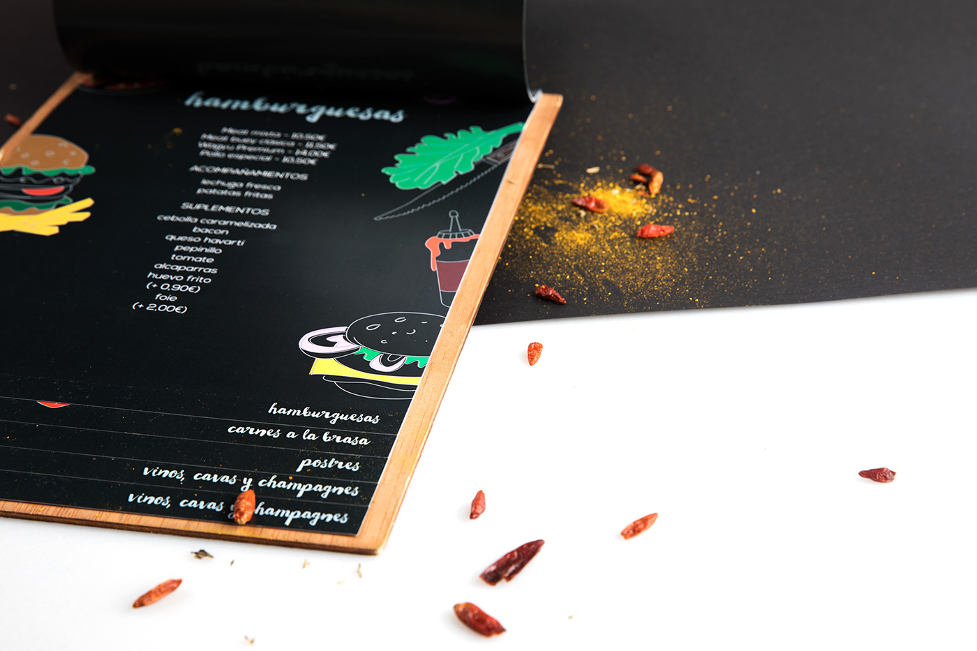
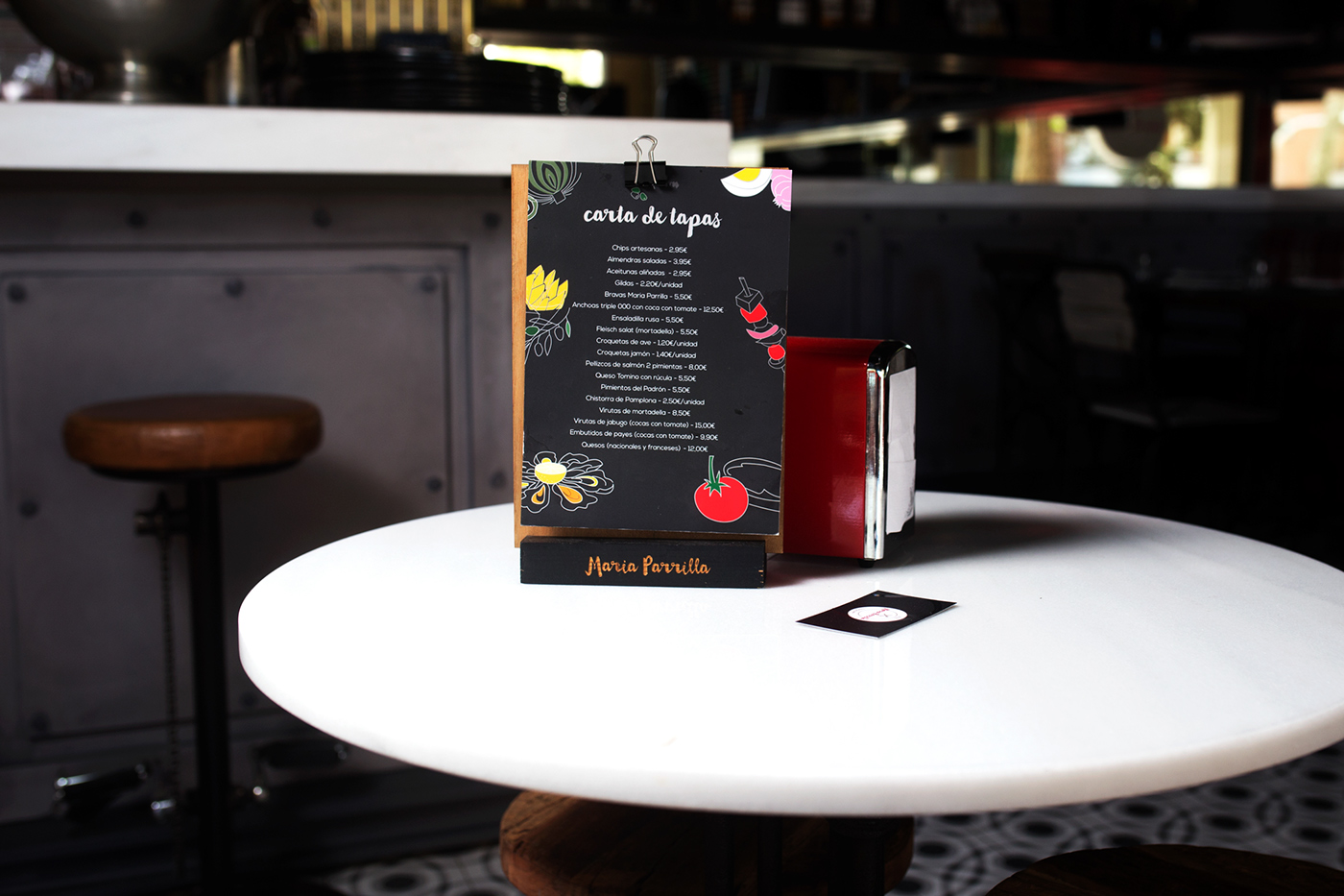
Focusing on the concept of the dish as a frame, the aim was to create a design system that provided Maria Parrilla with simple tools. A design system inspired by the food colors and shapes was developed throughout the stationery pieces. These principles act as guidance along the visual language of typography, colors, iconography and grid systems. The brandmark is created based on the idea of a dish. A dish being the frame for the essence and soul of the restaurant. The dish resembles the purpose of the restaurant, which is to emphasise and upgrade the idea of mediterranean and familiar food.
The main colors consist of a strong red and black, combined with black and a touch of ochre as the accent. These three colors symbolize the red of the meat and darkness and purity of the distinctive slate piece of a grill. Maria Parrilla uses the typeface Nexa by FontFabric. Characterised by its excellent legibility in both, web and print design areas, the font allows its use throughout all the branding applications, maintaining the coherence and familiar look all along the image.


