Protopapa Highschool tutorials
Logo and visual identity
Logo and visual identity
The client asked for a redesign on their visual identity in order to become more friendly to their customers and to make education much more fun for their teenage students.
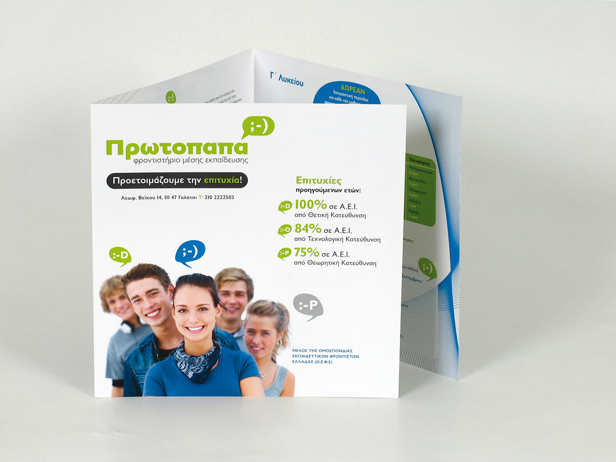
The identity was designed intending to appeal to teenage students -with a rather personal approach to both them and their parents- using their own contemporary communication language.
The brochure communicates that studying at Protopapa Tutorials is like being in a company of friends who acquire knowledge through an effective method in a joyful environment.
[In collaboration with Asterias Graphic Design Group]