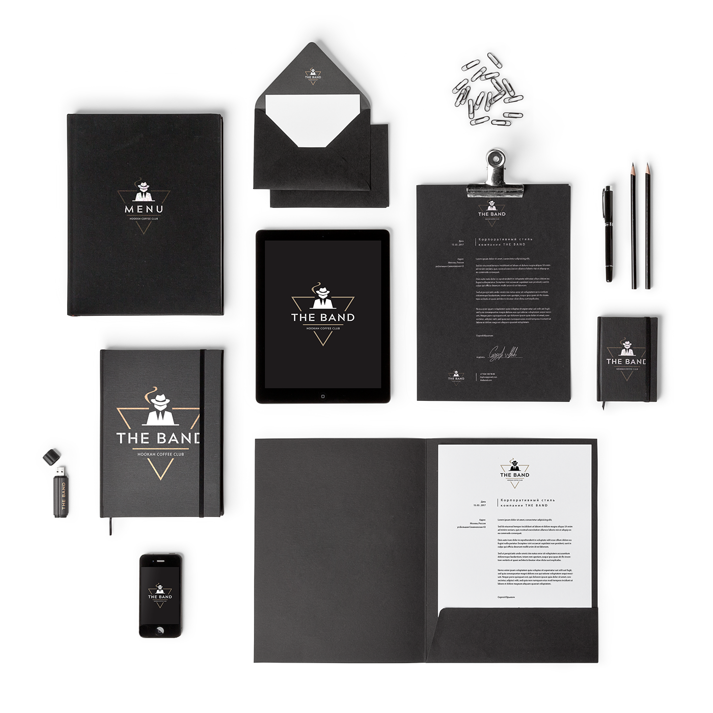
Business goal: to create a logo without using inside-the-box images of hookahs and coffee shops, which are common for a number of cafes and restaurants. The logo should be strict, memorable and reflect the naming of the club.

For the main texts was chosen Roboto Condensed font headset without serifs to maintain the brand style.
The font has a mechanical skeleton and geometric shape. This grotesque style allows you to preserve the natural rhythm of reading, which is usually found in serif typefaces.
The composition of the main logo is built in the grotesque style of Acherus Militant 1 font, the outline is Bold.
Based on the logo style, brand graphic patterns were developed that should be used for booking the business documents, POS materials, souvenirs, packaging, advertising web layouts, etc.
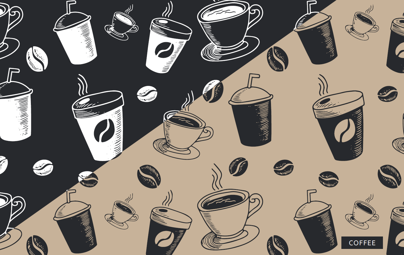
The combined parts are based on auxiliary elements and geometric shapes. The pattern should be executed in the main palette colors only on brand-name carriers, otherwise, it is possible to do exceptions and use a different color scheme.