


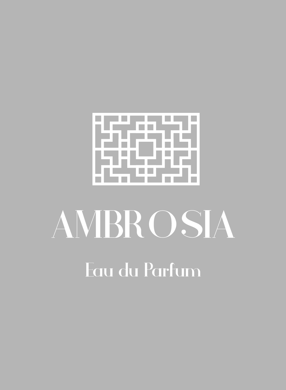
Ambrosia
am·bro·sia \am-ˈbrō-zh(ē-)ə\
1- a : the food of the Greek and Roman gods.
b : the ointment or perfume of the gods.
2- something extremely pleasing to taste or smell.
am·bro·sia \am-ˈbrō-zh(ē-)ə\
1- a : the food of the Greek and Roman gods.
b : the ointment or perfume of the gods.
2- something extremely pleasing to taste or smell.
CONCEPT:
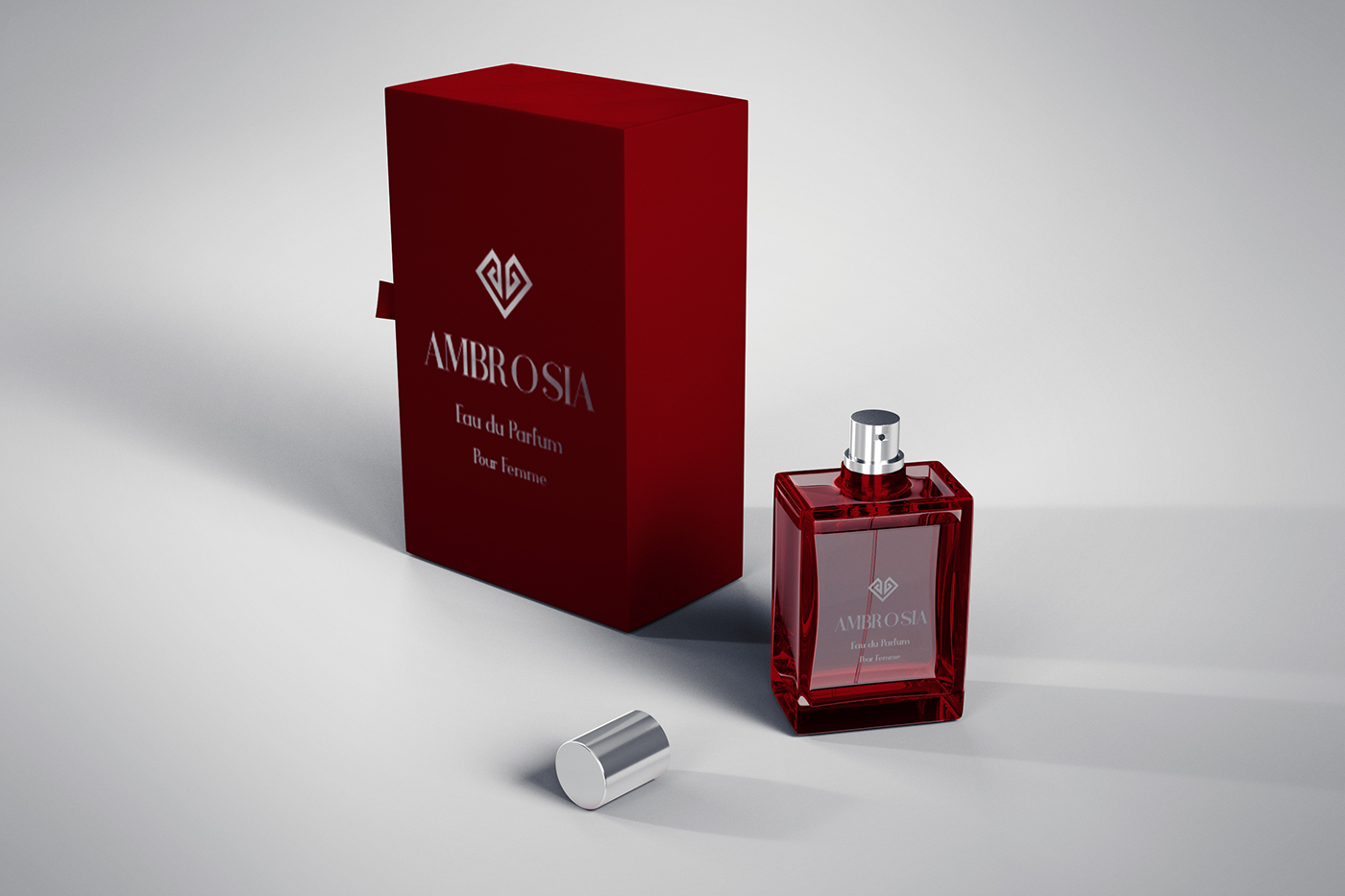
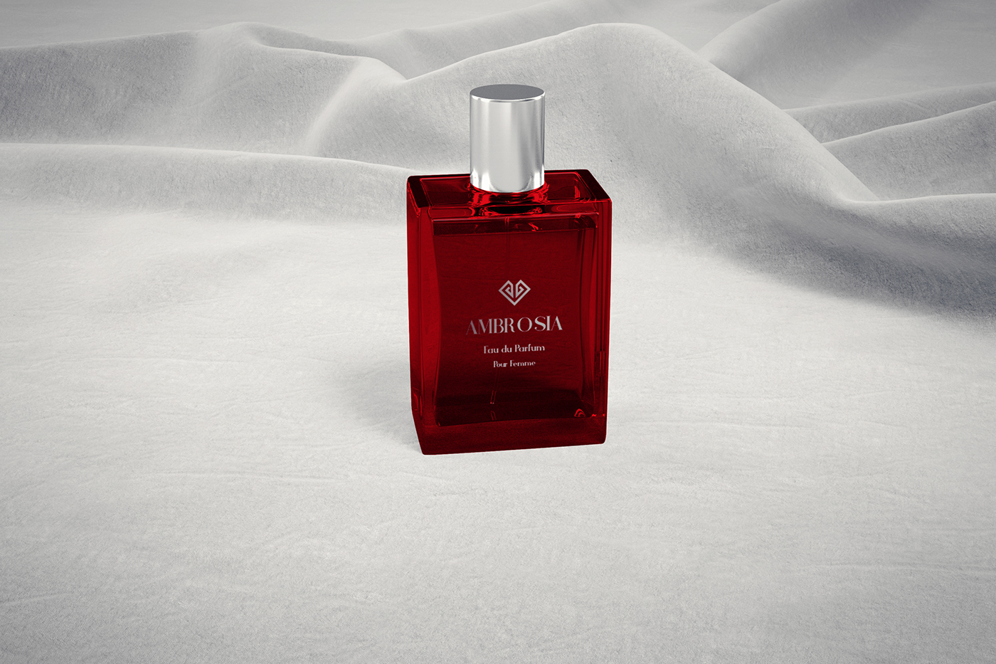
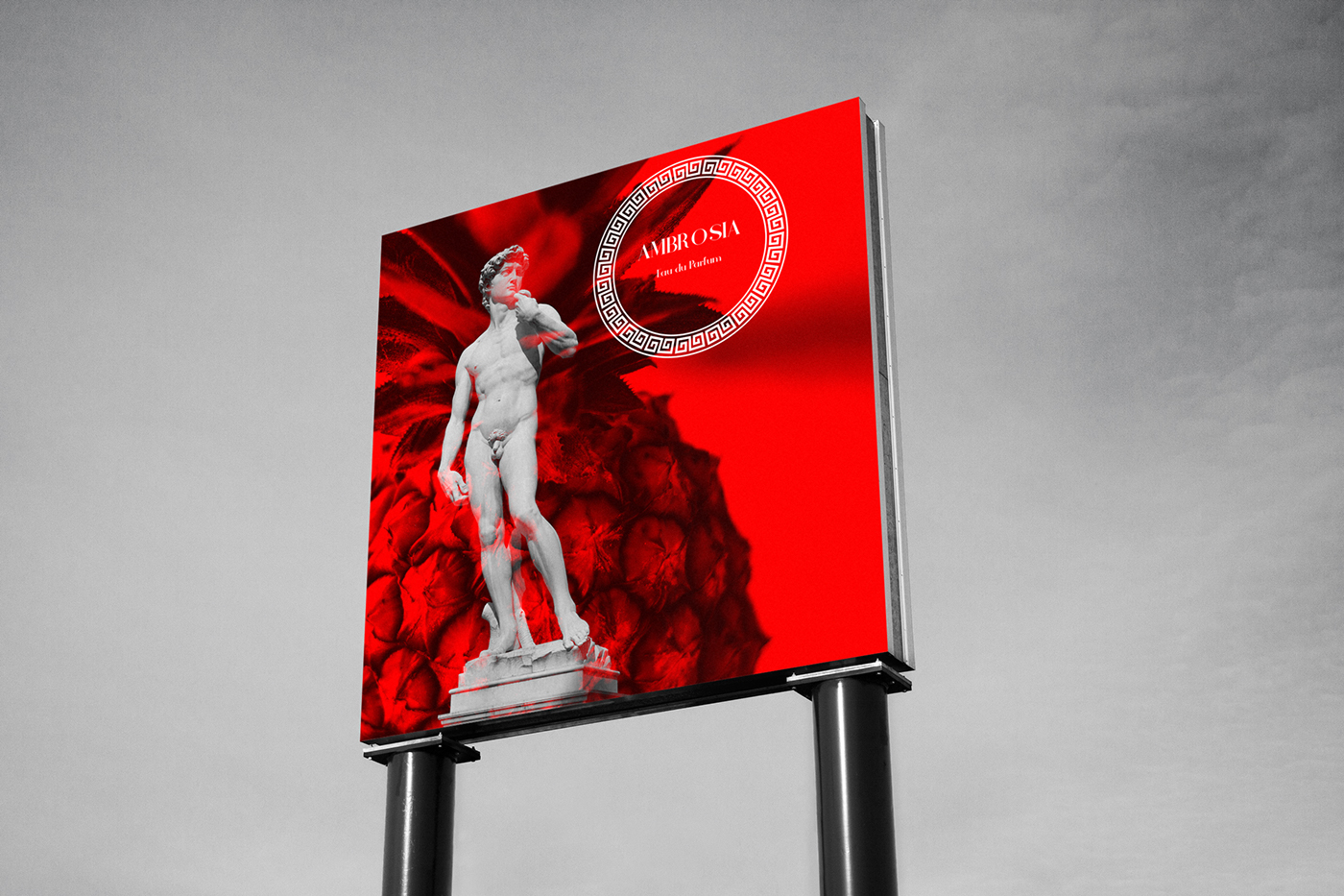
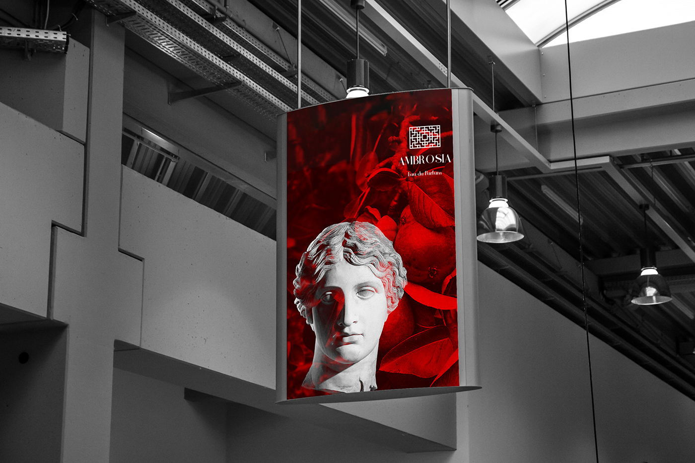
AMBROSIA is a perfume brand that represents eternal and divine aesthetics. It's the nectar of the Greek and Roman gods, their elixir of life, it's also their source for pleasure and timeless grandeur. I chose to showcase those elements by the use of red-tented fruits, marble statues, and the typeface in the logo.
APPROACH:
I've created this brand so the perfume can become the true embodiment of Ambrosia. I designed the main and secondary logos by typing the word AMBROSIA using "Athena regular type" and then decorated it with Hellenic ornaments. I've then used double exposure technique to combine fruits and marble statues pictures to convey the meaning of Ambrosia visually. I also chose this color palette to enhance the true meaning of Ambrosia, by using "Maroon" and "Cinnibar" shades of red for pleasure, and "Pink Swan" grey for timeless and divine grandeur of the marble statues.


Thank you
for inquiries
contact
salmatarreq@gmail.com
contact
salmatarreq@gmail.com


