Logo For harmony and science

Meteora is a private academy of math for school children; it’s core values are helping school children to develop their potential through engineering, arts and science.
Brief and problem definition
My task was to create a visual brand identity that reflects scientific spirit and sparks children's curiosity. Above this, the organisation deals with parents and serious schools, hence, brand must be looking reputable. From the very beginning, it was obvious that I dealt with enigma of mixing not-so-fit ingredients and making a tasty piece of cake.
It was said that “logo should look educational and carrying away to the world of science and harmony”.
Perfect shape — circle
In Ancient Greek culture (which has incredible impact on modern science and culture) the circle was thought of as the perfect shape. Circle was selected to be the base shape for logo construction to imply harmony and science.
Product domain research and mood boards
Mood boards help to discover possible concepts that reflect essence of the product; it’s a great way to stay with the client on the same page.


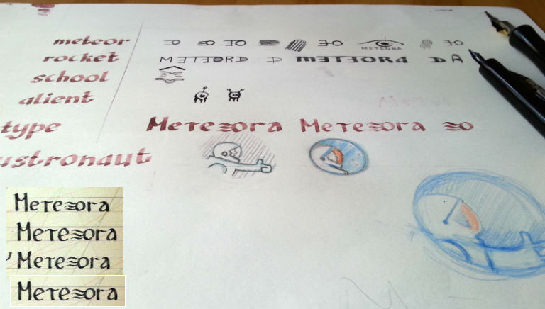
Ideation, sketching
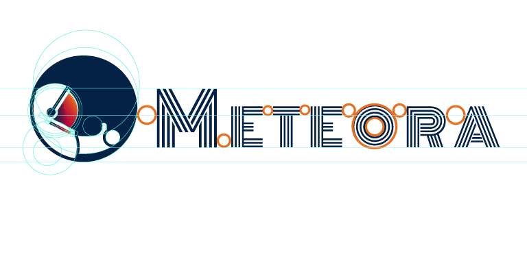
Logo Construction
Since the circle was selected to be the basic shape, golden ratio grid is the evident choice this time.

Constructing logo using golden ratio grid
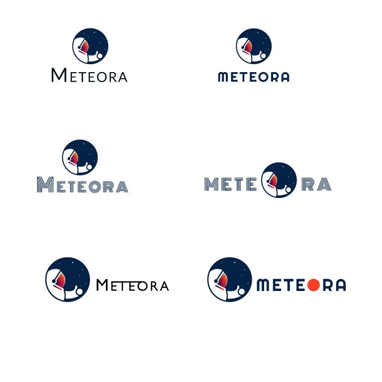
Typography and color palette exploration
The logo demanded a font type to stand out, to be something more fancy than sans serif. It was meant for children


Perfecting the design and double-checking
Here well-known techniques come in handy. But nothing can be more useful than the seeing eye.


Imaging logo in action
Logo was ordered to be suitable both for web and paper print. Here is how it would look in print (thanks to customink.com).


To be continued...