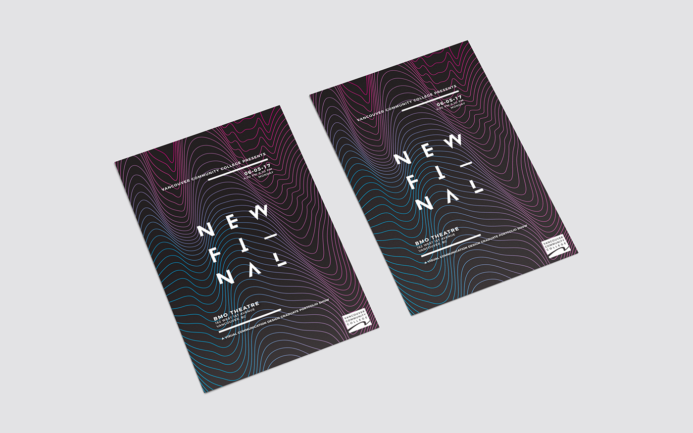
NEWFI—NAL was a branding identity concept designed for the 2017 grad show exhibition of Vancouver Community College’s Visual Communications Design program.
A naming convention many designers are familiar with, the concept came about as the result of creating a final, a finalfinal, and a final4realfinal version. An em dash was used in place of a regular hyphen in the word stack because it was not meant to split up "newfinal" but rather signify an additional thought: our grad show is not only the final day of school but also a new beginning for all of us. This duality also tied in with how the blended line imagery represented the relationship between the old and the new. The modern typography and retro colour scheme were a reflection of a designer's tendency to file away old ideas for future use.
Sometimes all you need to do is simply rework an old idea into something new, save it as a "newfinal", and call it a day.