The HWT Brylski Font Project

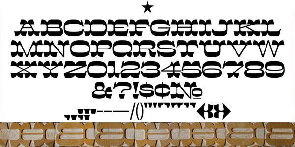
HWT Brylski is a typeface by Nick Sherman, named for retired wood type cutter Norb Brylski and designed to be cut as wood type at the Hamilton Wood Type & Printing Museum. It incorporates several themes that were common in 19th-century type design, including split tuscan serifs with angled mansard-style sides, heavy weight placement at the top and bottom of letters (traditionally referred to as French or Italian/Italienne, regardless of any actual relation to those countries), and an extended overall width.
The digital typeface includes a few bonus features:
• Alternate forms for G, M, N, Q, R, V, W, and exclamation mark

• A set of simplified glyphs for the percent, at, and copyright signs an homage to how those symbols were often sold as generic designs for wood type, marketed separately in the back of the catalog

• A set of punctuation with flipped side angles
• A handful of dingbats and arrows
• A handful of dingbats and arrows

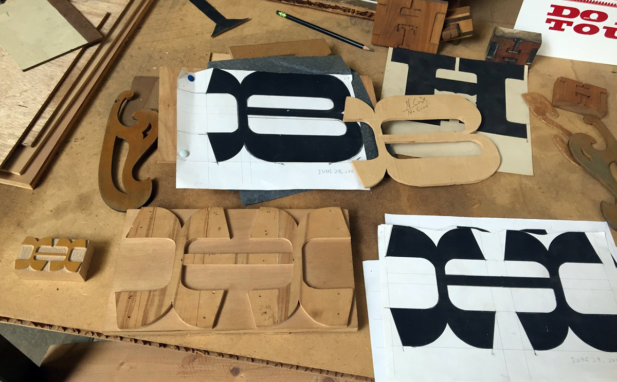
Following traditional wood type production methods, several limitations were employed in Brylski’s design process to simplify manufacturing and composition of the physical wood type. For example, in traditional fashion, all glyphs were designed with the same minimal amount of sidebearing space. At the intended size, all glyphs have widths in half-pica increments. Kerning is simplified to a minimum group of glyphs and is designed around the idea of wood blocks being sawed to interlock with each other.

Designer Nick Sherman watches Norb Brylski prepare for cutting his namesake font at the Hamilton Wood Type Museum.


George Brylski — daughter of Norb, continues the family legacy by keeping the art of pantographic type cutting alive at Hamilton.
Though not a strict revival of any one historical typeface, Brylski takes cues from various old-fashioned designs including Midway Ornate, Aldine Extended, Wm H. Page & Co’s No. 121 (a.k.a. Mansard), French Antique Extended, and Hellenic Wide, among others.

The design was started in 2011 and released in 2017. David Jonathan Ross assisted with the final digital font production.

The full digital character set includes language support for Western and Eastern European languages.
Brylski joins the ranks of the Hamilton Wood Type Legacy Project where noted designers have created new designs produced in traditional wood type, as well as digital releases, for letterpress printers and designers of all stripes. Graphic design legends Matthew Carter, Louise Fili, Marian Bantjes, & Erik Spiekermann have created “Van Lanen”, “Mardell”, “Bernice”, & “Artz” respectively, and now Nick Sherman adds “Brylski” to the series. The fonts each carry the names of residents of Two Rivers, WI who worked at the Hamilton Manufacturing company and kept the art of wood type alive into the present day.

The digital version of Brylski is available along with all other HWT fonts is available to the general public through P22’s Hamilton Wood Type Collection with proceeds of sales supporting Hamilton Wood Type & Printing Museum’s ongoing mission of preservation and education of printing heritage and engaging with contemporary designers. The wood type version of Brylski is currently in production at the Hamilton Museum. If you haven't been there you should really treat yourself and plan a visit!