
Il 2016 su Wikipedia
Corriere della Sera - La Lettura #268
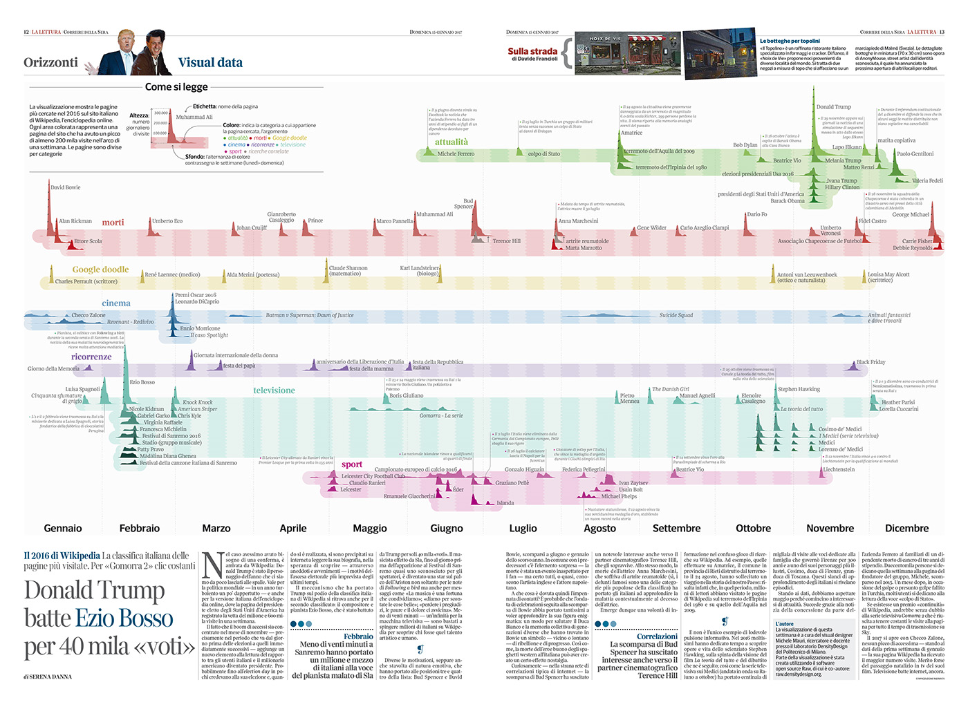
The artwork shows the most viewed Wikipedia pages in Italy during 2016, grouped by type: green for current affairs, red for deaths, yellow for Google doodles, blue for cinema, violet for recurring events, aquamarine for television and pink for sports.
In the visualization are shown only peaks that generated at least 200,000 views during a week.
The artwork has been created using RAWGraphs, an open-source tool for data visualization.
Data comes from Wikimedia API, scraped using a custom Python Script. Resulting articles have then been manually described and categorized.
The resulting dataset is freely available.
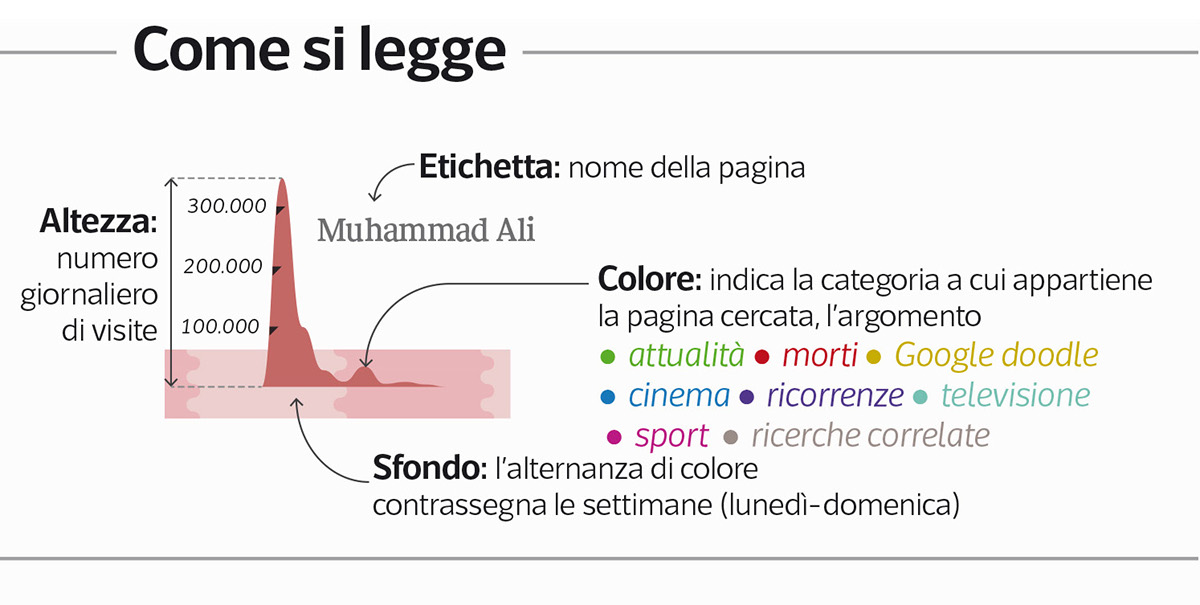
Detail of the legend: how to read the visualization
Each peak represents a Wikipedia article. Each black mark shows 100,000 views. The horizontal size of peaks represents their duration over time.

Left page: peaks from January to June. It is possible to see the influence of Sanremo festival, the most popular Italian song contest and awards, held annually in the city of Sanremo, in Italy, and consisting of a competition amongst previously unreleased songs. At the end of February, Oscar nominations draw all the national attention. From may, it is possible to see the influence of UEFA European Championship.
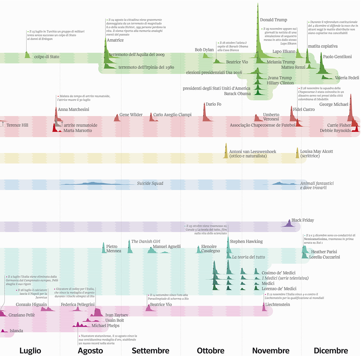
Right page: peaks from July to December. In this second part of the year, current events starts to drive the attention: earthquakes in central Italy in august, the election of the US president, the Italian constitutional referendum in December. In the sport category, soccer leaves space to the Rio Olympic Games.


