While happy with my old brand, i felt it didn’t suit my personality and style as much as it should. I wanted to design something that would be more amiable, colourful and creative. The idea of an ambigram was appealing and one I wanted to work on. The colour palette also felt limited so I wanted to expand on that.
The original idea was to develop an hand-written font, but the more I developed the idea, it needed something bolder and stronger. The result was a bold, colourful and adaptable/responsive logo.

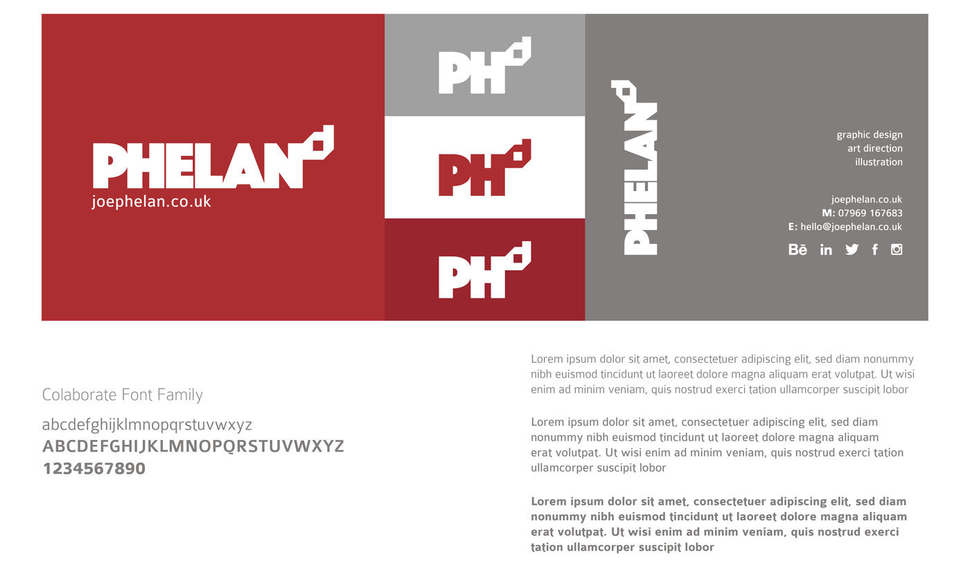
PHELANd – The Old Brand
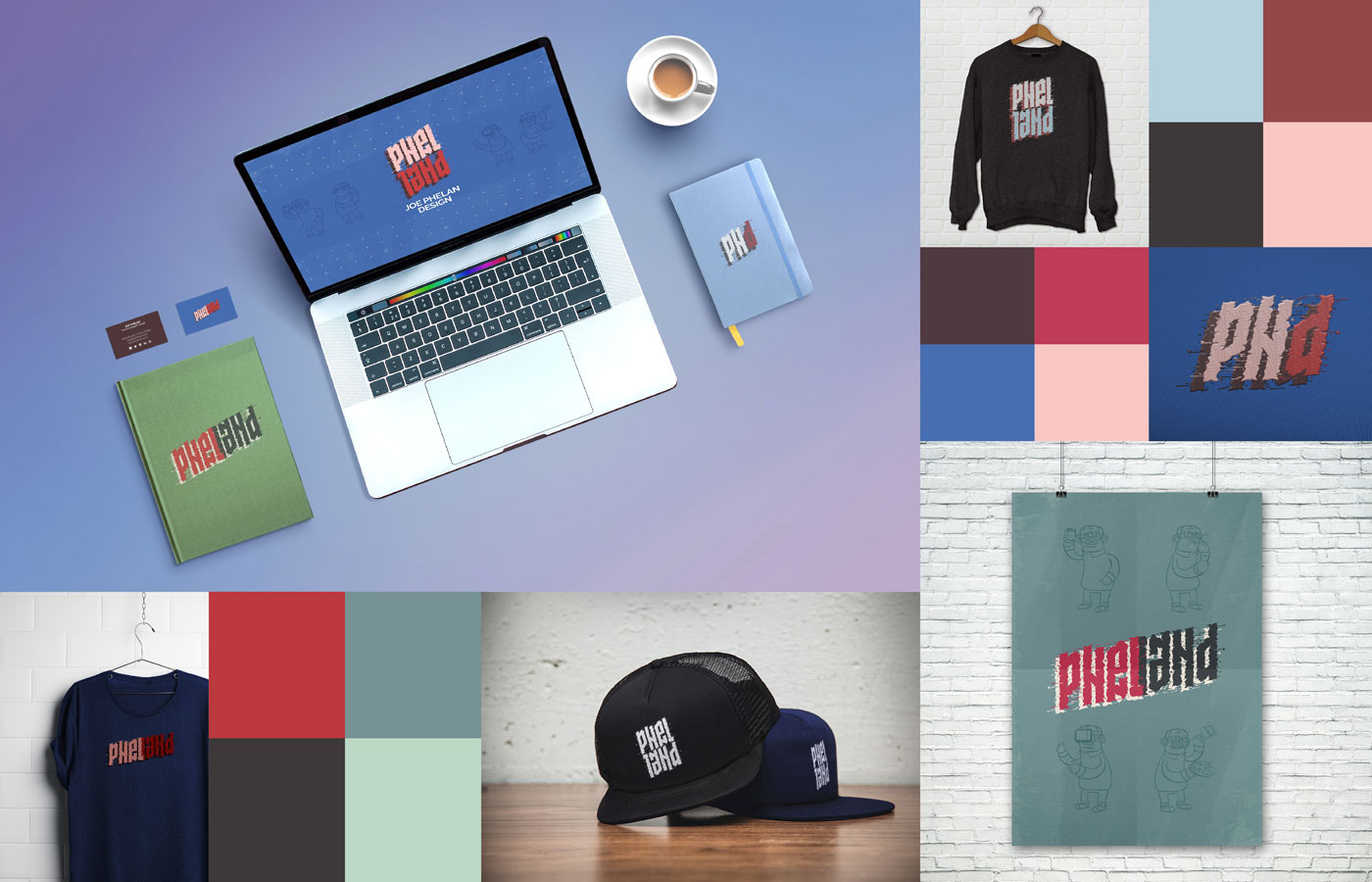
While I still love the simplicity of the logo, if wanted to develop a more engaging brand and logo. What I had in my mind was something that would work in many formats; printed, digitally and also embroidered/clothing. So, I got my iPad and started sketching…
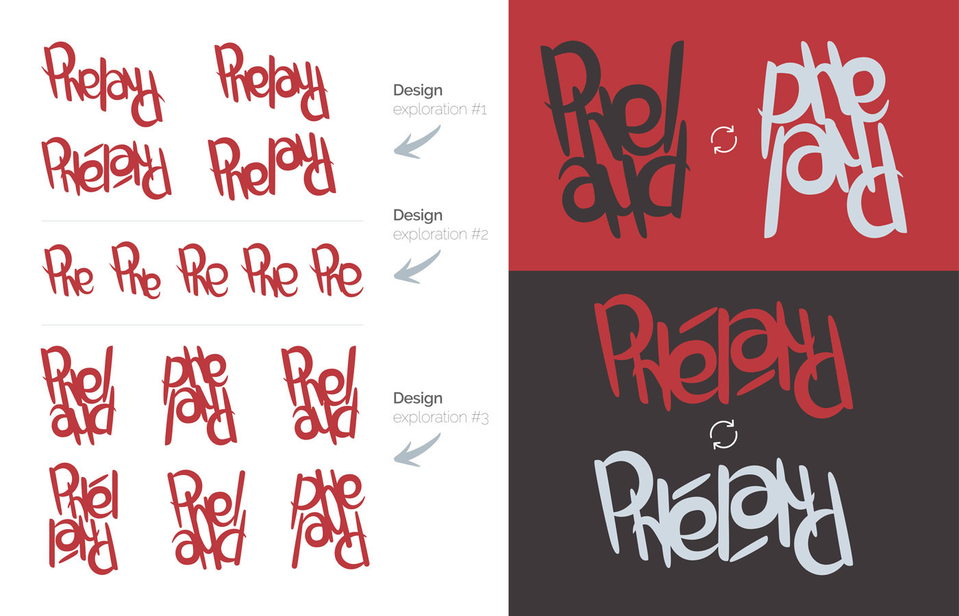
Concept #1- Graffiti
I started the create a ‘graffiti’ style font that could work as an ambigram. I particularly liked how the ‘Phe’ was working on both ends, but making it work as an ‘and’ was difficult and the ‘n’ was hard to manipulate. Added to this, the separating ‘L’ shape and no matter how many versions I created, I just wasnt happy with it. It was looking a bit too messy…
Concept #2- Geometric
After losing my patience due to the difficulty with the previous concept, I decided to keep the idea of the ambigram, but with a more structured and neat option. Again, as I developed this concept, the stand out issue was how the ‘Phel’ and the ‘Land’ interacted. This concept did throw out some positives and helping me develop the main 3rd concept. I particularly liked how the logo would be shortened to the ‘PHd’ and when I stacked the lettering, I started to see the potential…

Concept #3 – Final Design
After hours of developing the concept, I finally had what I was looking for… a responsive, multifunctional and exciting logo.
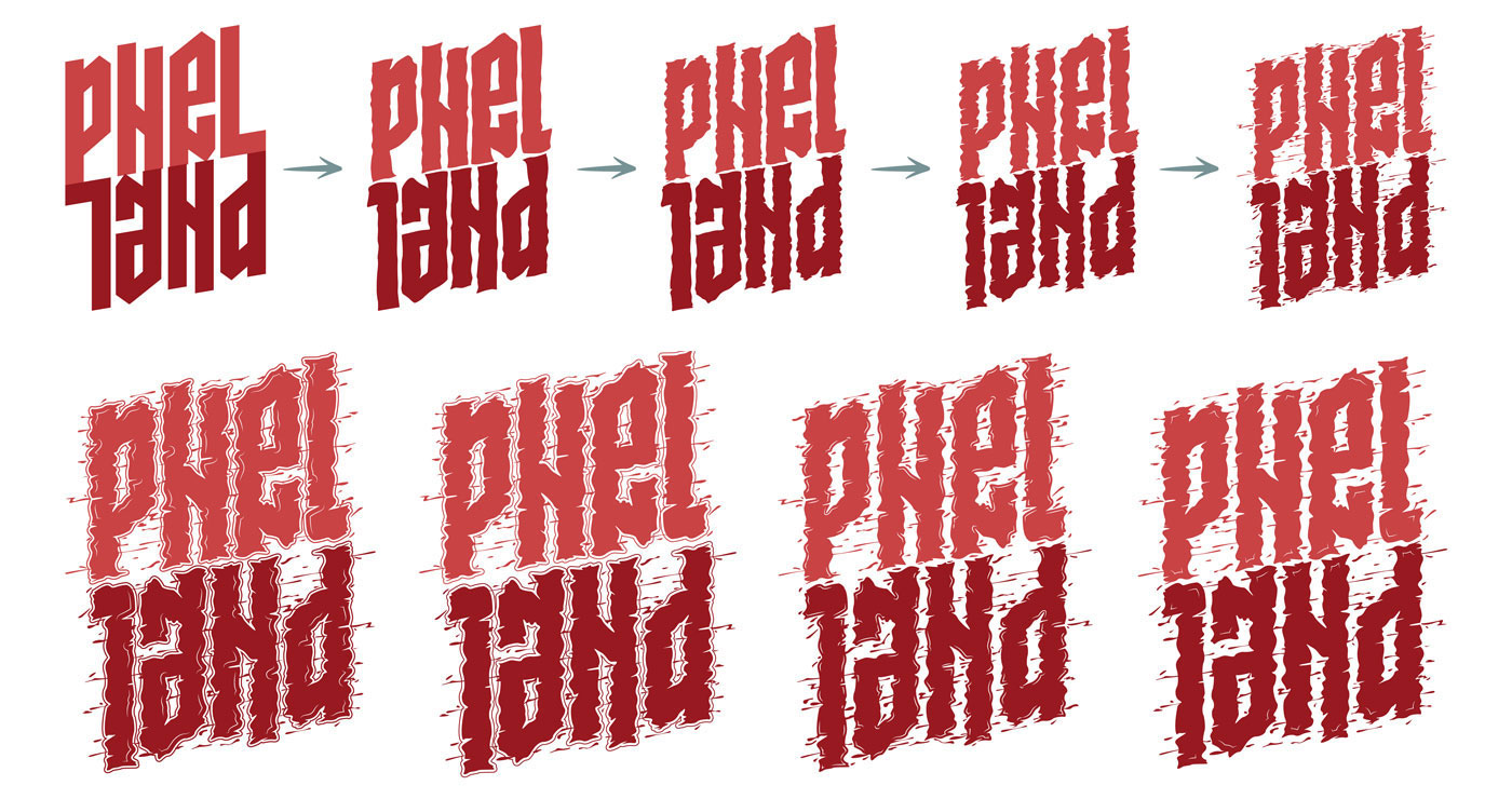
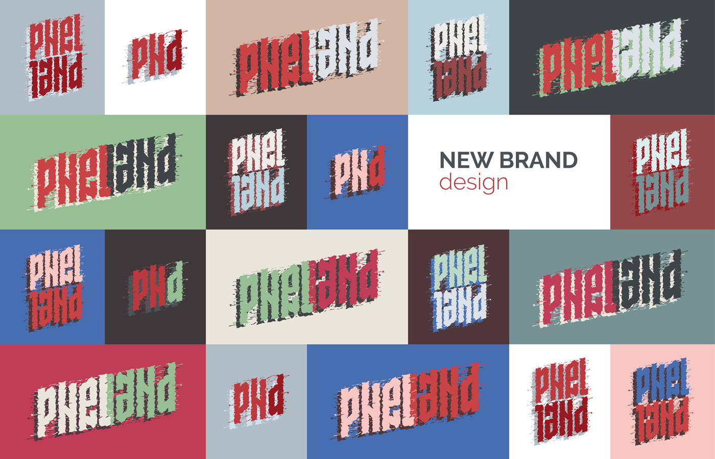
Brand Development – Palettes
The main strength for me, is the versatility of the logo… as I was developing colour palettes based around the original red and grey of the old brand, I created 5 palettes. When putting them into the logo, I found that they all worked and love the thought of having complete freedom to adjust the logo within this wide colour palette.

Brand Development – Logo Variations and Fonts
As demonstrated below, the logo has 3 forms to suit it’s environment and application. I chose the font family Fira Sans.It had many characteristics similar to the base design for this logo. It also is available on Google fonts, which is always helpful.


PHELANd Characters
The existing characters on the website were updated to match the new colour palettes.

Brand Development – Application