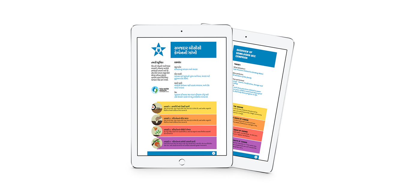

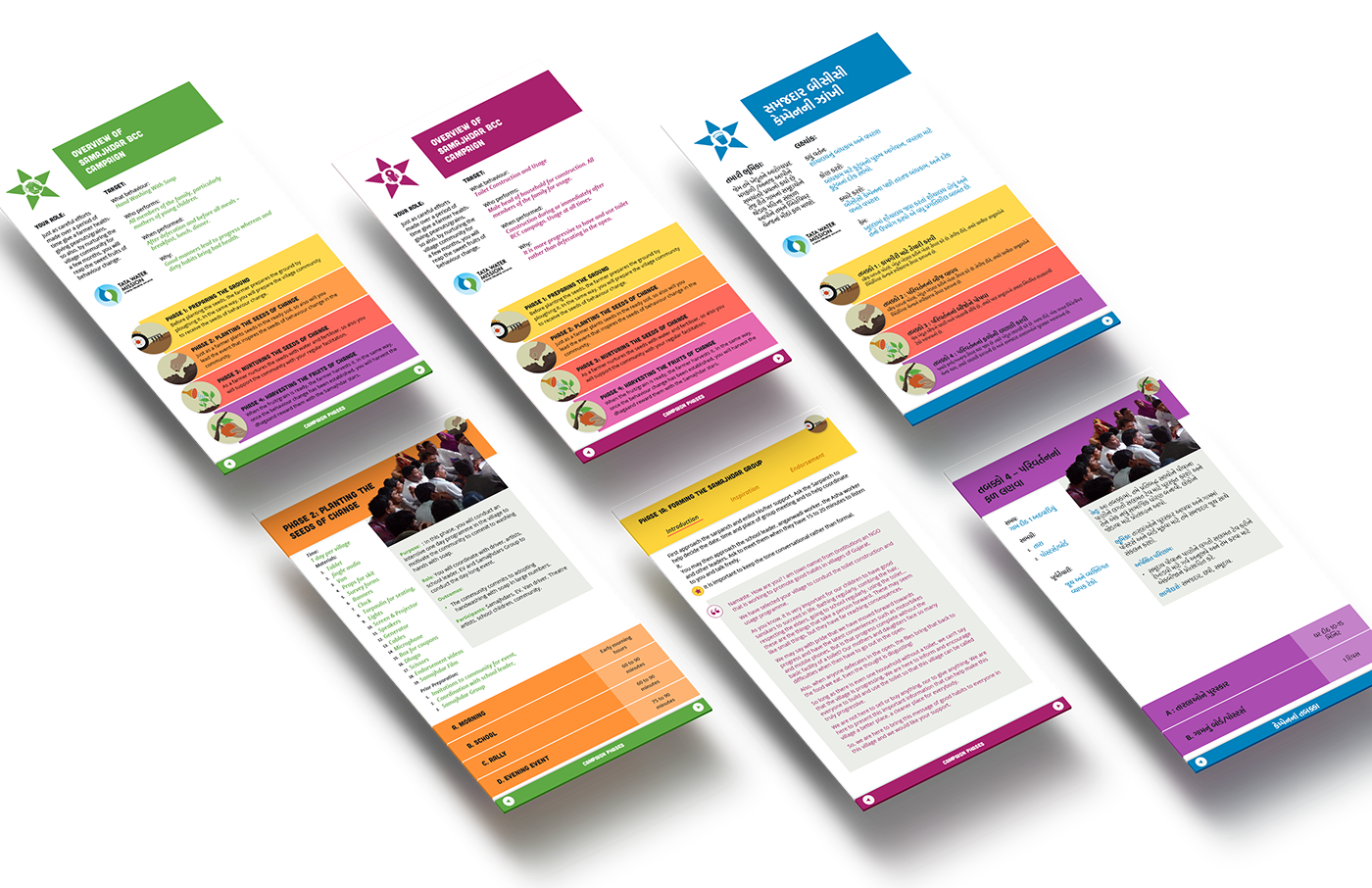
Samajhdar BCC Campaign
I designed a 3 toolkits for a WASH campaign initiated by the Tata Water Mission and Center of Gravity to be used by community volunteers across a 1000 Indian rural villages.
When the client approached me they expressed that due to budget and time constraints, the toolkits that were originally to be a tablet based app were now to be made into print books. Looking at the content it was clear that it would be best accessed through a tablet and I proposed using an interactive pdf instead that could mimic the functionality of an app.
A total of three toolkits were designed in the span of 3 weeks, aimed at aiding on-ground personnel in executing the behaviour change campaign. Each toolkit had to be easy to navigate, approachable, friendly and vibrant. Along with any section of the pdf being quickly accessible, clear visual hierarchies and colour markers were designed to help instantly identify and index the location of the page with respect to the document.
Typeface Selection:
The main display typeface had to be friendly, approachable but bold. I chose Cubano for it's rounded edges and low contrast in the strokes. For the body copy, since legibility was the only concern I chose Open Sans which gave me lots of weights to help create hierarchy in the document. The Gujarati and Devnagri typefaces were chosen to match the general weight of it's English counterpart along with delivering high legibility.
The main display typeface had to be friendly, approachable but bold. I chose Cubano for it's rounded edges and low contrast in the strokes. For the body copy, since legibility was the only concern I chose Open Sans which gave me lots of weights to help create hierarchy in the document. The Gujarati and Devnagri typefaces were chosen to match the general weight of it's English counterpart along with delivering high legibility.

Colour Selection:
The client required the colours used to be bright and friendly. Usually, using these many colours is something I do not recommend, but in this case an exception was made since there were only a few pages where they all appeared simultaneously.
The client required the colours used to be bright and friendly. Usually, using these many colours is something I do not recommend, but in this case an exception was made since there were only a few pages where they all appeared simultaneously.

Symbols:
Each phase required an illustrated symbol : Preparing the Ground, Planting the seeds of change, Nurturing the seeds of change, and Harvesting the fruits of change.
Each phase required an illustrated symbol : Preparing the Ground, Planting the seeds of change, Nurturing the seeds of change, and Harvesting the fruits of change.

Navigation & Flow:
The navigation required not only that it's functionality should mimic that of an app, but that it should also work as a printable booklet should they ever choose to print it. The content came with several subsections within each section. This proved to be challenging for a user since it is easy to lose track of where you are in the document. I leveraged the use of the phase colours along with a section header to help keep track of where you are in the document.