


Terreiro
2015
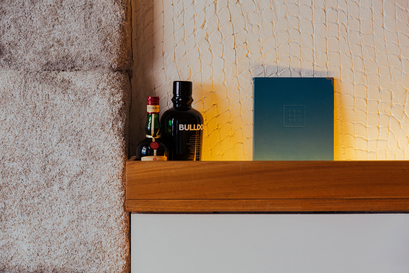
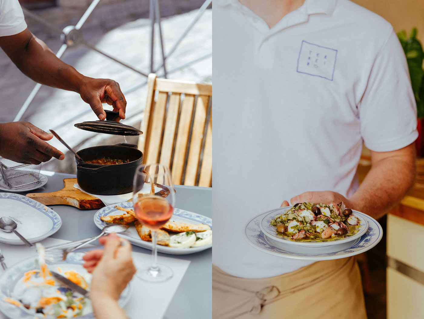
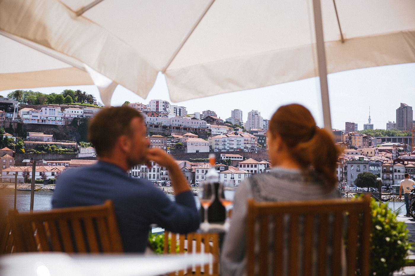
Terreiro is a traditional portuguese restaurant with a special emphasis on seafood. The restaurant's name comes from its location— an old square in one of Unesco's World Heritage areas: Largo do Terreiro. Terreiro is the name that one would give to a square or rectangular outdoor space, that is often empty with the purpose of using it for several activities such as agriculture related processes, like drying vegetables or popular and cultural parties and events.
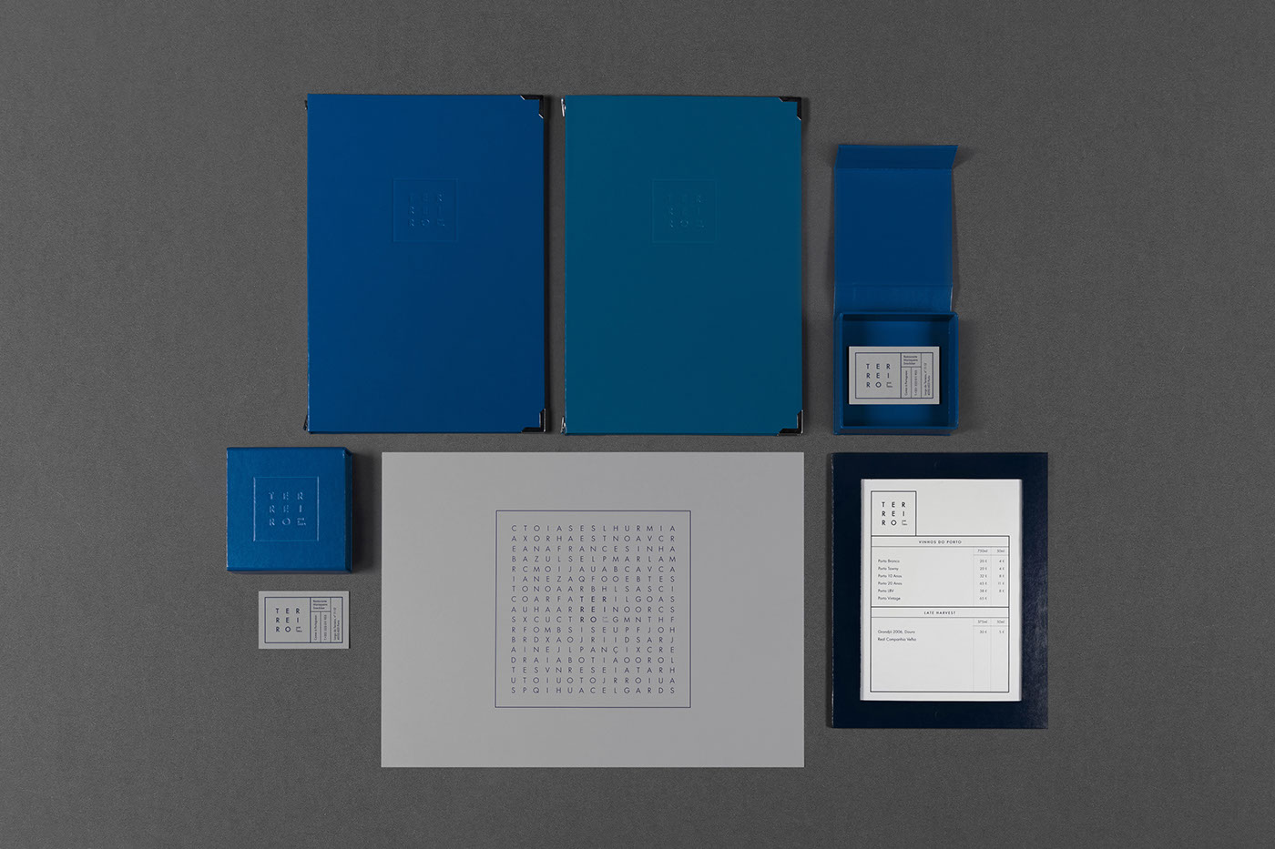
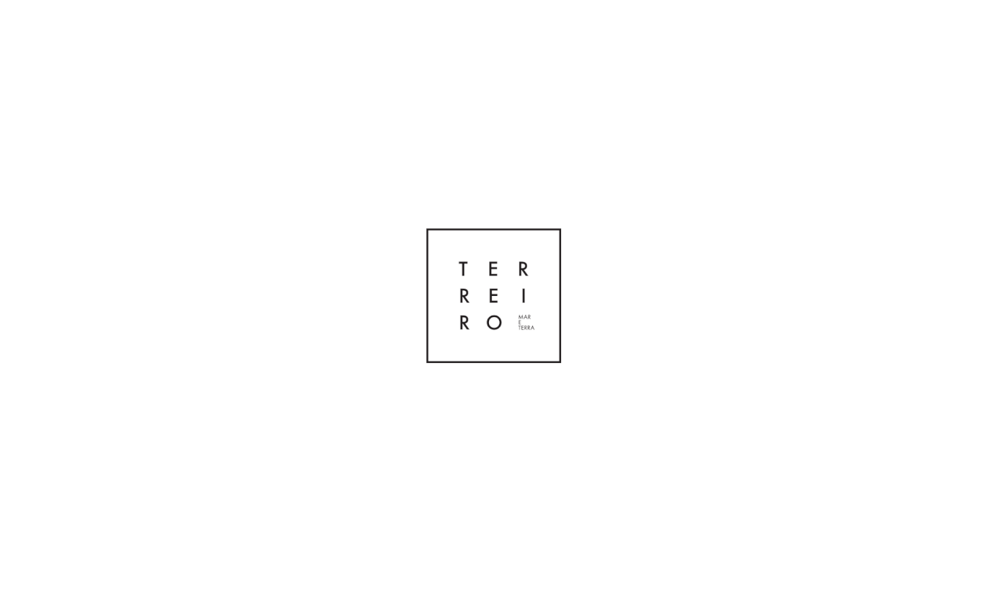
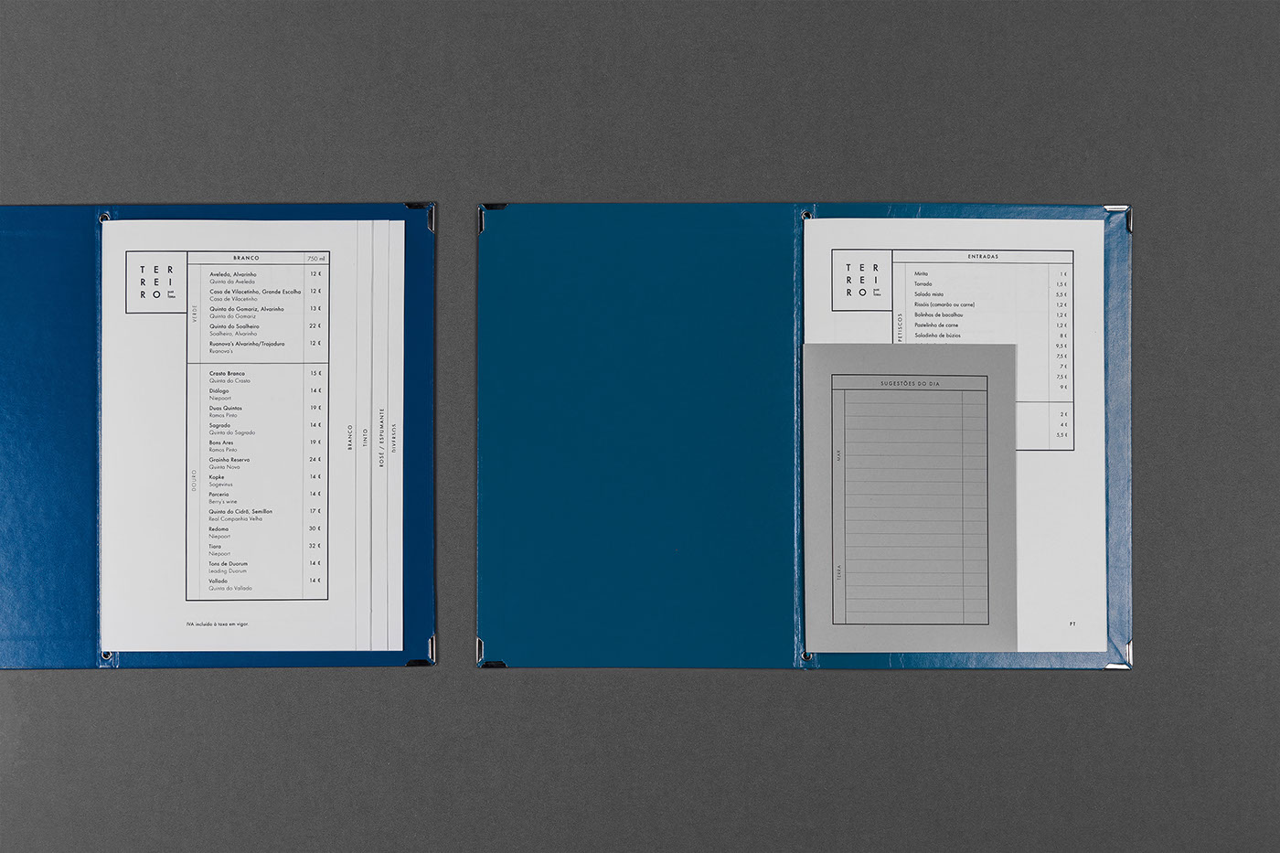
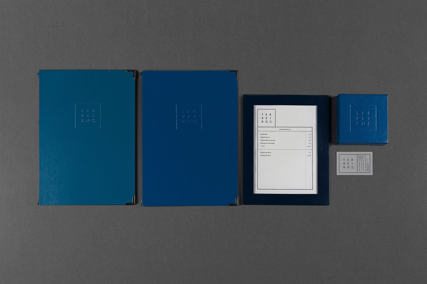
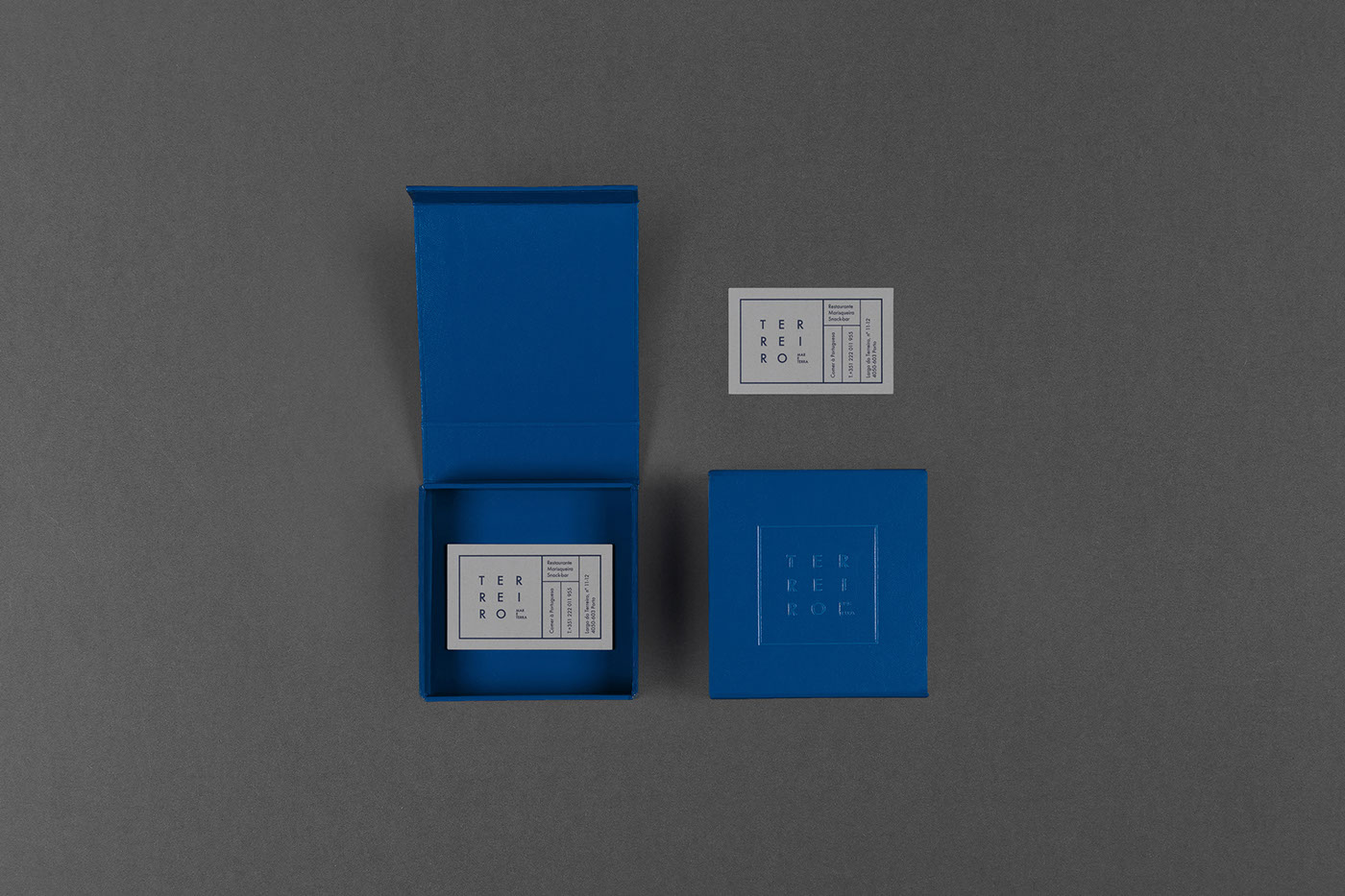
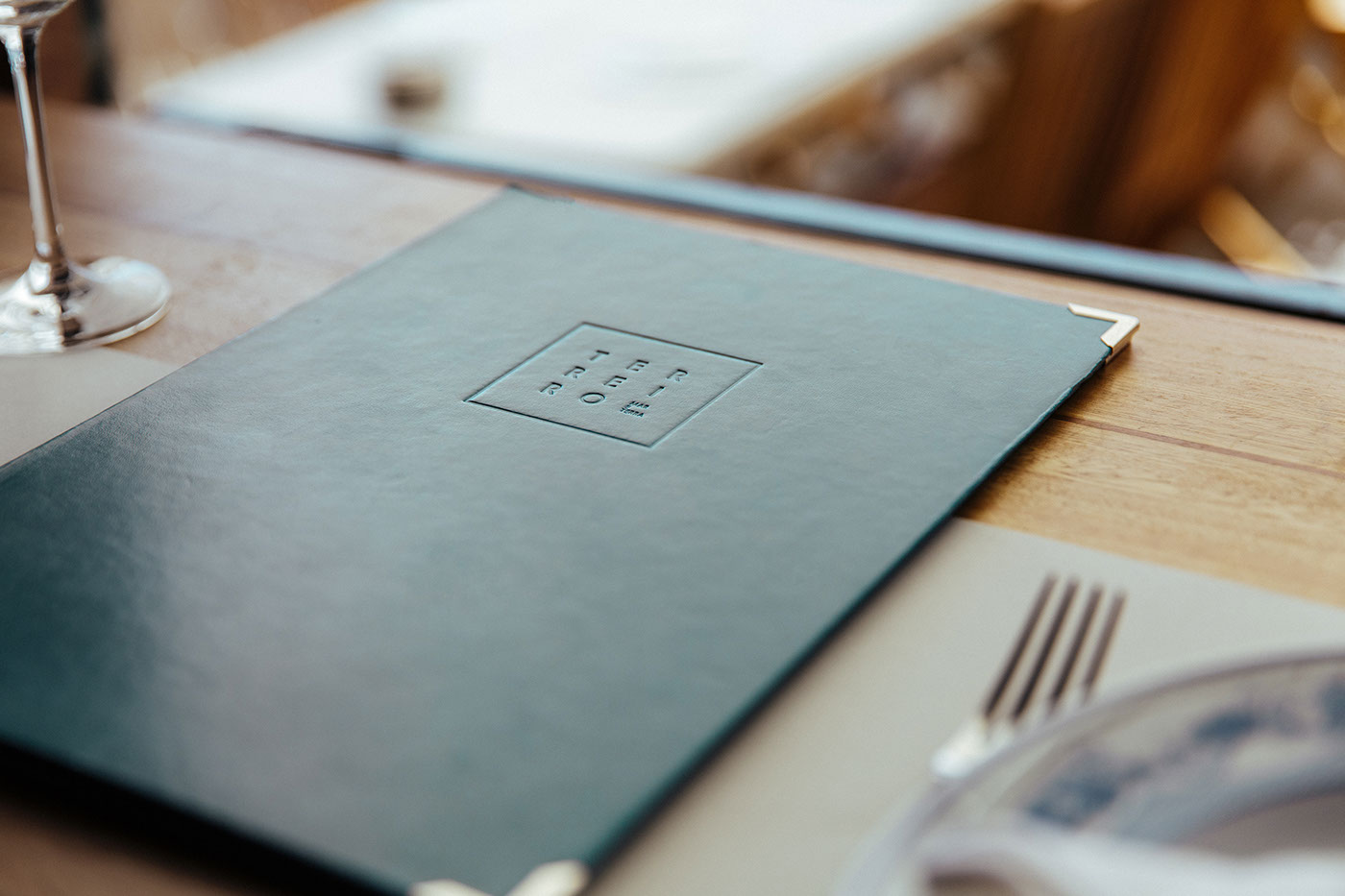
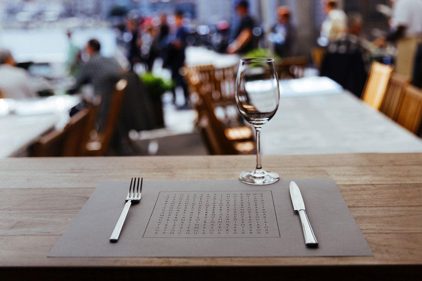
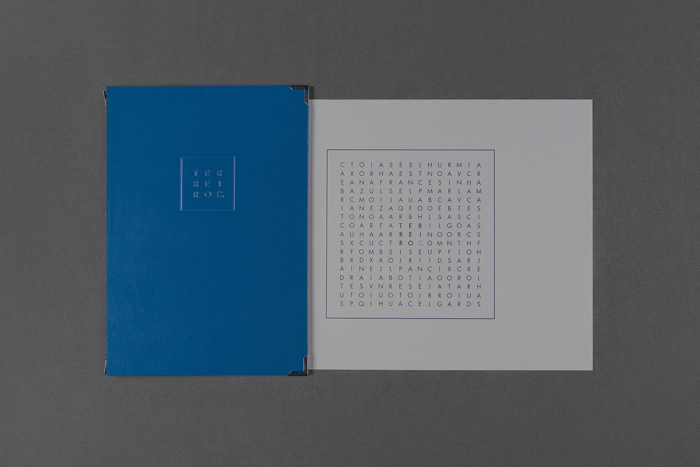
For this identity we started by playing with the idea of the rectangular space, that we could use as we'd like, in order to hold the information we need to show.
The logo exists as a squared container for typography, and it adapts to the menu, placemat, business card or any other communication object. When there's no need for space it doesn't exist. Along with this idea, we relied on the strong sea connection using a wide range of blues on the sand and grey background that is much present in the restaurant.


Thank you!
Client: Terreiro
Year: 2015
Art direction/ Graphic design: Raquel Rei
Photography: Álvaro Martino


