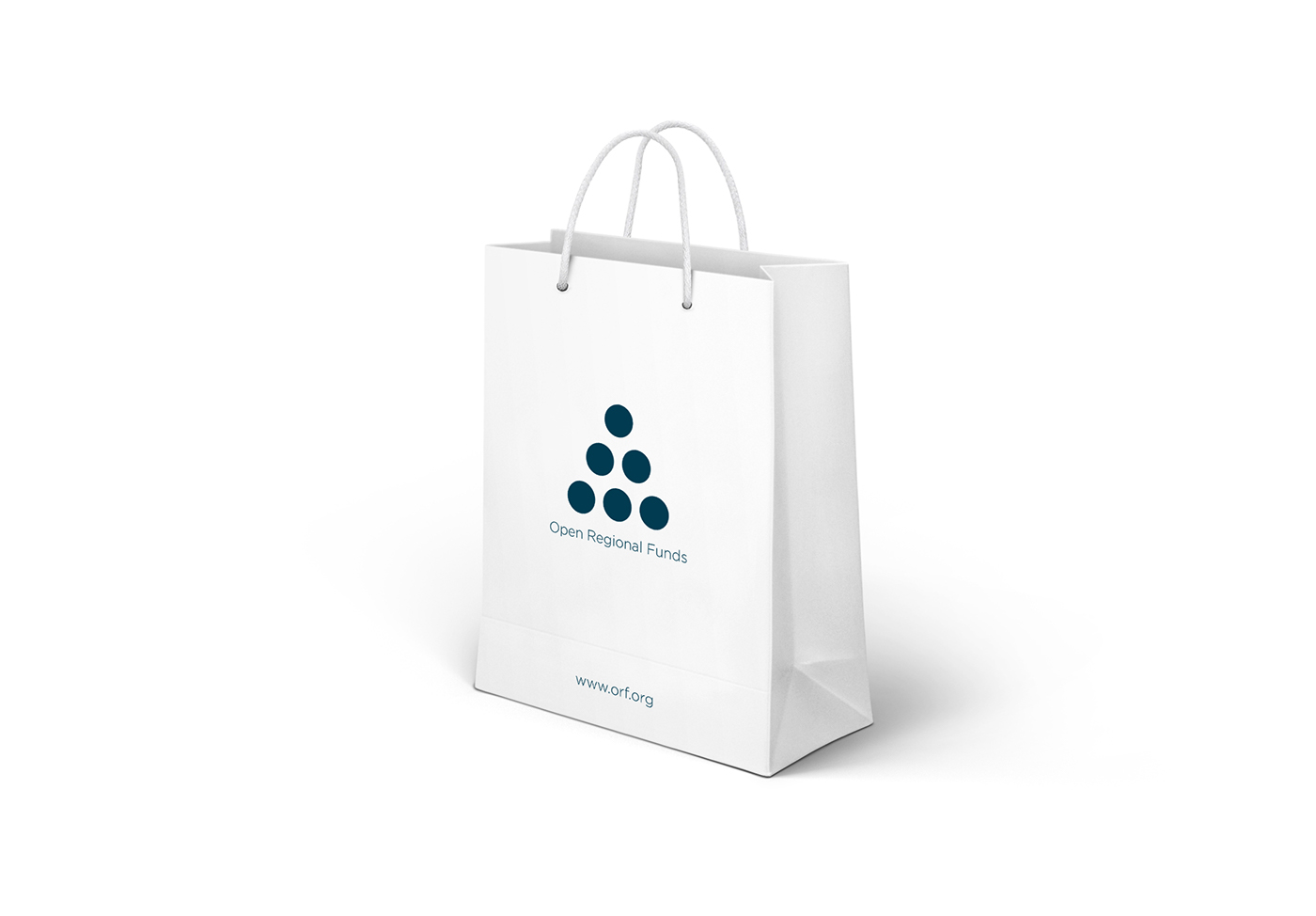


This visual identity is made as part of an open competition for the Open Regional Funds (ORF). It consist of six circles which are the same and have same distance between each others. Six circles symbolize six projects of the Open Regional Funds. As I wrote, all circles have same distance between each others, which symbolizes balance, nature, cooperation, communication, structure, sectors, connectivity and helping. Those circles are making something like pyramid or arrow, which symbolizes success, improvement, infinity, striving for the top and (re)productivity.


