
Clearly So Atlas
Branding / Explainer Video
I was asked by Clearly So, Europe’s leading impact investment bank, to work on the identity of their new online tool Atlas. I was responsible for their new branding and explainer video.
ClearlySo vision is to navigate private market investors towards more positively impactful investments.
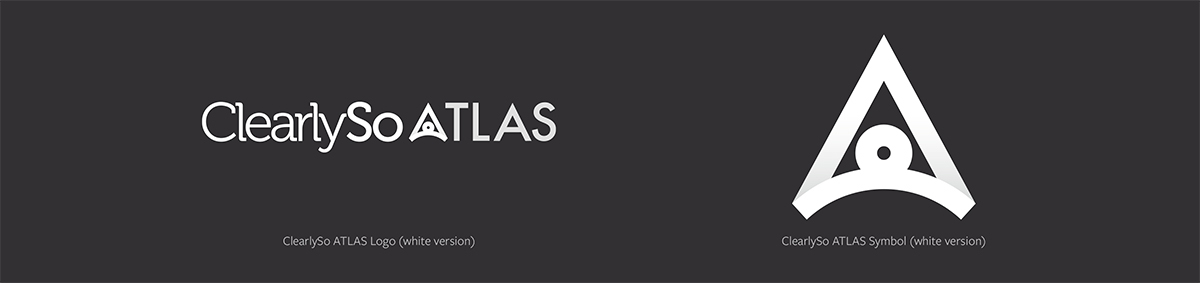
The new logo strikes a delicate balance between professionalism and warmth. The symbol is intended to represent the many facets of ClearlySo ATLAS. It’s a symbol of responsibility; of the extraordinary impact that investors can make. The symbol is an abstract depiction of dual themes. It represents a navigational compass and also Atlas, the titan who carried the weight of the world upon his shoulders.
ClearlySo Atlas Logo

White Version Logo
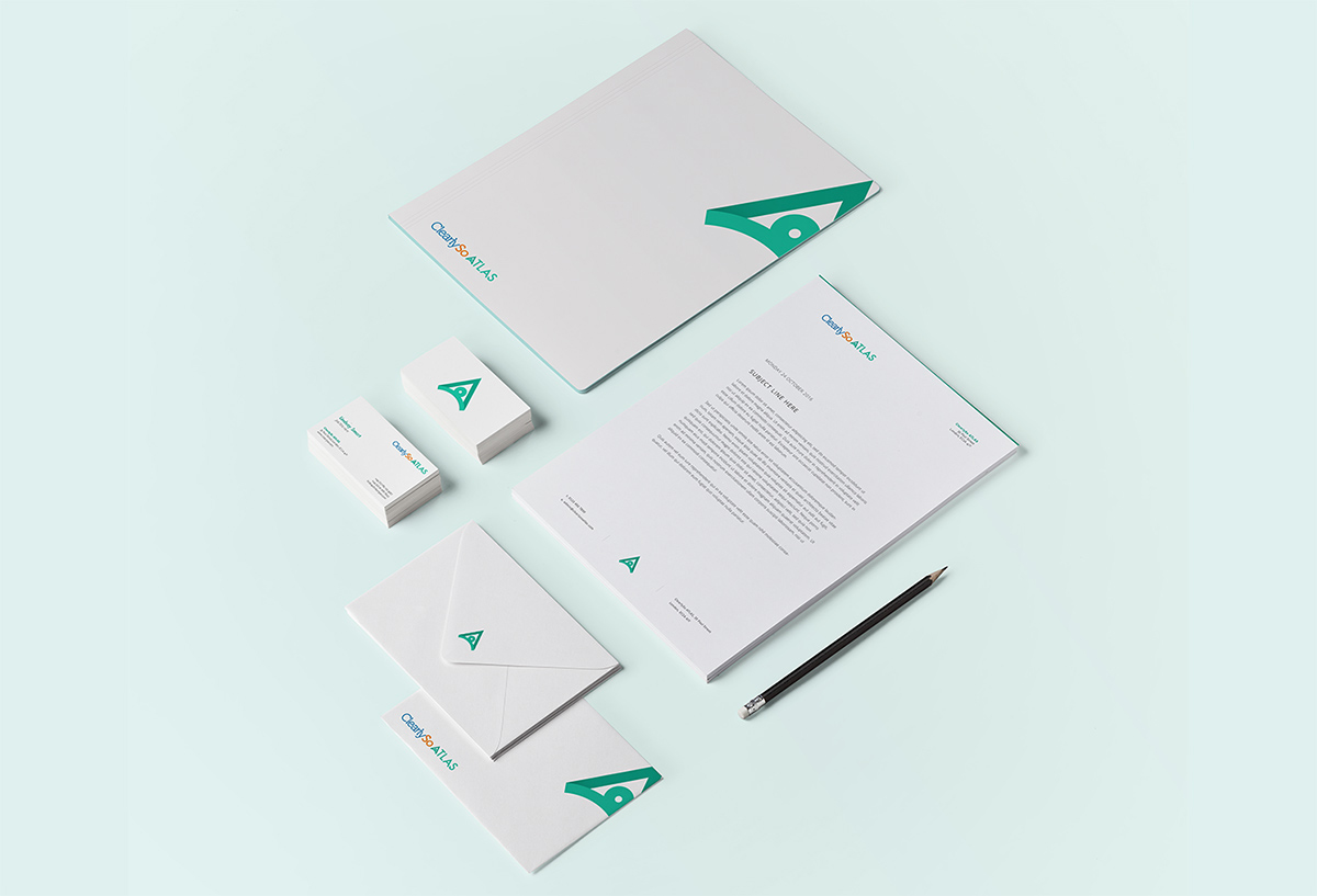
Brand Application
Illustrations