

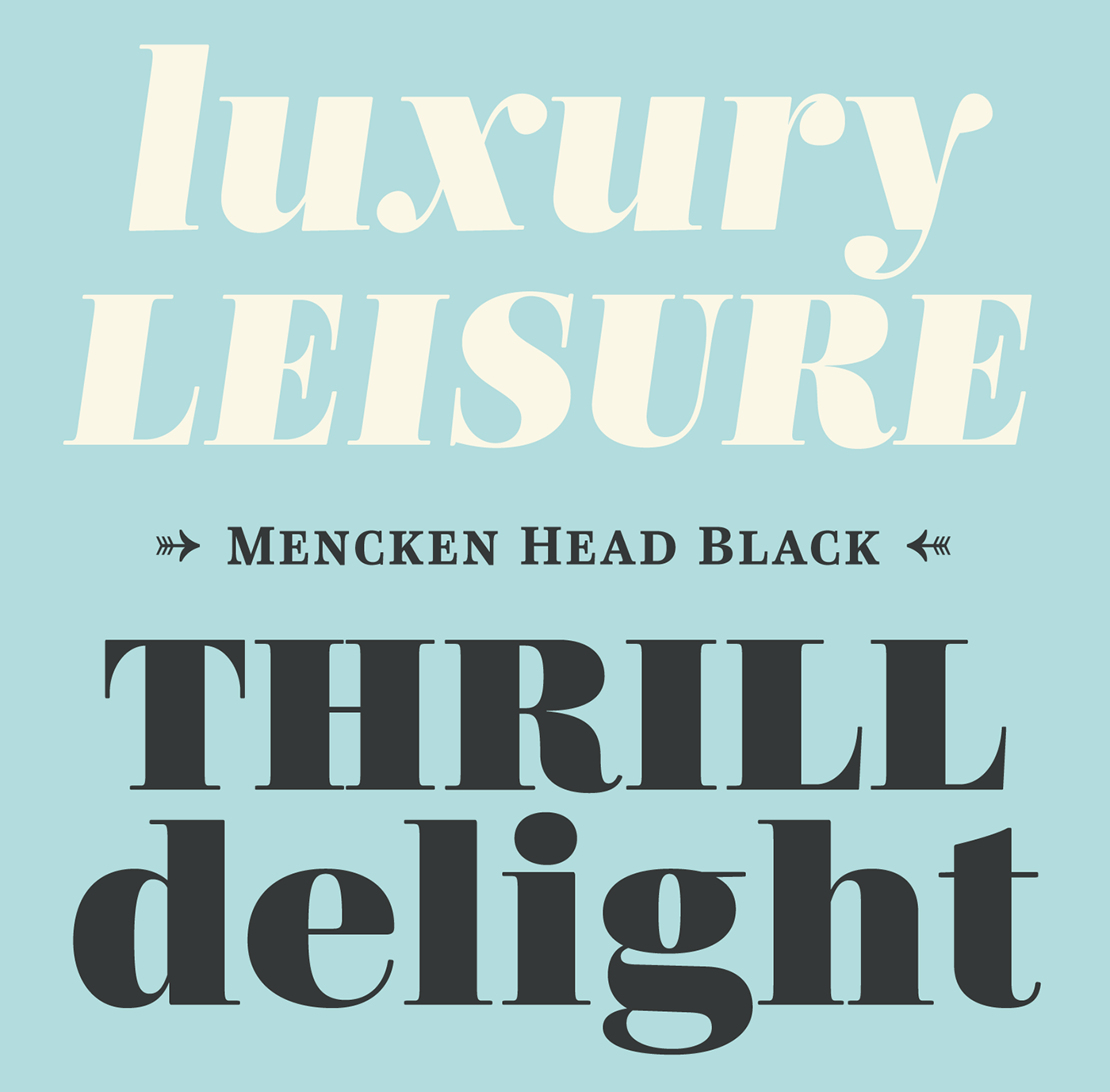

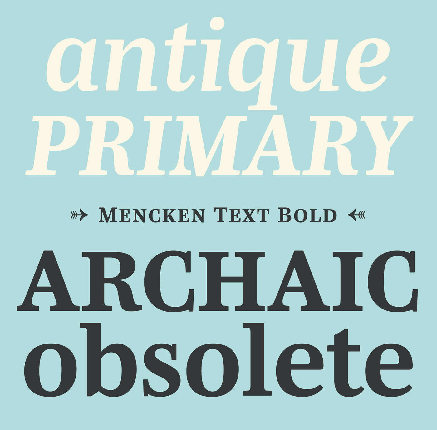
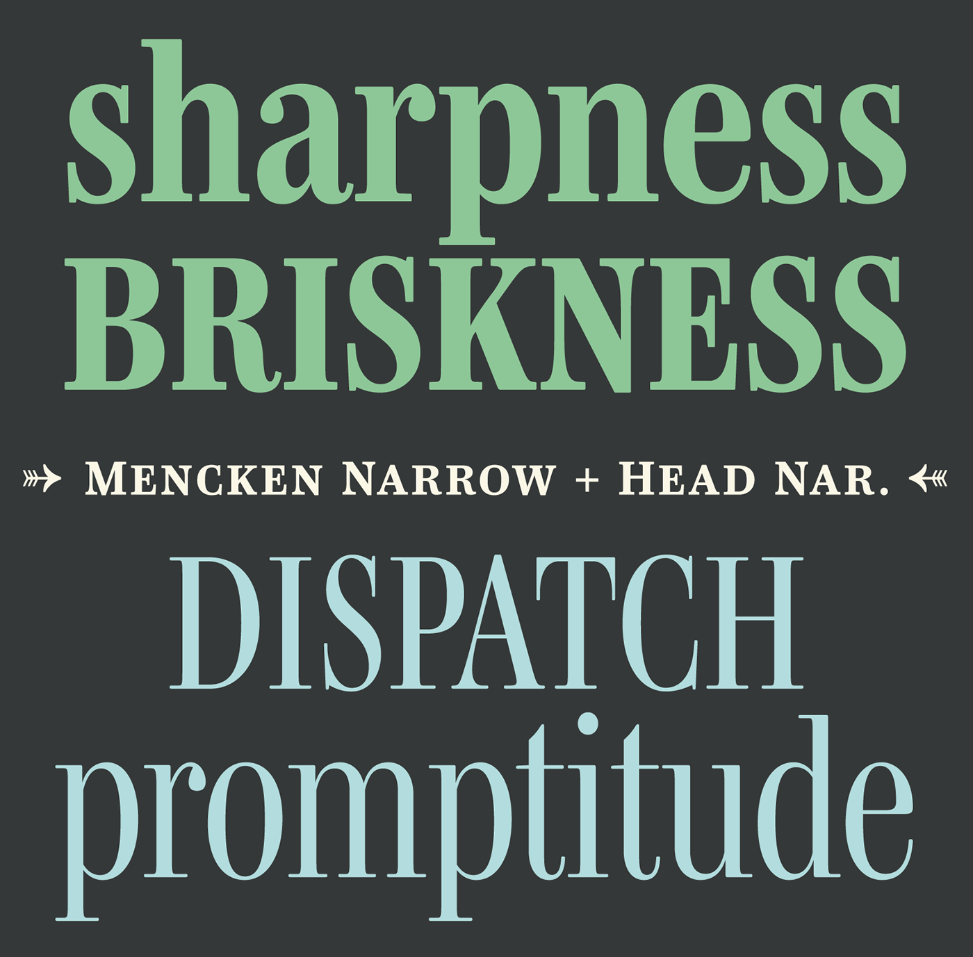
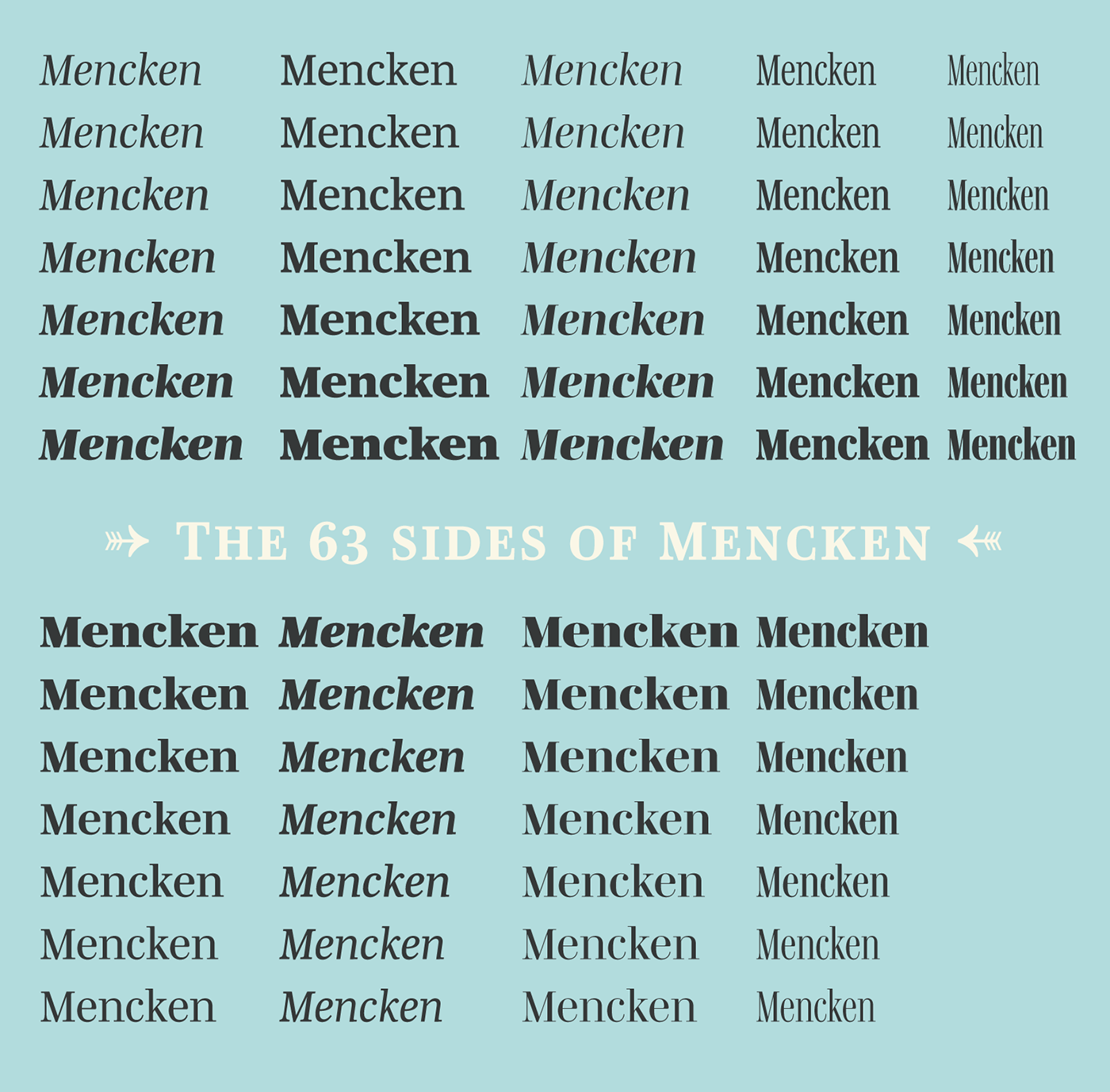
Mencken has sixty-three styles, divided into three widths, three optical sizes, romans, italics, borders and dingbats. Generally, optical size typeface families belong to a same common construction. It falls into the same category of type classification, while presenting different x-heights or contrasts. Mencken is unique because it is designed according to different axis and optical sizes. Firstly, Mencken Text is a low-contrast transitional typeface, designed on an oblique axis, asserting horizontal with featuring open counters. Its capitals follow Didots to better harmonize the rest of the family. On the other side of the spectrum, Mencken Head (and narrow variations) is designed on a vertical axis, high contrast, in a contemporary Didot style.
The Mencken is therefore a typeface answering to different sorts of uses, whose design is different according to its uses: from oblique axis in small size to vertical axis in large sizes. Vertical proportions (x-height, capitals height, etc.) were designed to be compatible with Le Monde series and specially Ardoise:small caps, drawn on an intermediate height between the lowercases x-height and capitals, in order to remain present for acronyms or to compose the first line of a paragraph or the words following a drop cap. Lucie Lacava and I followed the idea launched by Matthew Carter few years ago for some of his typefaces intended for publications.


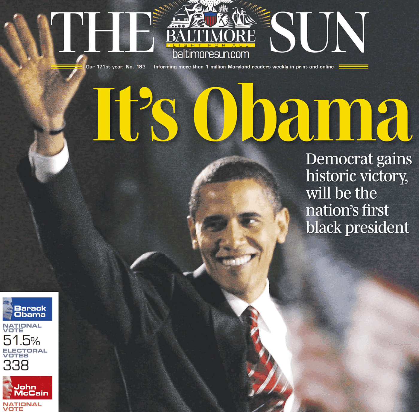
It is a bespoke typeface for American newspaper The Baltimore Sun started at the end of 2004 which marks the beginning of this project. The story started with a simple email exchange with Lucie Lacava then in charge of redesigning the American East Coast newspaper. As usual, she was looking for new typeface options in order to distinguish the redesign that she had started. At the time of its implementation, a survey of the newspaper’s readers has revealed that its previous typeface, drawn in the mid-1990s, was unsatisfactory. The Mencken was well received, some reader responses was particularly enjoyable: “It’s easier to read with the new type even though the type is designed by a French.”

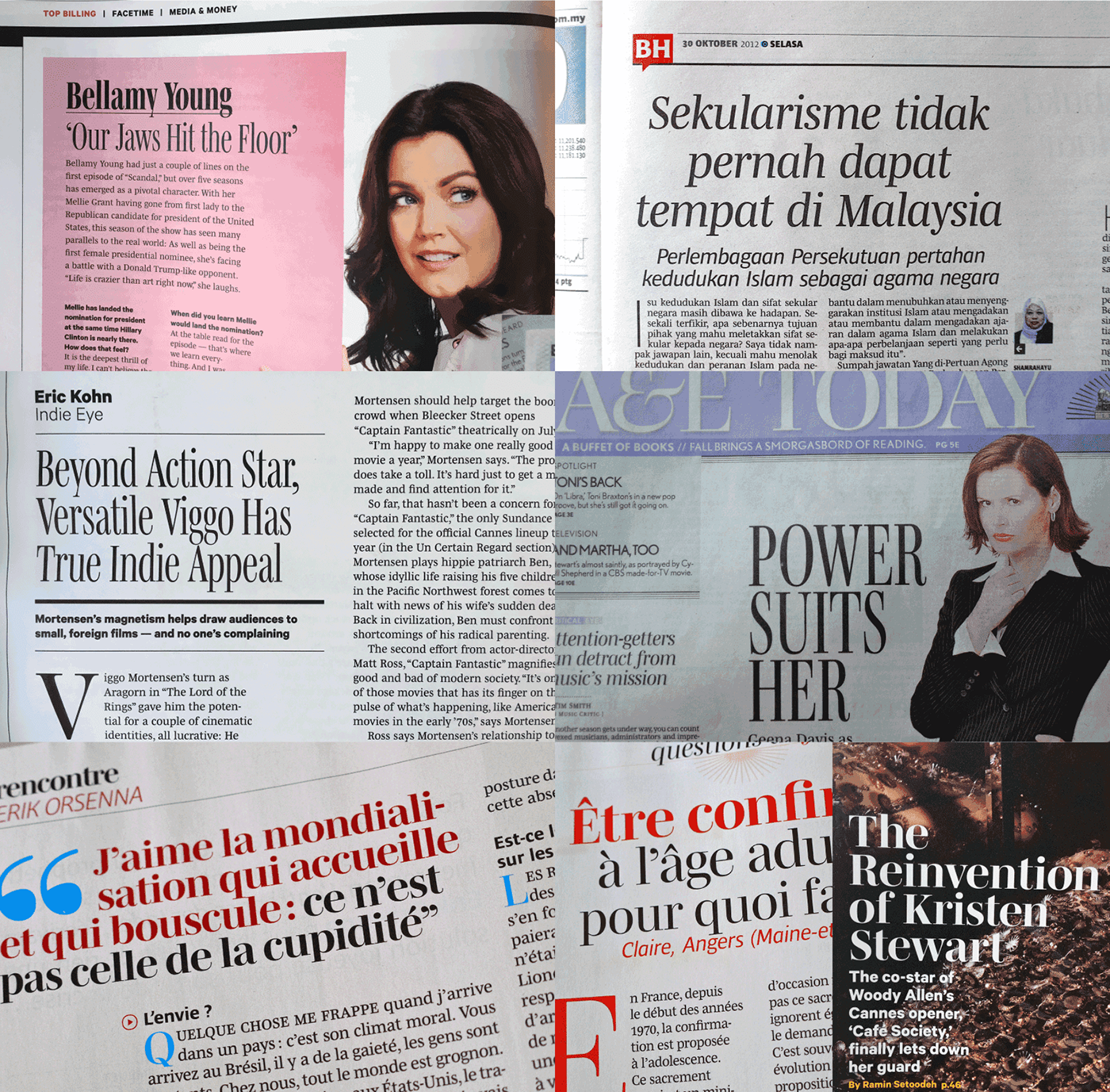
A typeface is designed for a specific use. Here the daily newspaper of Baltimore’s columns, enables to affirm a style due to the technical and formal constraints defined during the design stage. Obviously, a typeface cannot be confined to a single use linked to its history. The role of the typeface designer is to produce a tool intended for users who know how to respect rules in order to break them and to create new things for new territories. Mencken is used in various dailies, magazines such as Variety since its last redesign by Chris Mihal in 2016. The latest one is use by the art directors Thibault Caizergues and Olivier Alexanian launched since few days ago for the end of presidential campaign of Emmanuel Macron.


The name Mencken is a tribute to H. L. Mencken’s journalistic contributions to The Sun. According to the London Daily Mail, Mencken ventured beyond the typewriter into the world of typography. Because he felt Americans did not recognize irony when they read it, he proposed the creation of a special typeface to be called Ironics, with the text slanting in the opposite direction from italic types, to indicate the author’s humour. Affirming his irreverence, the Mencken typeface does not offer these typographic gadgets.
Henry Louis Mencken (1880 — 1956) was an American journalist, satirist, cultural critic and scholar of American English. Known as the “Sage of Baltimore”, he is regarded as one of the most influential American writers and prose stylists of the first half of the twentieth century. He commented widely on the social scene, literature, music, prominent politicians and contemporary movements. Source


Mencken is exclusively available at Typofonderie. This new typeface is presented in two subfamilies: Mencken and Mencken Head. The fonts include now more than 900 glyphs by font, extended languages support, 4 sets of figures, capitals, small caps, lowercases, superiors, ligatures, dingbats and borders, etc.
The new Mencken OpenType fonts are available in our STD, ePub versions and exclusive PRO version.Download the Mencken specimen in pdf format for full details of these Advanced typography functions. Download the Try-out versions!
→ € 45 – € 55 for any of Mencken styles STD or PRO
→ € 45 – € 55 for any of Mencken Head styles STD or PRO
→ Download for free the Mencken Head Full Family of 28 fonts in Try-out format
→ Download for free the Mencken Full Family of 35 fonts in Try-out format
→ € 45 – € 55 for any of Mencken Head styles STD or PRO
→ Download for free the Mencken Head Full Family of 28 fonts in Try-out format
→ Download for free the Mencken Full Family of 35 fonts in Try-out format


