
Public competition
This project was registered in the public contest organized by the Municipality of Bucharest that decided to adopt a logo for the city, launching a public competition for the realization of this mark. Following the scandal of the plagiarized logo, the Capital City Hall has chosen a new symbol for the Capital, made by Alexandru Mihai Nenciu.

The Challenge
The challenge offered by Bucharest was clear enough. The city needed a visual system and a visual identity that could organize and simplify communication with his own citizens and at the same time, to be able to define a clear system, which would bring together the city and the city hall. We wanted to represent Bucharest as a global city, a city for everyone.
Therefore, it became clear to us that Bucharest must be much more than a symbol, even more than a mere logo. It needed complexity. It needed a life. It needed a story. I mean personality.
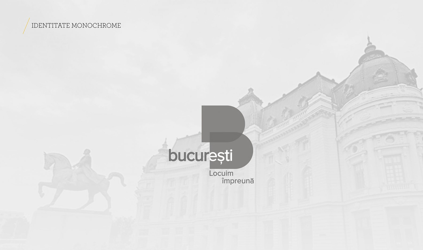
Giant “B”
Concept. The city of Bucharest is a dual city, with two faces, one looking ahead, the other, backward, the city of Bucharest is always divided into two big bodies: the city and the people, present and past. A city that goes forward, integrating both aspects.
The giant “B”. The city of Bucharest does not have its roots only in the architectural and urban forms of the city, Bucharest being the result of an interweaving of places, people and customs. From this overlap, the city of Bucharest is recommended as a transparent, diverse, dynamic and developing city.
Common points. The contrast obtained from the interweaving of the two equal elements will always generate a solid common bridge. For all of us.

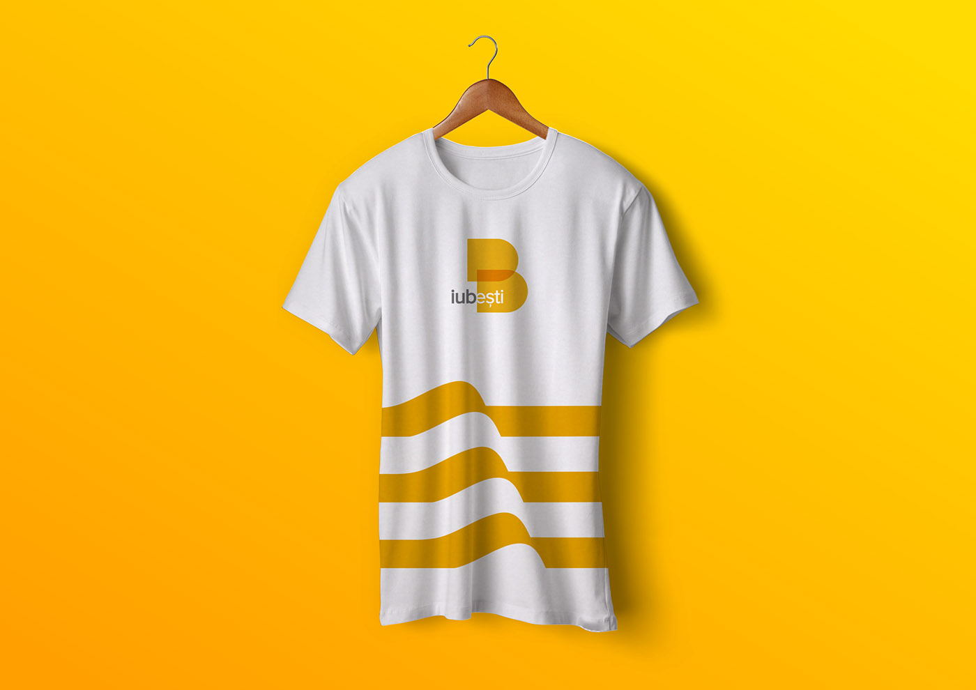
Visual language: “you are”
Depending on the context, the element ” you are ” in the structure of the word Bucharest can form a series of new and representative words offering a whole visual language: You love, grow, work, invest, and gain.

Sectorial brand: window logo
The option to fill the “B” letter with various thematic graphic elements offers an additional layer meant to get more attention and a stronger connection with the audience. This new approach to logo technology as a “window” offers a strong visual texture and effect, establishing consistent visual language in print & online or outdoor applications.


Expression: We live together
The slogan “We live together” is an integral part of the brand identity that represents and describes the image of Bucharest, as a global city, a city for everyone who lives in.


Appreciation and feedback
Even though the proposal made by BroHouse for the Municipality of Bucharest, was not a winner, it has enjoyed much appreciation in the online environment. Bogdan Naumovici: ” The BroHouse logo, the one with the slogan” We live together “, was among the first 10 discussed and was appreciated. Here is an appreciation that appeared on 4th of May, 2017 in the magazine Paginademedia.ro: ” There was also a slogan that I liked:” We live together! “. For a city divided between beautiful and free young people and retirees, between cyclists and drivers, among other things, it is an interesting positioning.
Copyright © BroHouse. All rights reserved.
Trademarks and brands are the property of their respective owners.


