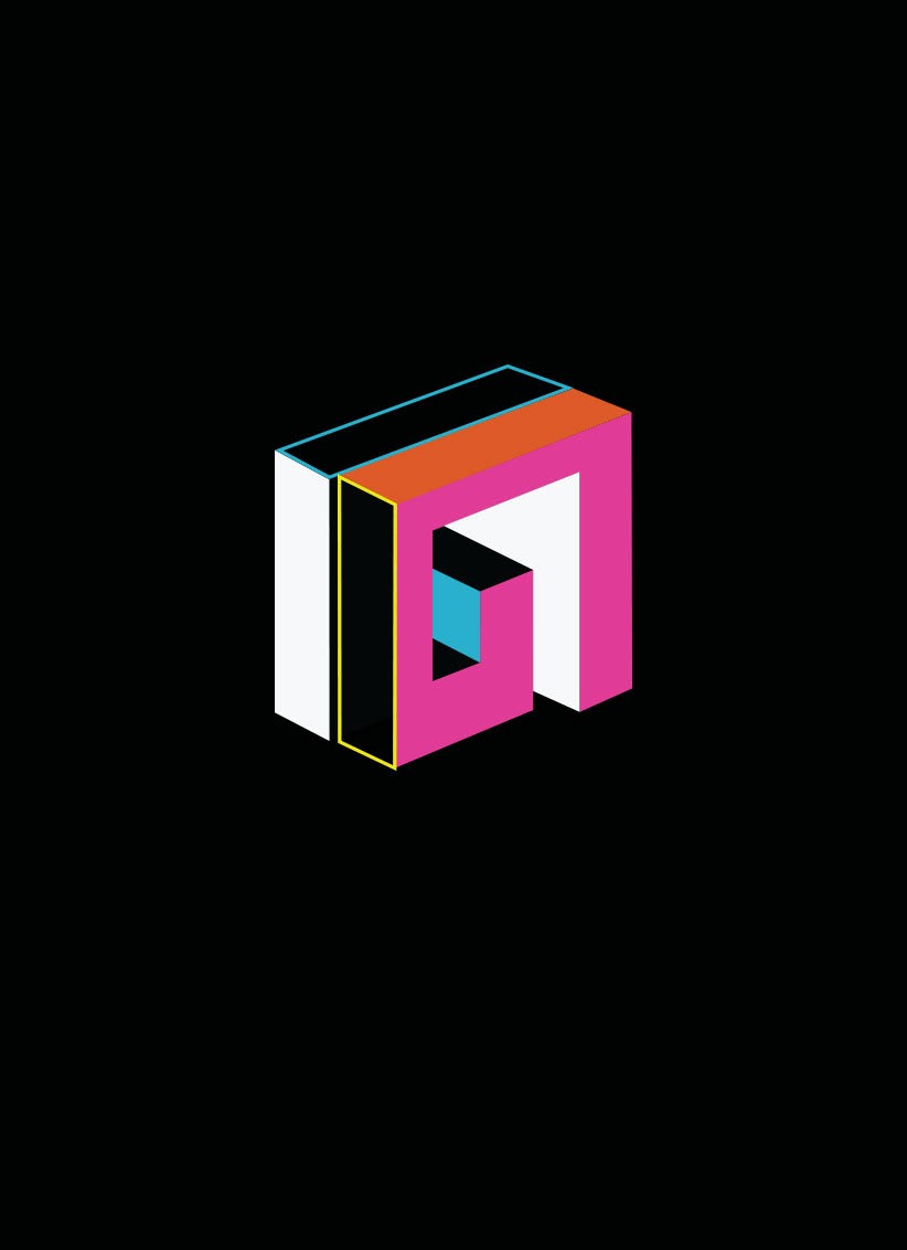
Creation of a typography and interpretation for the cover
of the spanish magazine "Yorokobu"
Inspired by the cubic architecture of the 20th century playing with volumes and surfaces.
I worked with architecture students, who helped me draw letters one by one.
I worked with architecture students, who helped me draw letters one by one.
I then reinterpreted these drawings on illustrator
and play with these letters and create new posters with new colors.