
a booklet for little rarities of young designers
RAREE SHOW is a booklet that has won a small typography competition at my school.
The task was to unify the showpieces of a group of different people, while leaving enough space for the individuality of each work. The challenge was not to simply use blank sheets, but to arrange the booklet in a proper style that would simultaneously not disturb the personality of each picture.
Since the goal was to create a container for little rarities I reminded myself of the so called "raree shows" which were well known in the olden days. The small colourful boxes, that mostly are designed as small TVs, are telling fairytales simply by controllable pictures. Just like storybooks do.
I perceived the raree show as the perfect kind of medium to tell the story of the young designers from my class. After picking the central theme of the booklet both the fonts and the graphic elements had to fit its retro- style.
This booklet (student work) has been created with ADOBE INDESIGN (layout) and ADOBE ILLUSTRATOR (graphic elements).
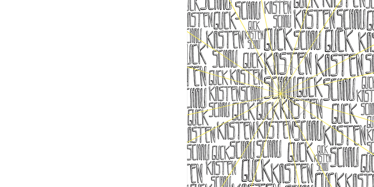
BOOKLET COVER (U1)
down right
the circle is marking the area that has been designed for being stamped out..
down right
the circle is marking the area that has been designed for being stamped out..
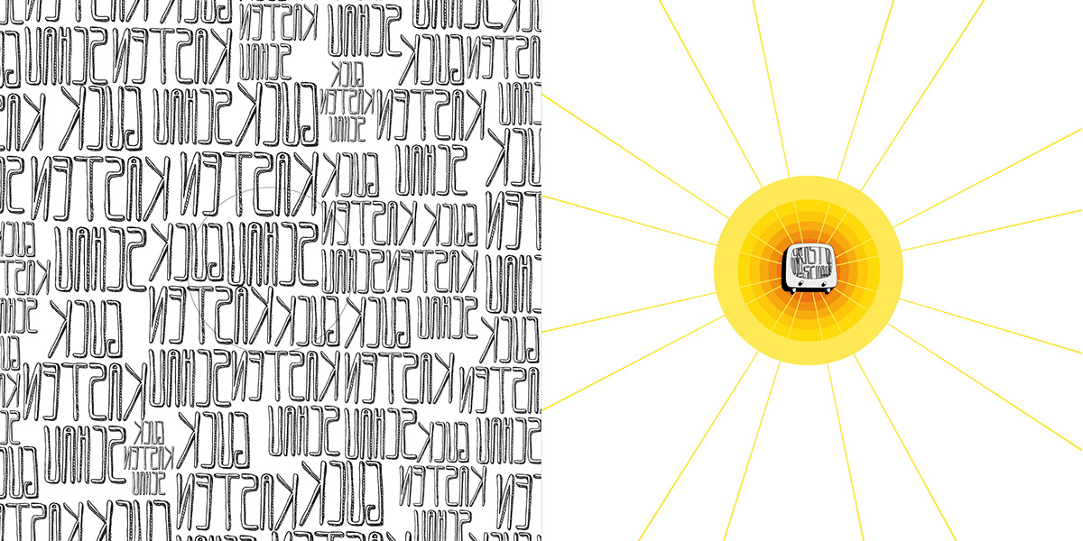
BOOKLET COVER (U2)
down right
..to show the disc with the raree show on the next page and therefor design a haptic effect
down right
..to show the disc with the raree show on the next page and therefor design a haptic effect
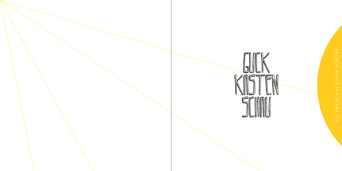
TITLE PAGE
down right
extracting the TITLE from the cover
"Guckkasten- Schau" is a wordplay of "Raree Show" in German
the SUBTITLE on the segment is illustrating the underlying idea of the compilation
"the whole thing on one disc (of The Raree Show)"
down right
extracting the TITLE from the cover
"Guckkasten- Schau" is a wordplay of "Raree Show" in German
the SUBTITLE on the segment is illustrating the underlying idea of the compilation
"the whole thing on one disc (of The Raree Show)"
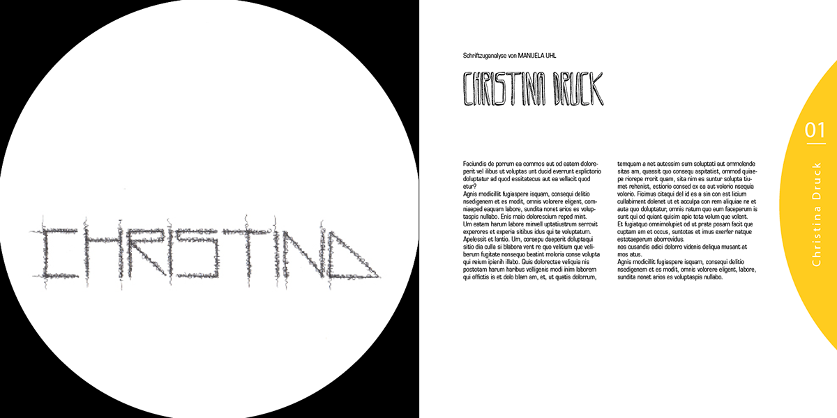
CONTENT (extract)
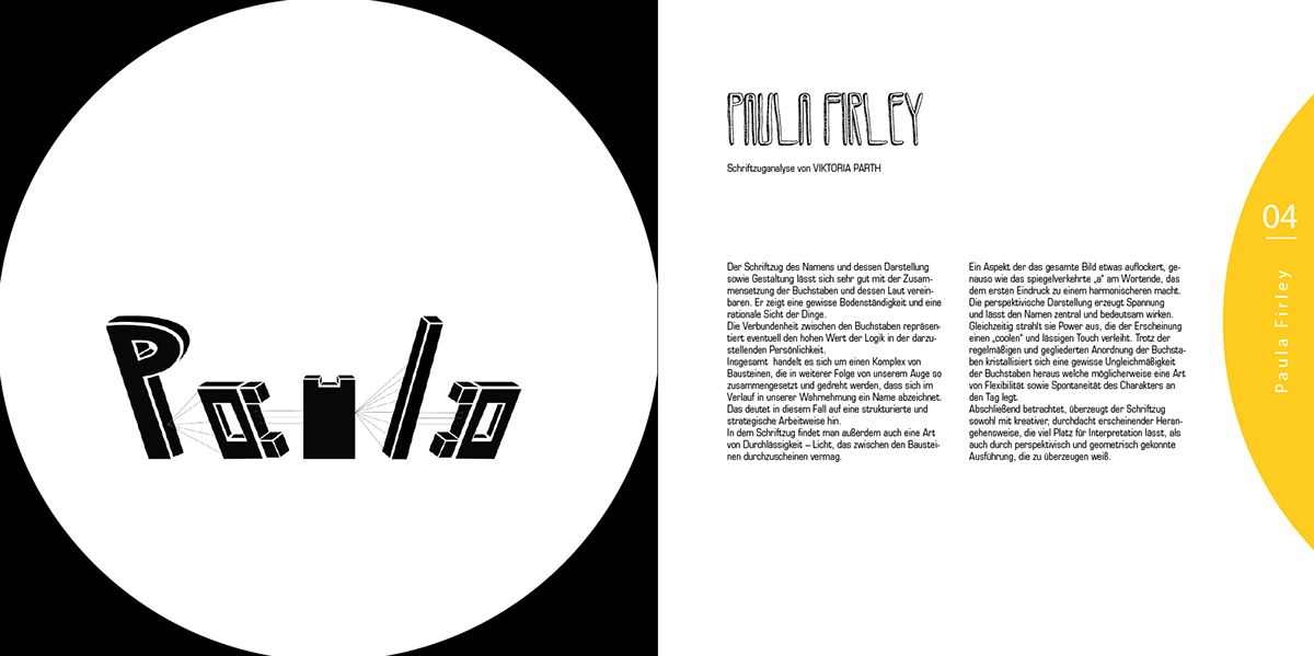
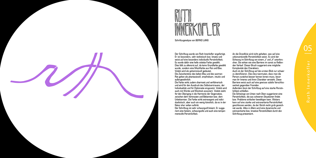
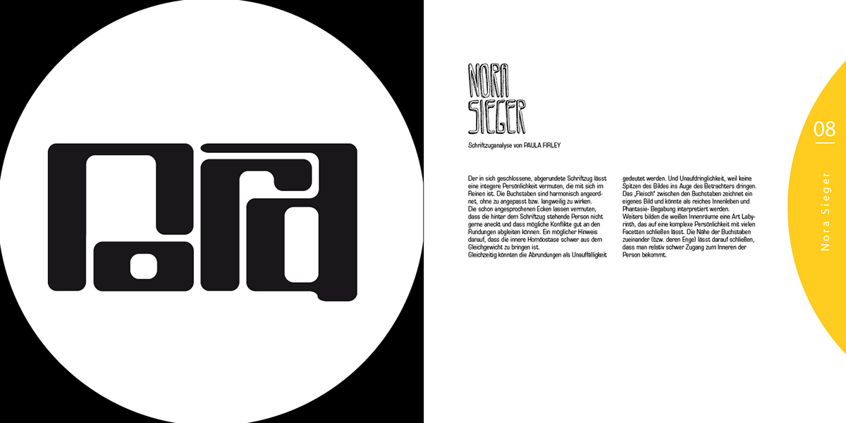
down left
watching the work through the peephole of the raree show
down right
introducing the creator´s work
pretending the truth of the raree show by simulating rotatability of the segment the names are on

IMPRINT
BOOKLET COVER (U3)

BOOKLET COVER (U4)

illustration below
evolution of the raree- show ("Guckkasten") from the cover

picture below
a "real" raree show

THANKS FOR WATCHING!


