

___
Festivais Gil Vicente 2010
Series of print designs for this years festival
of contemporary theatre.
___
Like in the rest of the world, the economical crisis is felt in Portugal, most
specially in the northern area of the country. Due to these facts, all the cultural
institutions's budgets were severally diminished.
We took that difficulty/weakness and chose to make a statement.
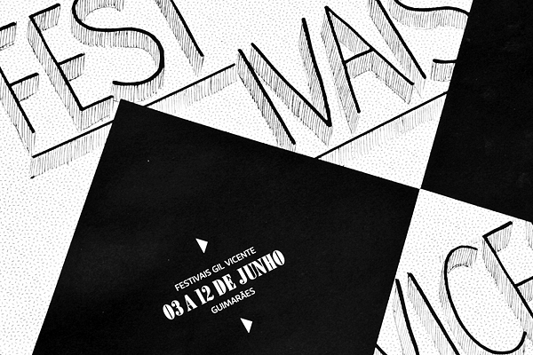
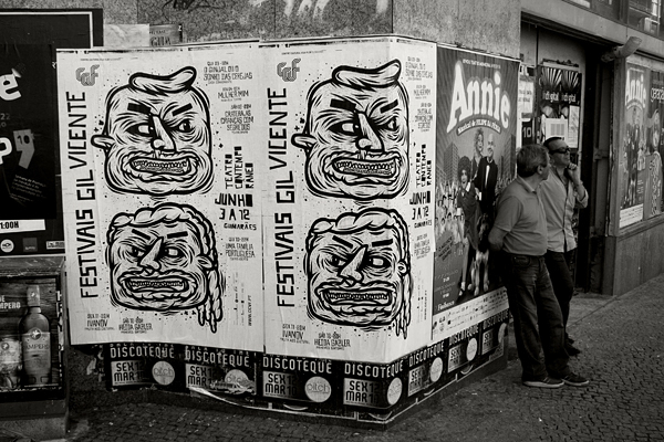
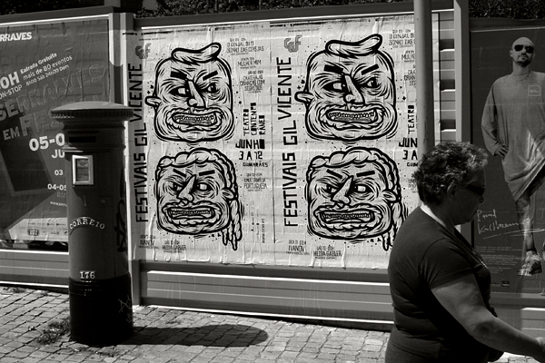
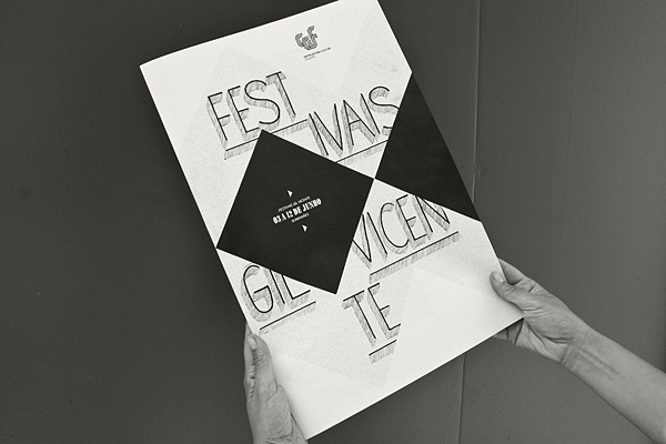
We proposed ourselves to design all of the promotional
materials for the theatre event Gil Vicente with one colour only Black
without scales of tone (greys).
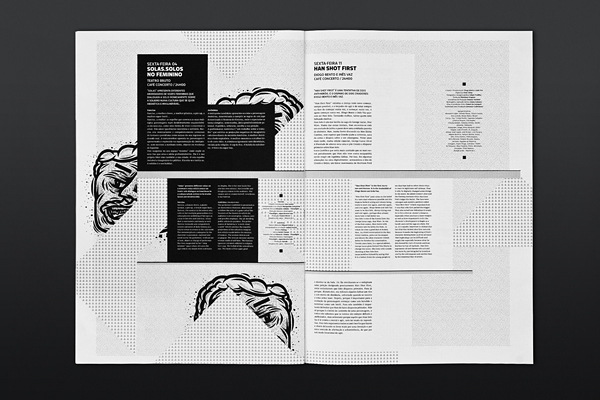
For the poster illustration we invited a street artist oker , whos work is very
powerful and raw. The illustrations he responded with served our intentions perfectly.
We worked the poster in a way that it looked as if any one could have done
it using a photocopy. (we actually presented the model to the client done in a
photocopier machine). Aesthetically we choose strength over delicacy.
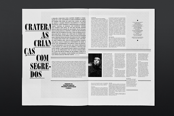
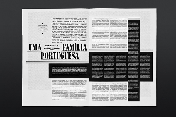
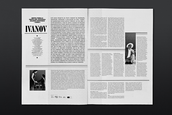
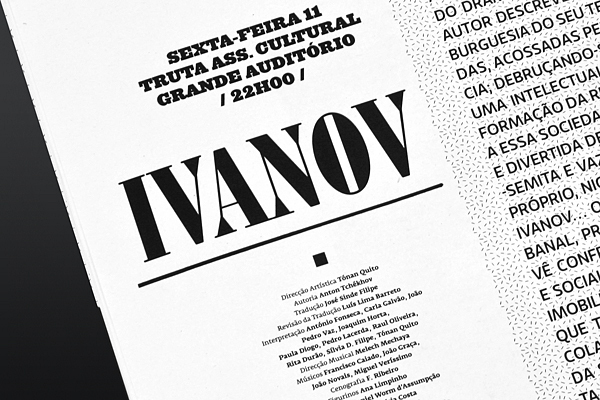
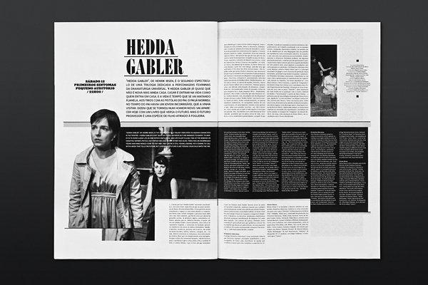
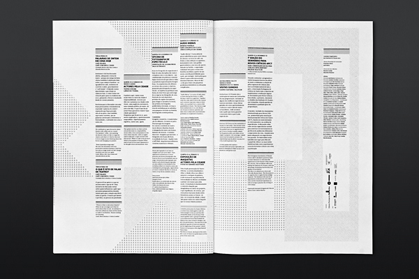
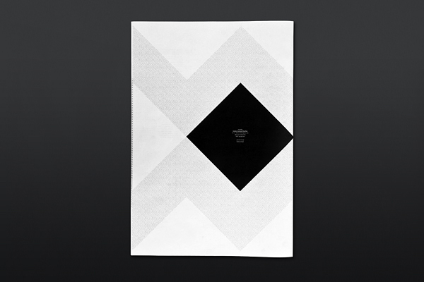
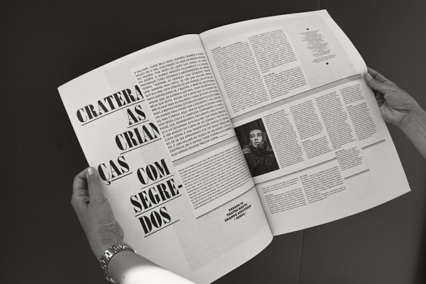
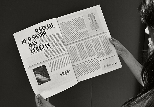
For the journal, we aimed to focus on the basics of editorial design
dividing/organising space and information. We also got inspired by
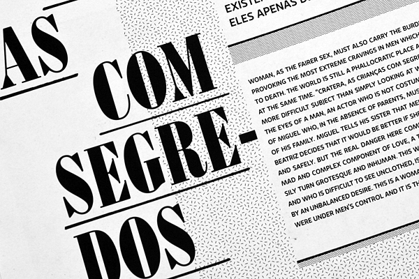
old architectural plans, where they avoided having greys just by using patterns
(Mecanorma patterns) as a way to make the heliographic copies look good.
They used to enhance the contrast of textures and space with lines (obviously)
drawn by hand. Aesthetically we choose delicacy over strength.
Ilustrations by Mário "Oker" Fonseca


