미래 Future by NOUVEAU
Creative Direction, Typography, Packaging
The Brief: Design and curate an LP album in reference to the typeface Avenir, to which it speaks about the typeface and it's characteristics.
Avenir is a typeface that's of clarity and personality. Clarity in it's modernist ethnicity (it being a typeface that's a hybrid of Futura and Erbar). Avenir is classified as a constructivist typeface but it does not fit in entirely, with it's form – does not have a purely geometric and linear drawing. Another unique fact or rather insight found during the research, was that 'Avenir' is a word in French that actually means 'Future' in English.
The Solution: Developed the band name to be called NOUVEAU (New in French) and the album title to be FUTURE (based on the insight). Thereafter a curation of song-list was made that reflected the history of Avenir. [Side A: 1988 / Ain't Got No One / Not Complete] – Avenir started
with 3 weights thus 3 songs on Side A. [Side B: Swiss in Nature / French in Character / Geometry of Feelings / Down to Earth / Avenir Unifié / The Other One / Unseen, Unheard, Unnoticed / We Live After / And Next ] – The last song was called 'And Next' was because after Avenir was the birth
of Avenir Next.
The Idea: To use Avenir letterforms to create other letterforms in another language that means 'Future'. I chose the Korean language, (미래) that means future and reflecting the notion that the future is universal. Humanist Aspect was reflected in the play of visual, textures formed for the sleeves and the Modernity Aspect was reflect in the material a use of the plastic cover and transparent LP representation of clarity.
Production: Offset Lithography (Plastic Cover) + Flat Bed Printing (Sleeves) + Debossing (Box Label)


Front Cover + Side A

Back Cover + Side B
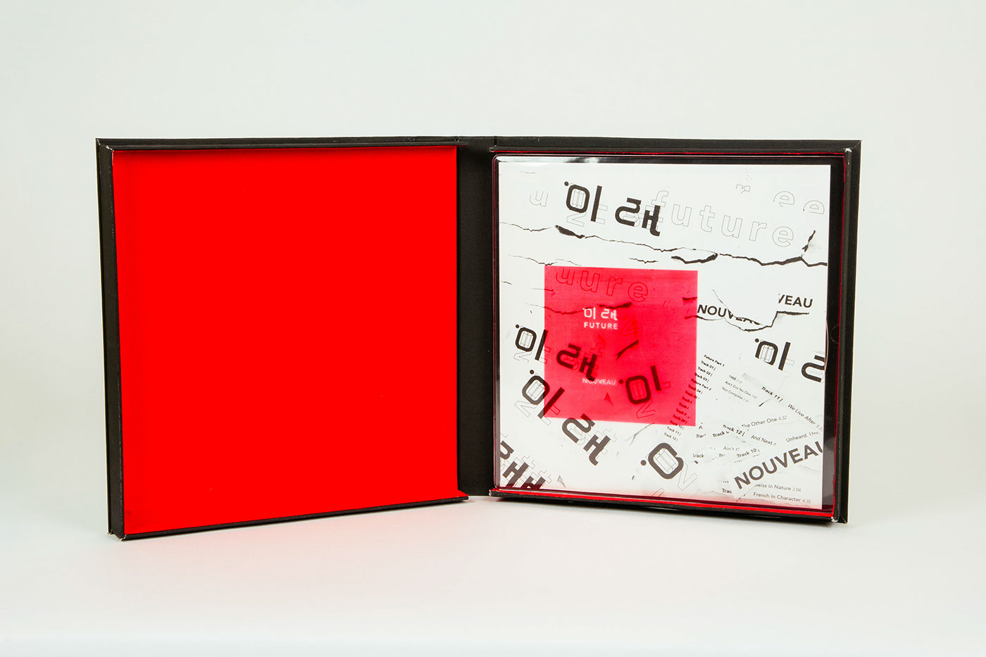
Internal red lining of the box is the representation of the innate characteristics of Avenir. At first glance Avenir doesn't seem special but with closer examination you'll see it's uniqueness. That's the concept of the box.

