

Positioning concept
The project started out unusually for us because the strategic stage had been completed not by us but by our colleagues from Mitrofanov & Partners. They had worked out the company’s positioning and its basic communication principles. We were invited to the key workshop to help develop the brand’s platform. The results of that meeting have helped us work out the project’s visual identity.

Technically speaking it's quite a complicated project, but from an average user’s perspective it’s handy and user-friendly. This is the idea we tried to accentuate in our concept. We didn’t want to create an overly-designed product that would confuse clients, so we were proceeding from the belief that an internally intricate project should come across as easy and user-friendly externally. It should be easy to implement and easy to work with.
Our client liked the idea, and together we agreed that the visual concept would communicate simplicity, modularity, and efficiency, which is beneficial both to company owners and staff.

Visual identification concept
The idea of efficiency can be conveyed through visual images and text, so we highlighted the simplicity of operating the program and the platform’s modularity. We had several brainstorms and came up with at least a hundred options, each and every one connected to blocks, construction sets, and modules. Our ideas bank was full with exploded view drawings, Rube Goldberg machine, astronomic and biologic systems, Lego, and many others.


We checked our short-list of ideas against 16 criteria, the basic ones being positioning, the brand’s character, transparency, and flexibility. We weighed their relevance comparing different options in a special sheet.

Finally we decided on the image of a Meccano metallic construction set that is a type of toy future engineers would love. It has a basic set of parts, which is similar to how our platform works, the idea of constructing something new following instructions is kin to Grotem out-of-the-box solutions, and the freedom to create your own objects reminds heavily of customized products.

Our concept like the construction set itself consists of separate parts, in our case graphic ones. To imitate metallic plates we’ve taken straight-lined and curved shapes, preserving the construction parts’ plasticity and holes for “bolts and screws”. The plates overlap and create graphic images on any given topic.

This graphic principle enables us to metaphorically convey specific images and pick a special symbol for every case.
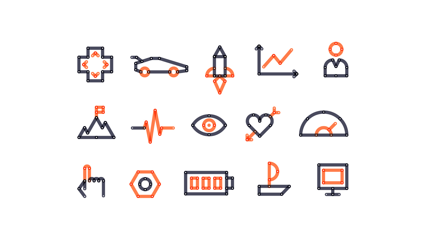
Using abstract diagrams and graphs we have emphasized that Grotem could be easily integrated into a client’s business processes, as well as combined with a company’s active projects. For that purpose we have highlighted the modules that symbolize Grotem, showing how they connect all the other adjacent parts, help create a single composition, and convey the image of a solid mechanism.

We have used rigid geometric elements to construct graphic patterns that are perfect for backgrounds, presentation spacers, and documents.


Metaphoric images, as well as abstract ones, also hint on Grotem’s potential to integrate into a client’s system and its influence on a company’s performance; for example, orange parts on the picture below represent Grotem, while white parts stand for its client. Together they are stronger.

For the corporate font we have chosen Decima Round font family, which reminds of Meccano parts due to its plasticity; the font actually looks like it's made of construction parts. The letters' rounded shape promotes a friendly image. We have used Regular typeface for basic text, and Bold one for accents and headings.

We have opted for a minimalistic color scheme with two leading colors to highlight that the project consists of two parts: a client's company and the Grotem platform in it. Bright and active coral that symbolizes Grotem is contrasted by a dark graphite hue. Neutral white color was used as background for documents rich in text or separate elements.
Logo
When designing the logo we banked on minimalism. The letters have preserved the plasticity of the graphic constructor parts, which are used to create illustrations and patterns. The logo also goes well with corporate identity media, but at the same time looks appropriate in formal documents and interfaces.

We have also worked out an animated logo for different interfaces, underlining the concept of construction parts. There is also a simplified version of the logo with just the initials to be used for web and small format media.

Corporate identity media
We have created a layout for this “modular solution”, where construction parts help both to design corporate identity media by supporting the layout with decorative elements and to emphasize ideas by conveying a certain image.


The construction set principle of putting objects together from separate parts can be used to design letters and numbers where graphics is out of place – for example, in documents and business presentations.


We have also designed T-shirts for passionate staff.

Client's feedback
"The guys from Nimax have designed a truly stunning visualization system. The final image is catchy and bright; it communicates our values and is very constructive (pun not intended). We see and perceive our company and our products exactly the way they now look. Our sense of pride in those helpful solutions that we develop is now supported by the sense of pride in their representation.
This style has momentarily caught on and spread across our company like wildfire – our staff uses it with great pleasure. Even having a branded cup is now not a formal privilege; such cups can be spotted on many office tables. We also receive many positive comments on the corporate style from our clients."
Maxim Opilkin,
Grotem Development Director
Grotem Development Director


