Cappelen Damm Education
Brand identity
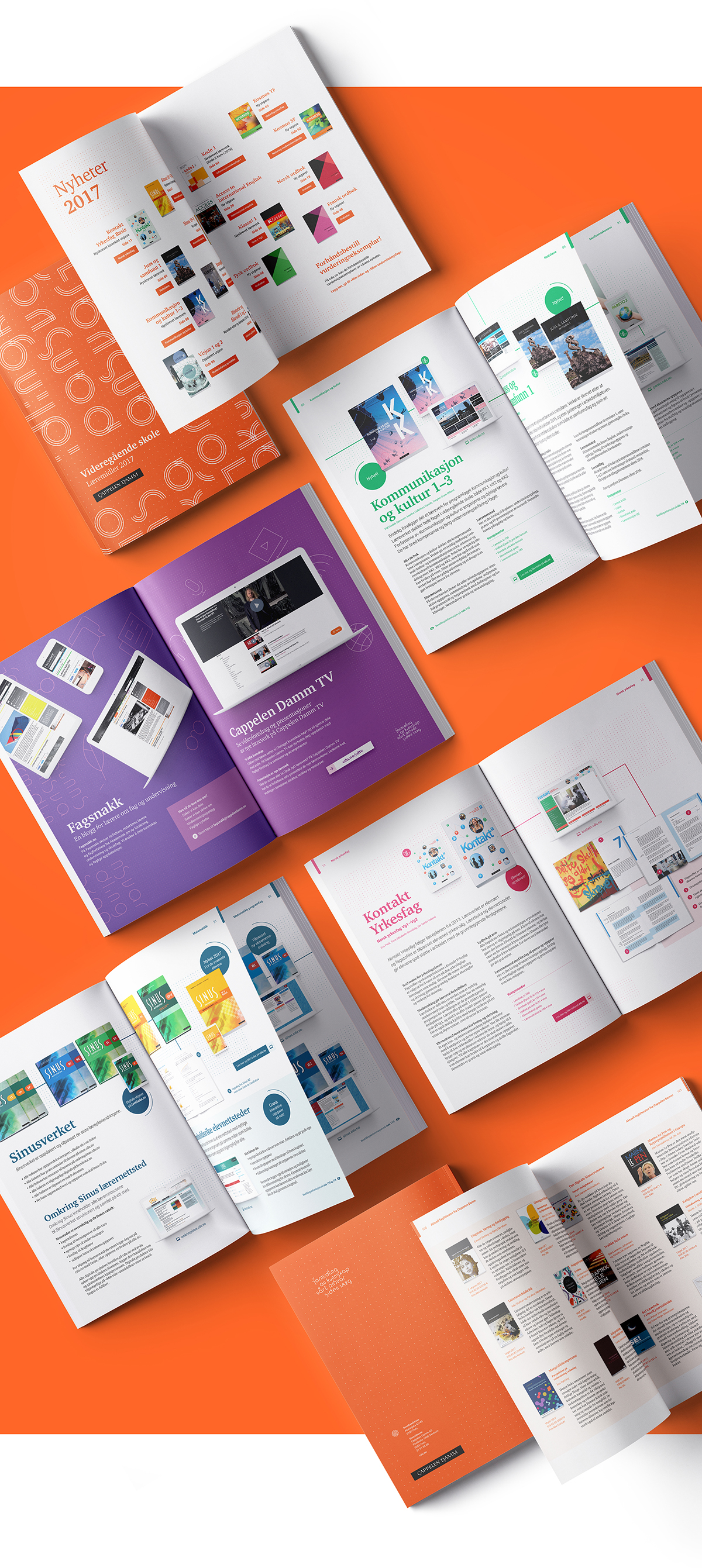
Cappelen Damm Education is the leading publisher of educational
books and supplementary material in Norway. To clearly communicate
a commitment to continue to be the leading publisher in this field,
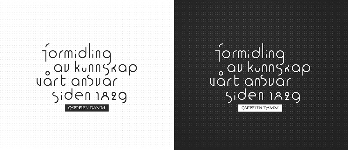
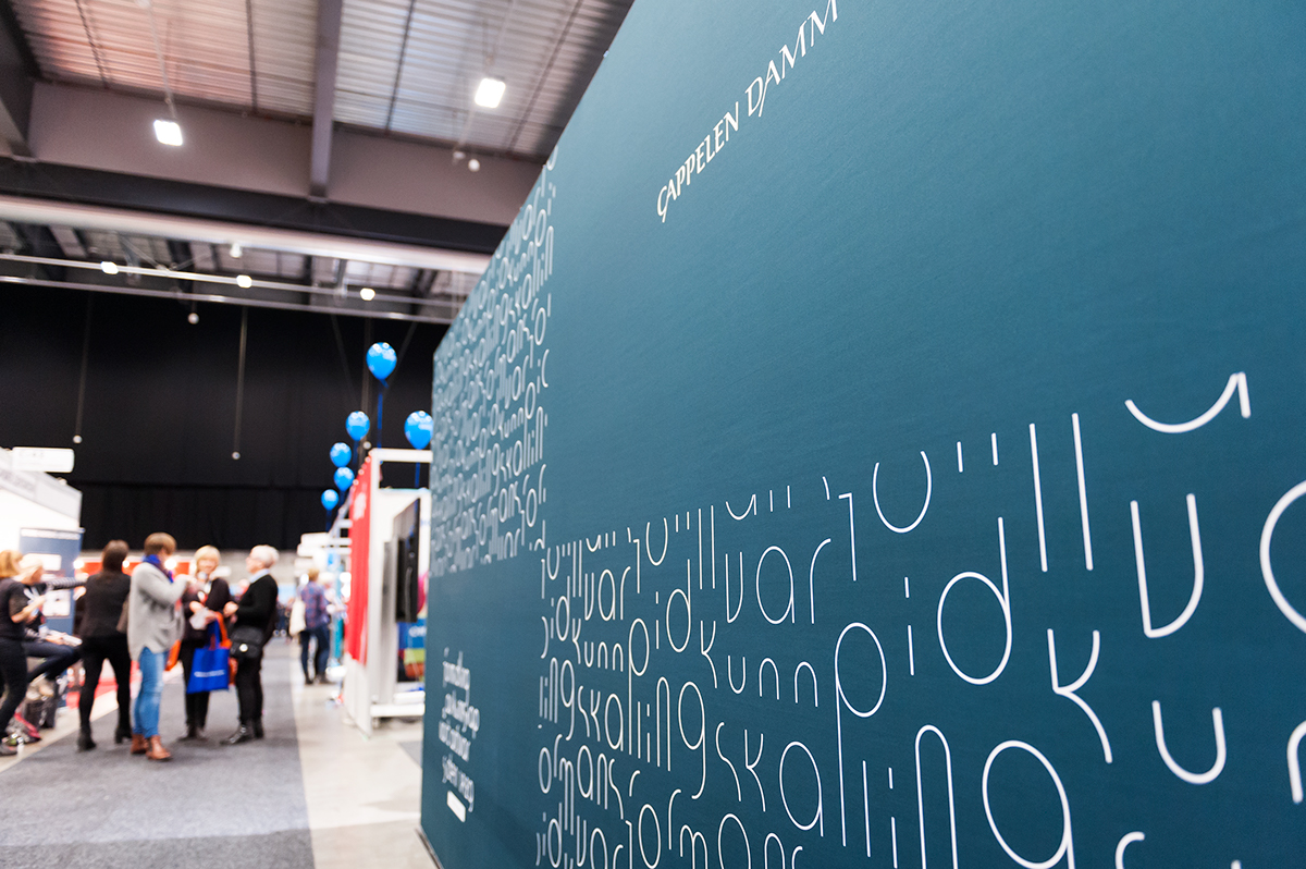
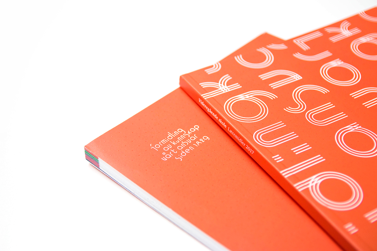
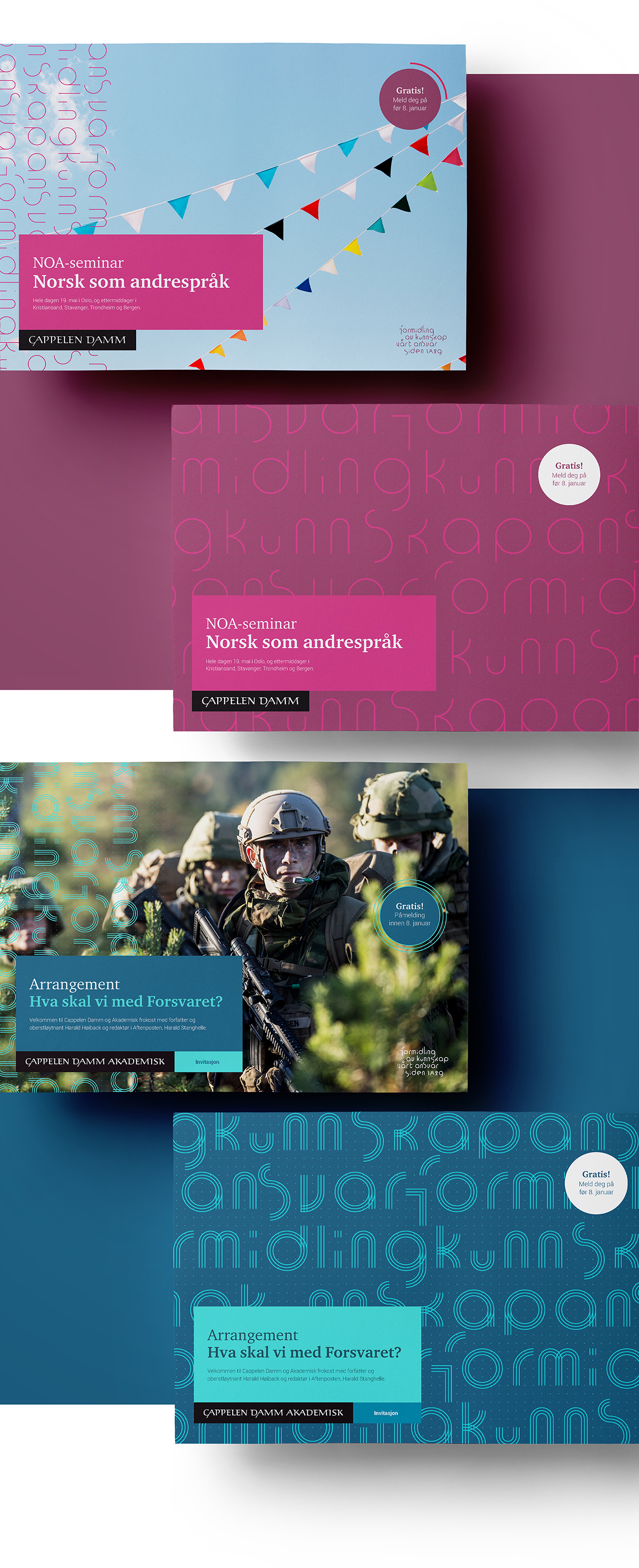
the brand promise «Sharing knowledge. Our responsibility since 1829.»
was included in the brand communication. Our task has been to create
a visual interpretation and an identity based on this promise.
books and supplementary material in Norway. To clearly communicate
a commitment to continue to be the leading publisher in this field,
the brand promise «Sharing knowledge. Our responsibility since 1829.»
was included in the brand communication. Our task has been to create
a visual interpretation and an identity based on this promise.
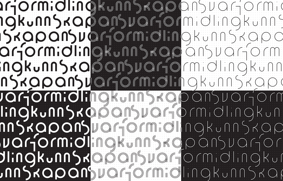
Education is about facilitating learning through systematization
and piecing together bits of knowledge and information. The familiar
«connect the dots»-drawings is often used to increase drawing- and
counting skills and was used as an inspiration for creating Cappelen
Damm Undervisnings new visual identity. Instead of making the brand
promise a static part of the existing Cappelen Damm logo, we made
the brand promise itself to be the most important design element.
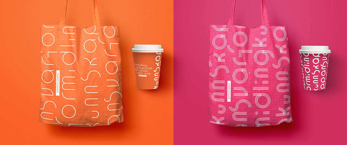
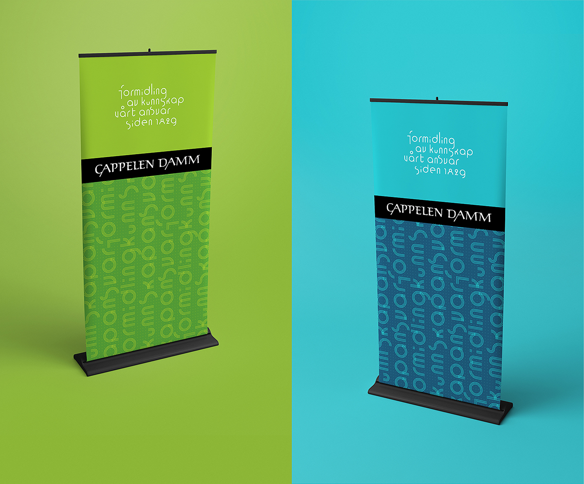
Along with a vivid colour palette and new typography we extended
the thought of connecting the dots to a versatile grid that together
with «connect the dots»-brand promise makes the new visual identity.
and piecing together bits of knowledge and information. The familiar
«connect the dots»-drawings is often used to increase drawing- and
counting skills and was used as an inspiration for creating Cappelen
Damm Undervisnings new visual identity. Instead of making the brand
promise a static part of the existing Cappelen Damm logo, we made
the brand promise itself to be the most important design element.
Along with a vivid colour palette and new typography we extended
the thought of connecting the dots to a versatile grid that together
with «connect the dots»-brand promise makes the new visual identity.