Back in May of 2011 I released the layering typeface Idler. After six years, I felt it was time to upgrade, refine, and greatly expand it as Idler Pro.
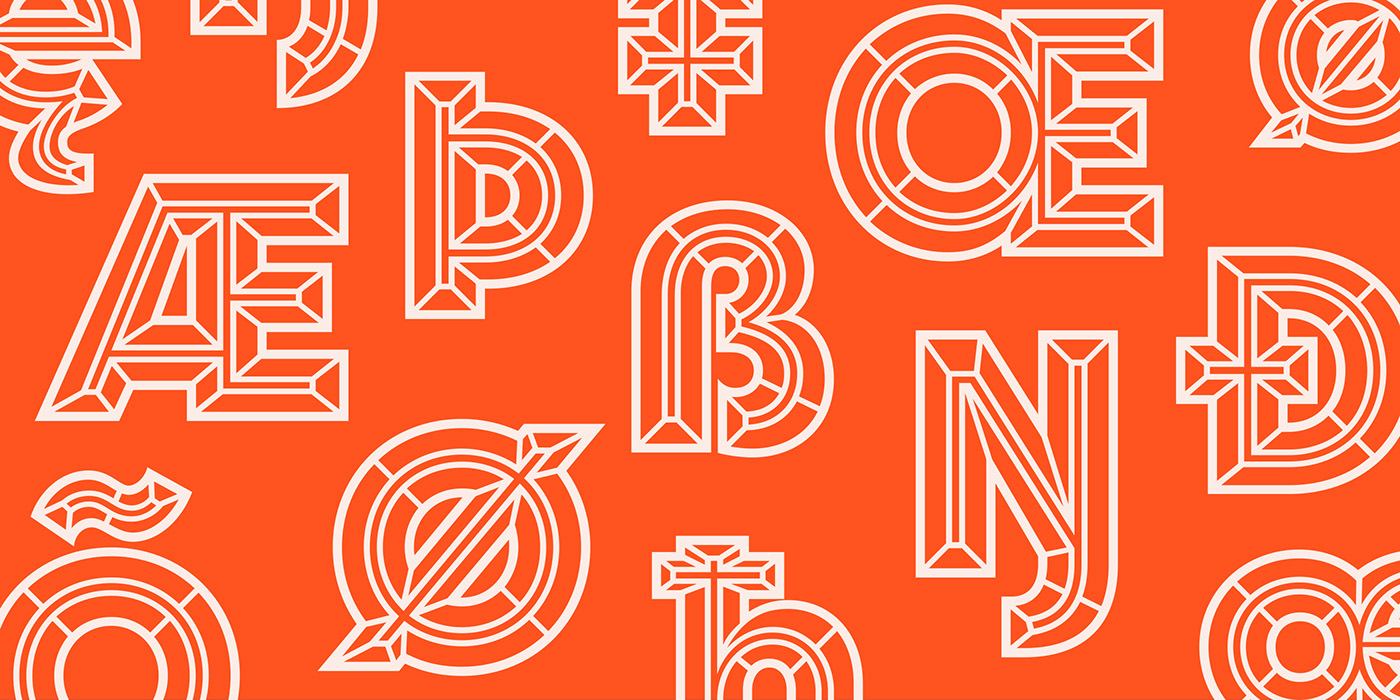
Every glyph has been completely redrawn. As a result, Idler Pro has far superior proportions, letter fitting, and overall harmony of shape and contrast. This is not subtle tweaking but rather a major upgrade.
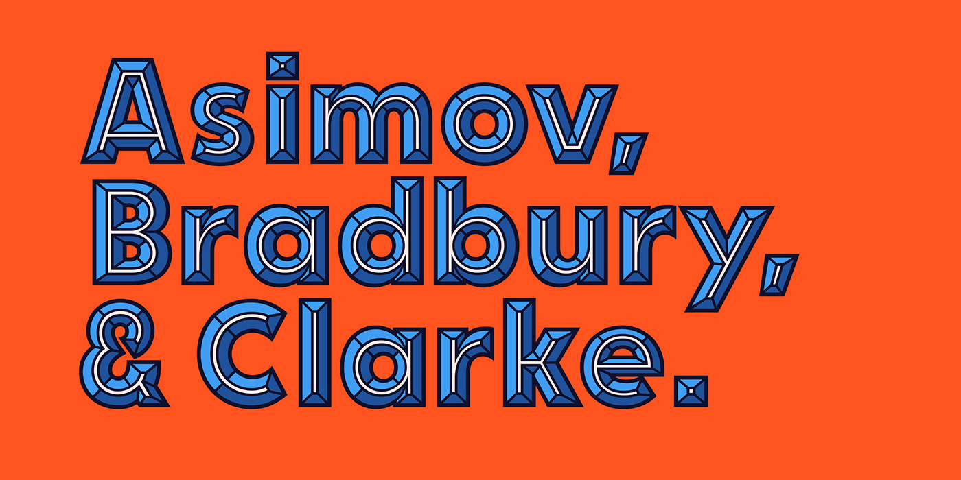
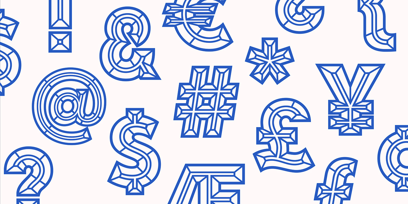
The most apparent addition will be the fact that Idler Pro now contains a full set of lowercase letters. However, even the capital letters, symbols, and numbers should feel much more refined and work much better together. Also, the layering is far more precise and fine tuned, allowing for all new combinations of layers that weren't possible before. Idler Pro also has a more thorough and superior collection of international characters and accent marks.
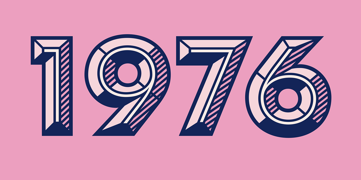
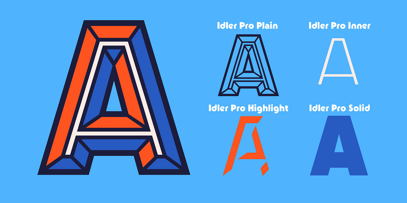
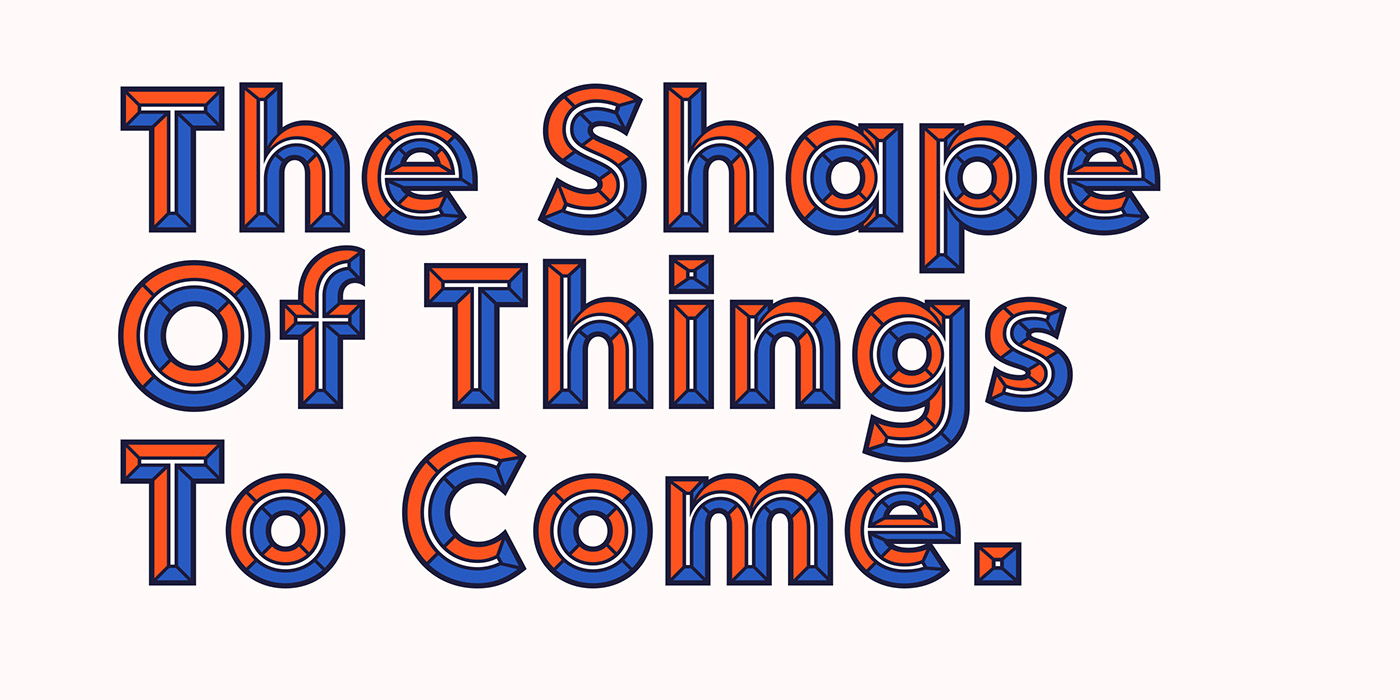
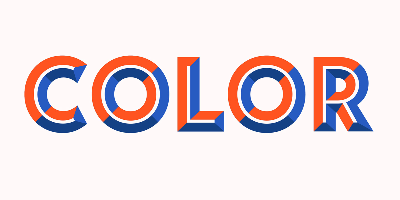
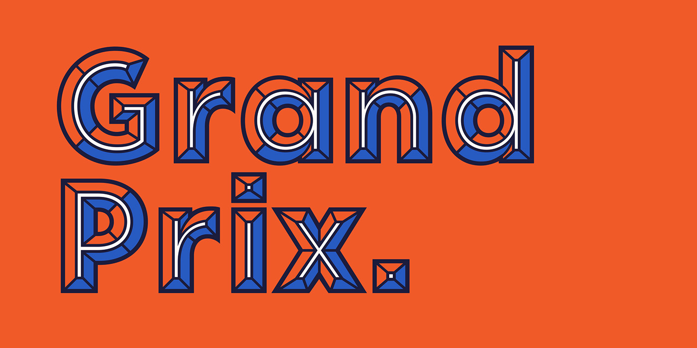
For those unfamiliar with Idler, it's a typeface built with layers in place of weights. Idler Pro's two main weights (Idler Pro Detail and Idler Pro Plain) can be used effectively on their own, but the typeface's true potential is realized when the user stacks the shaded weights with the main weights to create colorful, multi-layered effects.
The following gallery of images showcases just how versatile the Idler layering system is. Now with Idler Pro, it’s far better and has more utility than ever.
Idler Pro can be purchased here: