Goal App - Homepage Improvements
After the Goal app was released over 6 months ago, we were receiving feedback from our user base that prompted us to make some changes.
As the UI designer on this project I also worked alongside a UX designer to create this outcome. Below I will outline the changes we made to improve the homepage.

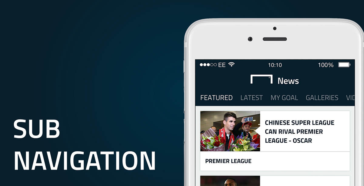
One of the main areas of focus was the content categorisation. The original app had an infinite list of news separated by content type e.g 'Latest News' or 'Video', which users found tedious and confusing to scroll through.
To resolve this we made a sub-navigation which surfaces categories to users instantly.

Another big change was the main navigation. Previously the apps navigation was at the top of the screen, this has now been moved to the bottom to follow usability principles and guidelines set by Apple and Google. There are also changes with how the user interacts with the content. Previously a swipe left or right would change section on the main navigation however now it switches between news categories, further increasing the users understanding of the news types the app offers.
There were also changes to the icons. As well as making new ones, we also had to make sure that the ones previously didn't lose their detail at this new smaller size.

One of the main pieces of feedback we received from users was that they like to digest as much content as possible. Taking this into account, the news cards have now been dropped from 285px high to 120px and are much more scannable than before.
UX Designer - Chris Johnson
UI Designer - Ryan Kenworthy


