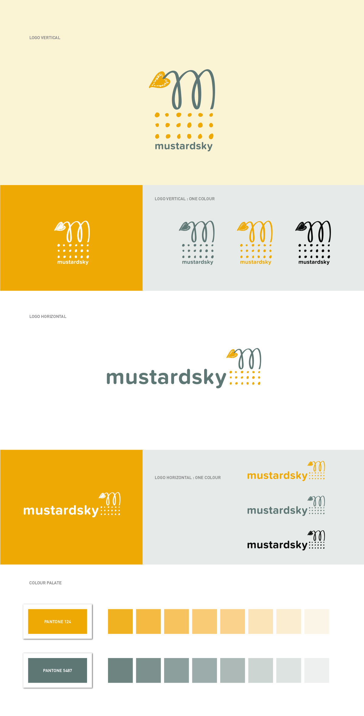
LOGO RATIONALE : The Mustardsky logo is made of two main elements – the mustard vine anchored by a heart shaped mustard pod and the mustard seeds below.
The dots at the bottom are like the individual makers who work with Mustardsky. Each unique talent / seed (be it craft, sewing, or creative thinking) is given the opportunity to create hence the seeds are all different in shapes. The dots also represent the platform for the workers to be empowered and to grow together with us. Everyone is unique and can express themselves freely, as symbolised by the more free-form ‘M’ – the icon with a flower pod that forms a heart shape. In a nutshell, Mustardsky is a brand that empowers the makers to create and grow with us…. towards LOVE!