Erfgoedbalans 2017
Book design for the Dutch Ministry of Education, Culture and Science
The 'Erfgoedbalans 2017' is a publication by the Ministry of Education, Culture and Science that gives information about the current situation of the Cultural Heritage in The Netherlands. This publication is being published once every four years. For the 2017 edition our studio was asked to come up with the concept and design.


The assignment
This project came to us because we were invited for a pitch with two other agencies and won the pitch. The briefing was simple: design a 60 pages book / publication with the corporate identity of the Government of The Netherlands in mind. That meant using the font RijksoverheidSerif.ttf and color palette.
The design
COLORS & FONTS - Because this publication is about cultural heritage in The Netherlands and about different kinds of heritage, such as archaeology, monuments, UNESCO, traditions and born digital heritage, we came up with the idea to give every chapter it's own color theme. The darker blue is the main color in the book (there is no black type in it), the other chapters contain violet, mint, orange, red and light blue, based on the Government identity. To give it a more modern look we wanted to use a different font for the title pages and headings to go along with the classical Rijksoverheid font. We used the Isidora for it's round character and alternative options and added (dotted) lines to give it a stencil / 'still in progress' look. Therefore showing the reference to archaeology and conservation of heritage on one side and the continuously changing heritage with new traditions and discoveries on the other.
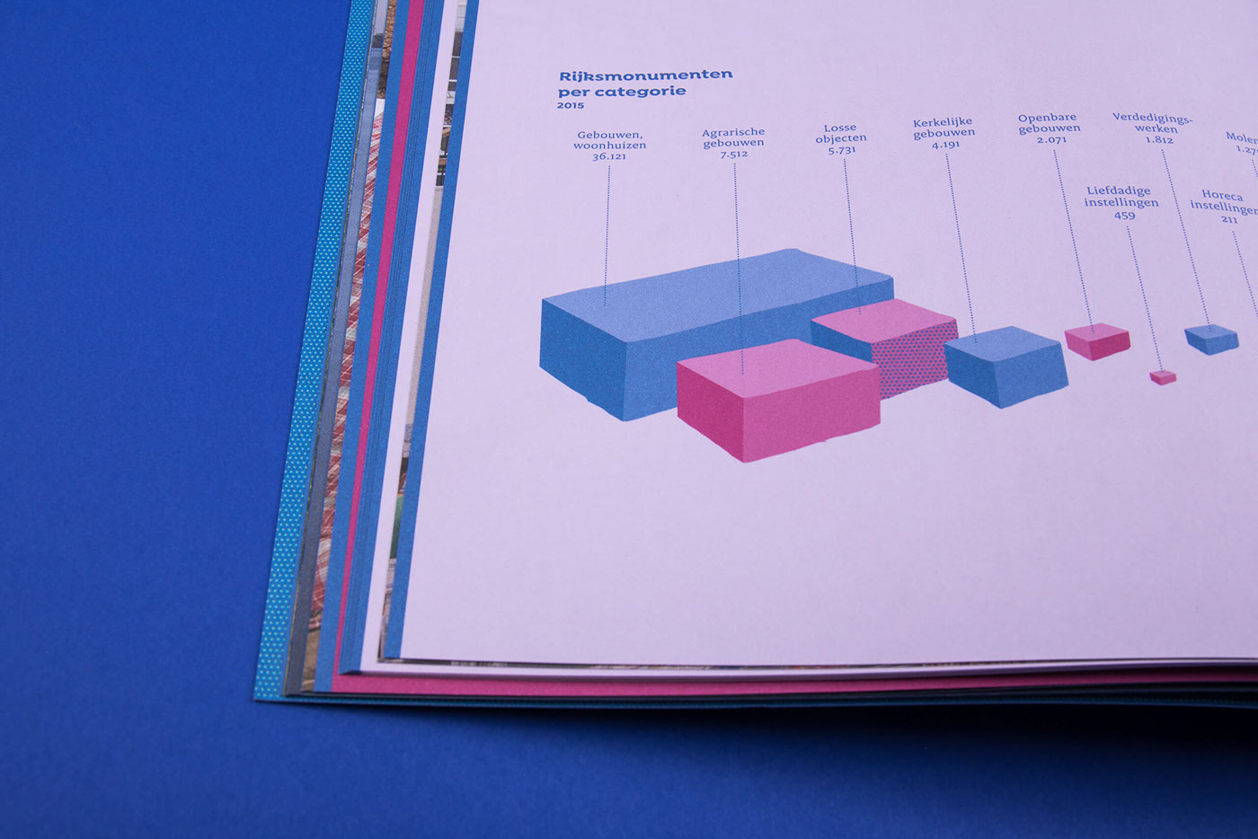
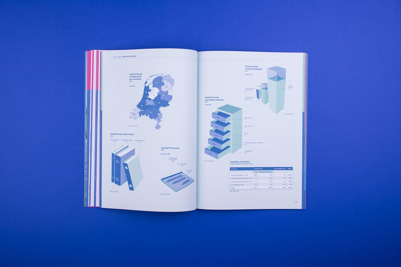
ILLUSTRATIONS - Next to the many graphs and tables in the texts we wanted to give each chapter a section overview with illustration based infographics. Each illustration contains two colors and white with a pattern element and the style is three dimensional and a bit abstract. We wanted to give numbers about 'excavation licenses' for example a more approachable look.
PHOTOGRAPHY - After some research we found a huge online archive from the Cultural Heritage Agency containing almost a million images. We made a selection and luckily got some help of 'Heritage experts' and people from the Ministry. We wanted to show a divers image of Dutch culture, traditions, landscape and new developments and use the images as an image essay between the chapters. Always used as spreads with no text on it, just the photo. In the back of the book you can find an index with some information and copyright of the images. Each chapter closes with a conclusion and an object, showing the scale of the Dutch heritage, from Wadden Sea to shoes designed by Jan Taminiau.
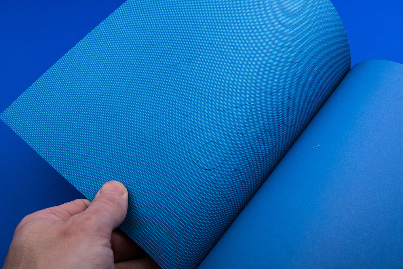
PRINT - The printer is determined by the Dutch Government because of contracts. Therefore we worked with De Bink in Leiden. This turned out to be a good collaboration. Because of the many subtle colour tones we worked with press printing tests to determine the amount of color for each chapter and give the photography it's spark. For the cover we worked with embossing, on the back we used a paper embossing to give the book it's own texture. The paper is Rives Design which has a dotted pattern in it combining the printed pattern on the cover.
The result is a colourful book of 120 pages showing the divers cultural landscape of The Netherlands. On the side you can see the color bars indicating each chapter. By separating the footnotes from the rest of the text we made a clear readable book. With the photography, illustrations and colours we tried to make this book more accessible for a broader audience then just the people from the heritage field or the Dutch Parlement. The binding technique makes sure that the book stays open while you get a cup of coffee.
Many thanks to the Ministry for their confidence and the fact that they were open to our design and design choices. This publication is way different then the usual government reports, but since this comes out every four years, we wanted to make it more special.

