

Introduction
Thrive Snacks is a health-oriented organic snack company. Their main product is based on the pistachio.
Color Palette
The logo has to convey the message of healthiness, freshness, and happiness. The first step to accomplish this is to choose the colour palette.

These four base colours gives the organic feeling that the brand requires.
Concept
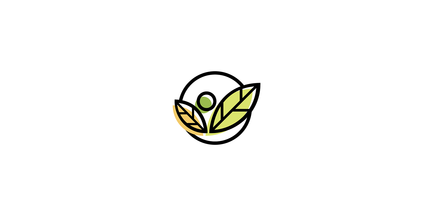
As the company's primary product is a pistachio, I wanted the logo to be based around that.

This, however, feels incomplete. I overlaid a leaf outline and combined it in a circle. The leaf symbolises nature while the circle provides harmony. This gives a new perspective and added depth to the logo.
Typeface
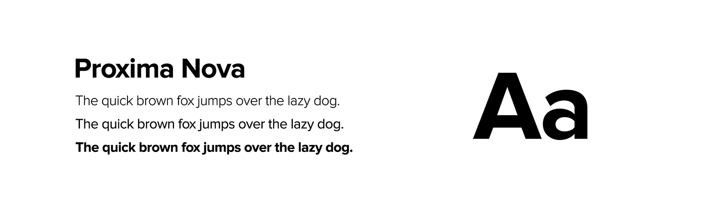
The brand needed a typeface to match. It has to feel friendly and modern. Approachable but steady. I shortlisted three typefaces - Cordale, Proxima Nova, and Pacifico.

Ultimately, I chose Proxima Nova. It's sturdy, therefore achieving contrast with the icon; it's friendly; it's very legible. I didn't choose Cordale because the strokes feel too archaic, Pacifico because it's too friendly and childish.
Complete Logo


