Piazza Critique
INFO 3450 Hall of Fame and Shame 2
INFO 3450 Hall of Fame and Shame 2
For this Hall of Fame and Shame, I am critiquing Piazza.com.Piazza’s motto is “Ask. Answer. Explore. Whenever.” In essence, it is a classwebsite geared toward creating discussions. It is an interesting to study on acouple of levels. Most immediately, it is interesting because I am a user ofPiazza, through requirements of my courses since last fall. I have found beingable to talk to other students online useful, but I have also found my own useof the website quite frustrating. I haven’t given much thought to why itfrustrated me before this assignment. In a broader sense, with the rise ofonline courses and learning tools, many professors, teachers, and those in thepopular media seem claim the future of learning is online. Perhaps that is so,but there is an abundance of online learning tools and “spaces” such asBlackboard, Edmodo, and Piazza, just to name a few. However, in the rush tokeep up with the technological curve, there may not be enough consideration onthe part of educators as to how the design of these systems may affect howstudents learn and interact with each other.

An overview of the Piazza interface
Piazza is visually separated into 2 main sections. The feedon the left displays a list of posts, starting with pinned and favorite posts,then listing the rest in chronological order starting with the most recent. Avariety of symbols are displayed here, indicating information such as if thepost is a “note,” when it was posted, tags, how many new responses there are,student and instructor responses, if it is an instructor note, if there areattachments, and if it is favorited or not. Unread posts are displayed in blackand have a very light blue bar on the side, but read posts are slightly lighterand do not have the blue bar. There is also a small menu with options toarchive, mark as read/unread, or getting the weblink, when you hover over partof the post. At the top of this section is a button for new posts and a searchbox.
The second section is the main post section, which has thenote or question, text that accompanies it, and follow up discussions, whichstudents can reply to, and mark as resolved or unresolved. At the bottom of theinitial post are options such as editing, favoriting, and a drop down menu withmore options (follow the post, attach files, or mark as a duplicate or spam). Atthe top of this section is a bar that slides to show you the history of thediscussion.
Around the periphery are various options and icons, fromchanging the view of the feed, providing updates, statistics, accountinformation, and ways to navigate to other courses. At the bottom is also aticker of recent activity, average response time, and the number of peopleonline now.
The Good
Piazza has some great utility. In providing many avenues fordiscussion (questions, notes, follow up discussions, replies to them), itencourages users to post. Furthermore, adding the statistics bar at the bottomshowing current response times encourages users to post, to “beat” the averageor highlighted response time – in the same way that online games will shareother users’ high scores to encourage people to keep playing.

The statistics bar is a subtle way of cluing in users to make their own posts and add to the website. If users dramatically affect the response time or answer a question quickly, they can see relatively quick feedback, seeing how they influence the system.
Piazza also provides a lot of visual feedback – when you mouse over most icons, tooltipswill display what the icon means. The symbols and colors all provide usefulinformation (once you know what they mean).
It is also relatively aesthetically appealing. In contrast,Blackboard, another common school class site is, has a layout based on htmlframes and tables. While updating its look with colors and rounded edges, thebasic layout has stayed the same, limiting its aesthetic appeal. In contrast,Piazza is bright with its blue, gray, and white color scheme and its use ofrounded buttons and icons seem natural and modern. There are some visualdistractions, but overall, the website has a nice aesthetic.
In terms of functionality, when make new post, you’reallowed to use certain rich text elements like lists, bolding, and underlining text,as well as being able to format code and equations, which provide an advantage overother sites that don’t have such options, which are quite important for acomputer science, math, or science class. Yet at the same time, there areenough constraints that users can’t post any html in their posts, functioningto limit what can get posted.
The Not-So-Good
In terms of functionality, it seems that Piazza has a fullset of available tools and options that render it a flexible tool. However, itcan be hard to organize and make sense of the available functions for severalreasons. These include a bad mapping (and understanding) of icons, limitedvisibility of options, and everything being spread out across the screen, in abad use of proximity. Together, these widen Norman’s gulf of evaluation, as itis hard to tell what is going on with the system for the untrained user. Piazzaseems complicated at first, because a lot of the knowledge that it requires is “inthe head” and not “in the world.”
For example, Piazza indicates that certain posts are “notes”by using a square with several lines. This is a nice icon, but looks remarkablysimilar to other websites’ icons for something being draggable. In fact, Ifirst thought that the icon meant that posts were draggable, and when theywouldn’t move, I thought my browser had froze! This is an example of a mismatchin the design model and conceptual model, as well as bad mapping of an icon.
For example, Piazza indicates that certain posts are “notes”by using a square with several lines. This is a nice icon, but looks remarkablysimilar to other websites’ icons for something being draggable. In fact, Ifirst thought that the icon meant that posts were draggable, and when theywouldn’t move, I thought my browser had froze! This is an example of a mismatchin the design model and conceptual model, as well as bad mapping of an icon.
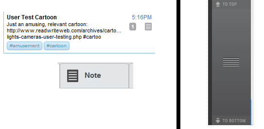
The Piazza Note Icons (left) look very similar to the conventional "drag bar" icons, such as those in Behance. This shows bad mappings, and a lack of following convention. While that can be helpful sometimes, it hurts usability here.
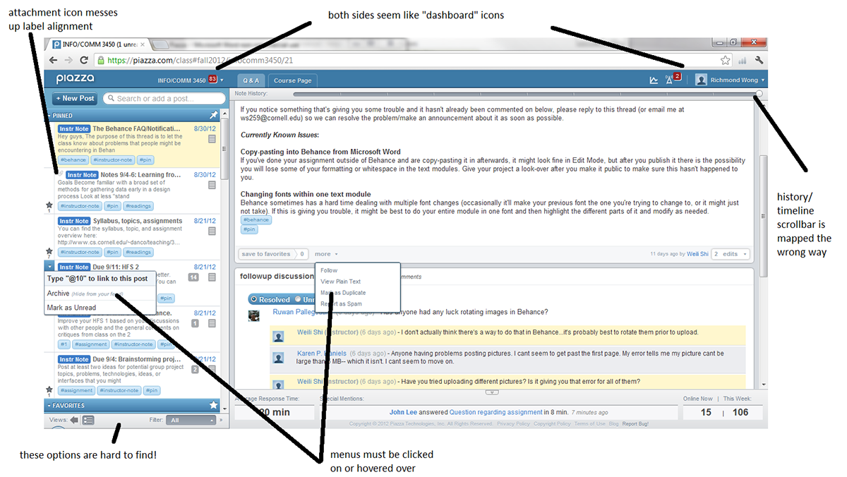
There are some lapses in visibility – for instance, in thereading pane, the bar at the bottom of each post that indicates options such asfavoriting or editing, is easily missed when there are follow up discussionsbelow. Furthermore, having options all over the screen (at the top for account,the bottom for feed views, and drop down menus in multiple places)makes thesite less aesthetic, and also makes it hard just to tell what is possible,again widening the gulf of evaluation. It took me a year to find out you couldchange the preview size of posts in the feed! It’s also hard to tell what isclickable. It seems that the stars in the feed should be clickable to favoritea post, but you can only do that in the reading pane. It is also to know whaticons can be clicked on until you actually try clicking on them; another lapse invisibility.
There are several problems with the interface.
I like the functionality of the timeline scrollbar, allowingyou to see past revisions or discussions within one post. However, discussionsscroll up and down, while the timeline bar is oriented horizontally. This couldbe better mapped by making the timeline bar vertical.
Aesthetically, in the feed, the “attachment” icon (whichuses the convention of the paperclip) shifts the instructor note block tag,which messes up the alignment, and can feel jarring, as there is no longer astraight left line to follow. Also, while I appreciate the subtleties inmarking a post as read (having gray text and the disappearance of a light bluebar), there is not enough contrast to easily tell what has been read or not.
Aesthetically, in the feed, the “attachment” icon (whichuses the convention of the paperclip) shifts the instructor note block tag,which messes up the alignment, and can feel jarring, as there is no longer astraight left line to follow. Also, while I appreciate the subtleties inmarking a post as read (having gray text and the disappearance of a light bluebar), there is not enough contrast to easily tell what has been read or not.
Improvements
There are many ways that Piazza could be improved. First isthe “note” icon. Instead of straight lines, a simple change to bullet points wouldconvey that the post is a note or list or something that conveys information, whileavoiding being confused with a “draggable” box. This will follow convention andprovide better mapping. There isn’t much tradeoff here, besides the time andmanpower needed to create the new icon and code it into the interface. Othericons like the statistics icon can also be changed to provide better mappings.

A simple change in the design of the "Note" icon could go a long way in improving usability by being better mapped.
For the timeline scrollbar, it could be reorientedvertically on the side. One of the tradeoffs is that by doing so, you will losesome horizontal space on the screen, which is already crowded because of the2-column layout. Furthermore, it is possible that a vertical timeline bar couldbe confused as a scroll bar. Perhaps if it is a thick solid line divided upinto “time blocks” it could be mitigated. But this tradeoff is made up for byhaving a representation of a timeline that has a much better natural mapping,where down on the bar and down on the screen both correspond to newer posts.Another part of this tradeoff is that perhaps people will be confused becausethey are used to the Facebook model (especially amongst the age group using theside), where up corresponds to newer posts.

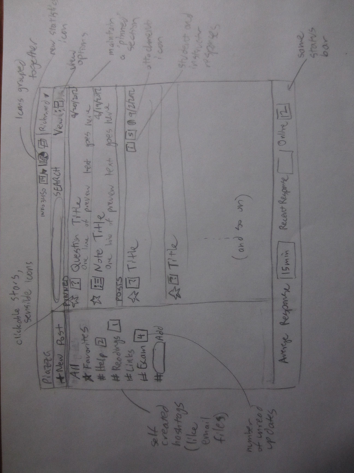
Here is a sketch of how the main post-reading part of the interface could be improved through additional visibility, repetition, and natural mapping.
In the feed, aesthetics can be improved by moving where theattachment icon is shown. Visibility can be highlighted, by creating a largercontrast between what has been read and what hasn’t. Perhaps having abackground color would do this, or changing what is bold and not. Making aclickable star in the feed would greatly help show what’s visible, and movingthe view options to the top (instead of having sort options at the top and viewoptions at the bottom) would help make all the users’ options more visible. Thismay lose some of the subtlety that is part of the current scheme, but thegreater visibility should help usability. Similarly, in the reading pane, the “action”bar can be moved up to be made more visible, but that also loses some of the subtletythat is present in the current scheme (which makes it hard to see!).

A sketch of how the aesthetics, mappings, and visibility of the feed portion of the interface could be improved.
However, I was also thinking of some larger conceptual changes.I figured out that for me, this mental model of the feed did not work well forme. To me, it does not have enough information architecture. My model of aclass discussion site clusters information into some hierarchy, such as sortingby topic. The single feed model makes finding specific information, such aspast assignments, difficult, because everything is thrown into one feed, and itis hard to separate signal from noise. While the ability to favorite posts oradd hashtags gives some sense of order, it isn’t enough for me to navigate.Feeds work well on sites like Facebook or Twitter, because I am not interestedin what happened 2 or 3 weeks, or even months ago. This made me think of themental model of email –this summer I had an internship in a fast pacedenvironment, and it was not uncommon to get 50+ emails a day (on par with myPiazza feed), but I never felt as frustrated. And this is because the mentalmodel with email is different. While like a feed of incoming messages, email istreated more like a file system than a feed. Perhaps I could apply this toPiazza.
My new concept for Piazza is based off an email model morethan a feed model. The feed now takes up the main portion of the screen, and onthe left is a set of user tags. Like filing emails into folders or categories,users can add their own private tags to posts (or drag the posts to the tags).Theseprovide a user created sense of information architecture that is missing in thecurrent implementation of Piazza.
My new concept for Piazza is based off an email model morethan a feed model. The feed now takes up the main portion of the screen, and onthe left is a set of user tags. Like filing emails into folders or categories,users can add their own private tags to posts (or drag the posts to the tags).Theseprovide a user created sense of information architecture that is missing in thecurrent implementation of Piazza.
A sketch to see how Piazza might look if based off of an email-feed model rather than a social media-feed model.
What was the feed ismoved over into the larger window. Clicking on a post will open it in the sameway posts are currently opened. A pinned section will stay at the top of thenew post feed. This new conceptual model seems to have more organization, or atleast as much organization as a user wants to use. Icons are aligned to try toprovide a nice aesthetic feel. All the viewing options and dashboard typefunctions are located near the top, following the guidelines of proximity, aswell as visibility, so that these like functions are grouped near each other. Ihave also tried to include the smaller changes discussed earlier regarding visibilityand mapping. The major tradeoff of this redesign is that the current users whohave worked to get knowledge in the head of how Piazza works will no longer beable to use that knowledge, because it is different. Also, you lose the abilityto browse the feed and view a post at the same time. I never saw this functionas being especially useful, but perhaps there are others who do. Also, theremay be something about the current design that encourages participation that Iam removing unknowingly, which would put quite a dent in the whole point havehaving Piazza be a place for conversation. However, I think the benefits inease of use by adopting a familiar mental model, and the added benefits ofbetter visibility and aping make the tradeoffs well worth it.
Furthermore...
Socially, a tool like Piazza may change classroom dynamics atthe college level, by allowing students to have a larger voice and role in thecourse. Piazza is probably most usefulfor large lecture classes, and alters the dynamic of learning from a one wayprofessor lecturing to students model to a more discussion based model, whetherthat is discussion amongst peers, or with instructors. It helps elevate the legitimacyof student discussions as part of the formal learning experience, and notmerely an outside-of-class, get-with-your friends one.
There are potential “big brother” concerns about privacy,and what instructors and other students can see and know about one’s privateinformation. The “post as anonymous” functionality is a great way to helpalleviate some of these concerns, but at the same time, it’s not clear tostudents what instructors are able to see (such as if they read certain posts,downloaded certain files, etc), and perhaps having greater transparency couldbetter define the social boundaries of the Piazza environment.
There are potential “big brother” concerns about privacy,and what instructors and other students can see and know about one’s privateinformation. The “post as anonymous” functionality is a great way to helpalleviate some of these concerns, but at the same time, it’s not clear tostudents what instructors are able to see (such as if they read certain posts,downloaded certain files, etc), and perhaps having greater transparency couldbetter define the social boundaries of the Piazza environment.

