
Filmore was born from the simple idea that skincare should be 'a routine not a regime'.

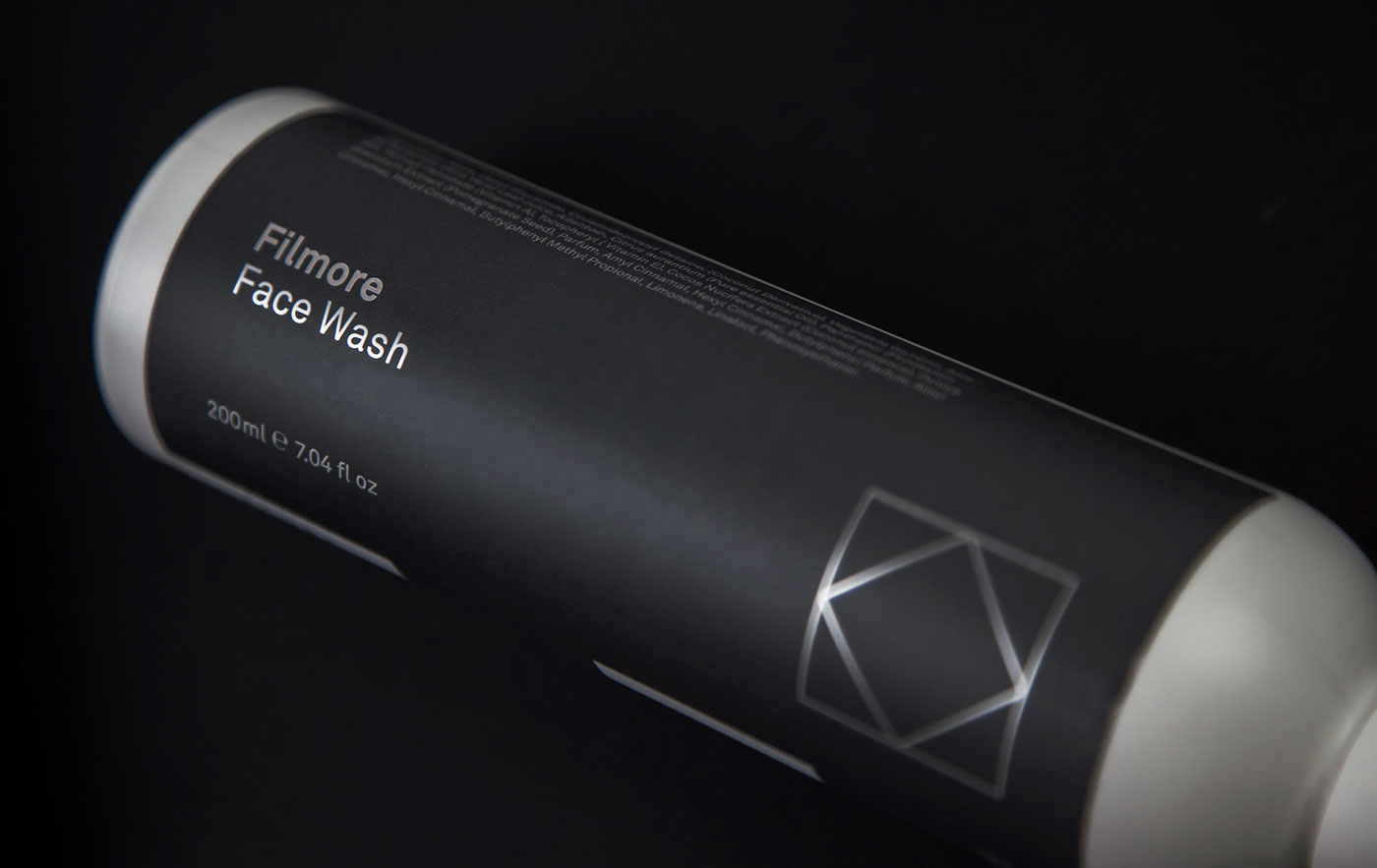
Crafted in Scotland, Filmore’s products use natural ingredients such as Scottish water, coconut oil and pomegranate extract to guarantee skin will always be clean and hydrated with minimal fuss and no irritation.
Taking inspiration from the Scottish water used we referenced the initial‘F’ in the International Code of Signals (ICS – an international system of signals and codes for use by vessels to communicate important messages) to create a clean, minimal marque.

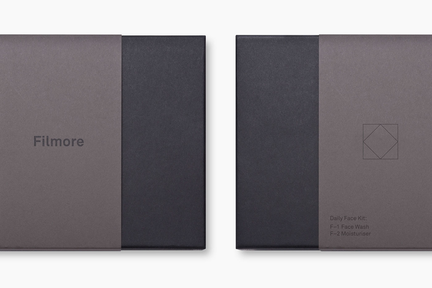
The overall identity then uses a series of interlocking bold F’s to create a grid structure for product information, directions for use and ingredients.

The routine idea is emphasised through a unique numbering system (F–1 / F–2) logically designed to encourage the routine application of the products and their complementary use together. As additional products are added to the range this allows for skincare routines to be carefully curated and developed.


—
Client: Filmore Skincare
Role: Design & Strategy
Discipline: Corporate identity / Packaging
Website: Filmoreskincare.com
More info: Contact studio@freytaganderson.com
Role: Design & Strategy
Discipline: Corporate identity / Packaging
Website: Filmoreskincare.com
More info: Contact studio@freytaganderson.com


