Honey Monster Puffs commands enormous consumer affection and recognition, but had lost a little relevance. After reducing the sugar content down from ‘red’ to ‘amber’, the next step was a full repositioning and rebrand.
Robot Food embarked on a study of consumer trends followed by a collaborative brand workshop to establish the new positioning, mission and values. After this came new product development workshops to develop a pipeline of exciting new products.
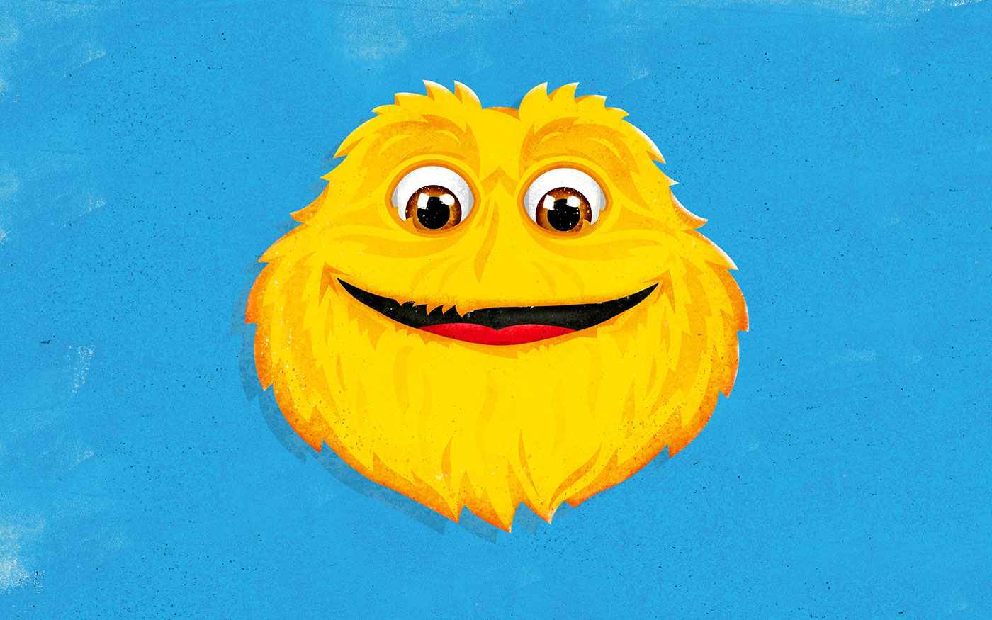
Working to the new brand blueprint, the team’s design strategy aims to throw consumers off their autopilot while retaining key brand equities – including the new-look Honey Monster, who proudly takes center-stage on packs. Moving him on from his old suited character, Robot Food created a flat, clean graphic Honey Monster for a friendlier, contemporary effect.
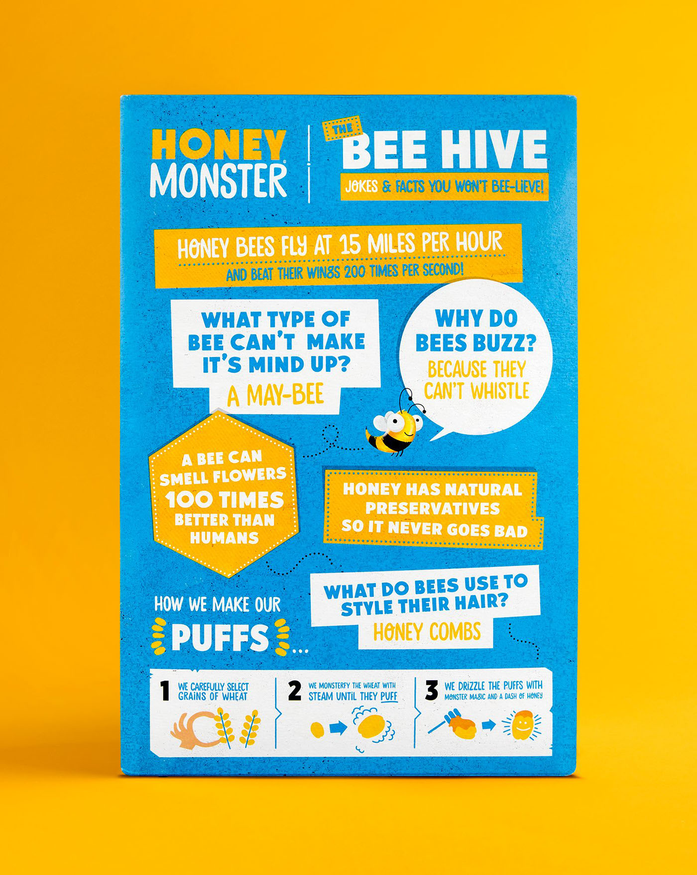
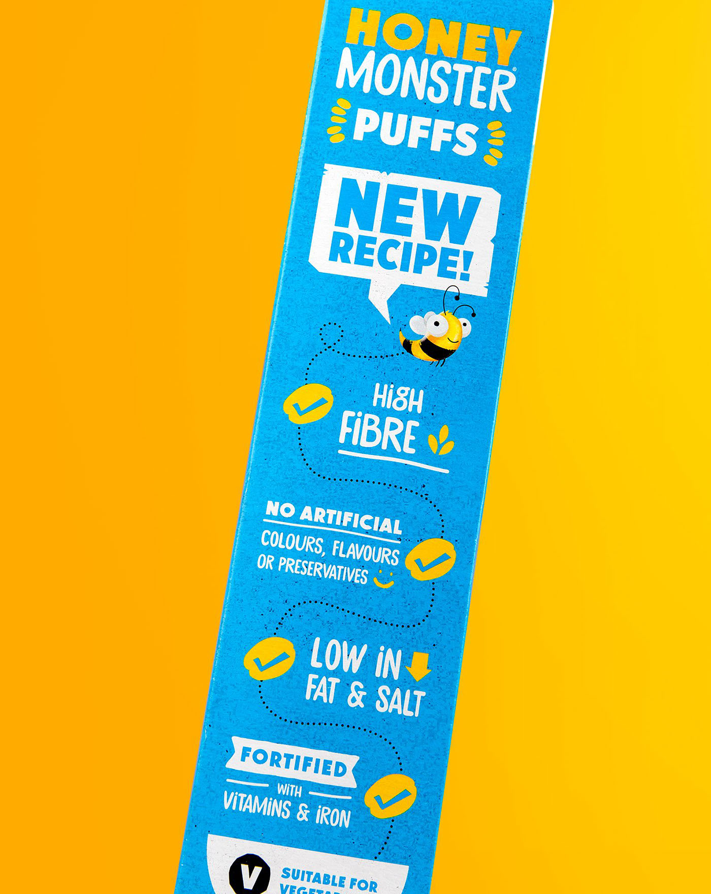
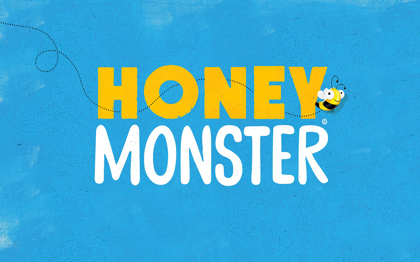
The new pack hierarchy is cleaner and clearer, and the prouder, bolder brand marque replaces the previous brash red logo with a tastier, more considered yellow and white colourway. The fun, straight talking tone of voice is accessibly witty with transparent pack claims – a refreshing contrast to some cereal brands’ tendency to over-claim on health and under-claim on sugar content.