
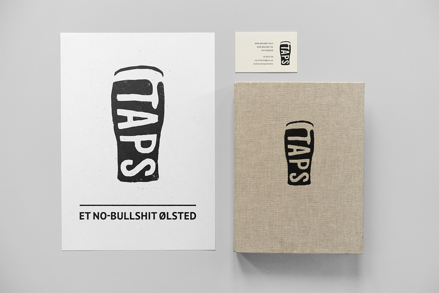


Logo and identity design for Taps, a no-bullshit beer pub in Trondheim.
The logo is a stylized version of a pint glass with the bar name TAPS flowing down its side like beer foam. It also depicts the silhouette of a classic beer tap handle. With its simplfied characteristics, the logo refers to the qualities of craftsmanship and DIY ethics. The logo marks a direct and straight-to-the-point attitude; This is a no-bullshit beer pub!
Photo of Håvard LJ at Taps by Jorg Solheim.
Client:
Taps
Technique:
Ink on paper, digital
Ink on paper, digital
Year:
2015
2015

