
Brief
The aim of this project was to update the existing website for a Brighton based company called BOSH Run. This company started on Facebook and is a service where people of all skill levels can communicate with other runners and arrange to meet up at social and running events. Key points stated by the client were:
1. Colour scheme must be blue to stay within the branding guidelines
2. Must look like it’s made for the people (not too professional)
3. Users must easily be able to see dates of events
4. Target audience age group is 16-60
5. The website must have the follwoing features: Chatroom, Forum, Race diary, Members area, Photo gallery, Shop and Links to social media
Brand/competition
The project started out by carrying out research into the BOSH run brand and the competition (such as Watford Joggers, Fetch Everyone and Barking Road Runners).
I found that the main disadvantage BOSH Run had to its competitors is the lack in features as it only has 3 pages, whereas the competitors websites had lists of events, specific areas for members, forums and a fully functioning online shop.
The only advantage BOSH Run had over the competition was that the website felt very friendly and personal. This was achieved by having pictures of BOSH run members on the home page as well as a blog created by the owner. In comparison, the competitors' websites look very corporate.
One of the key targets I made for this project was to retain the friendly and personal image of the website.
User research
User research was carried out by potential users of the site (people interested in running) completing a questionnaire aimed to find out what types of tasks they are likely to complete on this website.
The results from this questionnaire helped aid the navigation design process by allowing me to understand how the users will navigate the website.


Navigation and wire-frames
Navigation was decided through card sorting and laid out using post-it notes before wire-frames were made in Balsamiq Mockups.


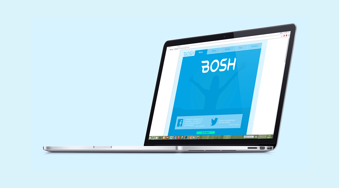
Visual style guide
The colour blue was predominately used to represent the BOSH Run brand and a complimentary shade of green was used to highlight any interactive areas. Different shades of blue were used to show areas in different states. Helvetica was used as the typeface as it matches the simple and clean design of the site.

Design
The aim of this design was to add functionality while retaining the friendly image of BOSH Run. This was achieved by making the user experience as simple as possible, the focus being on making the user feel as if they can always retrace their steps if they end up in the wrong place. The design takes advantage of tabbed views in order to achieve this effect.
The ability to search for events by difficulty means that the service appeals to anyone, whether they are professional runners or it is the first time they are going for a run. This translates into the forum which can also be sorted by expertise in running.
Once the user logs in as a member, they have the ability to post a new personal best at the push of one button. Their personal best results will be visible to all other members on the forum.


Conclusion
This project has taught me many new skills in web design. I learnt the importance of thoroughly researching the target audience in order to understand their needs and how to design a user experience that will best meet those needs.
The most challenging part of the project for me was creating something that stands out from the competition. I overcame this by creating something that is simple to use, exciting and appeals to all levels of runners.
The next step for this project is to make these designs responsive, meaning they will work across a range of different devices. Watch this space for future updates.