Puffy Love Identity
Our objective when creating a new brand for the gourmet marshmallow maker was to create a look that reflected its mission to elevate the humble marshmallow and appeal to sophisticated foodies.

Brand Mark
The concept was to play on the most recognizable symbol for love—the heart. To make the brand approachable and to distinguish the overused heart symbol with something more unique, we decided to transform it into a character. The division of the heart into pieces communicates the complexity, intricacy, and rich taste of these bespoke marshmallows.

Colour Palette
The colour palette is bright, fun, and playful. In a further attempt to build on the heart symbol and the word love, while creating a playful brand inspired by the word love, the main brand mark is coloured in tones of pink while the flavour colours have a pastel yet retro feel to create a soft and nostalgic feel. Each flavour icon has different colours that communicate the individuality of each flavour.


Flavour Icons
One of the challenges was creating a system for the ever-growing flavour list. Borrowing the form of the mother brand, each icon was transformed into a character using colours and a unique name to communicate the flavour and the quality of the marshmallow. For example, Lovely Lavender is romantic and elegant, while Raspberry Lemonade Crush is refreshing and playful. Seasonal, limited edition, and custom flavours are embellished with characteristics in order to communicate the premium product.


Graphics
To communicate qualities of the product beyond the flavours and character, we designed supporting elements to the brand. For example, we designed a set of sleek-line icons that can be used to communicate something specific in limited space but also flat illustrations to accompany larger sections of information. We also created typographic compositions that can accompany other graphics or be a standalone graphic that is the bare minimum of the brand.


Packaging
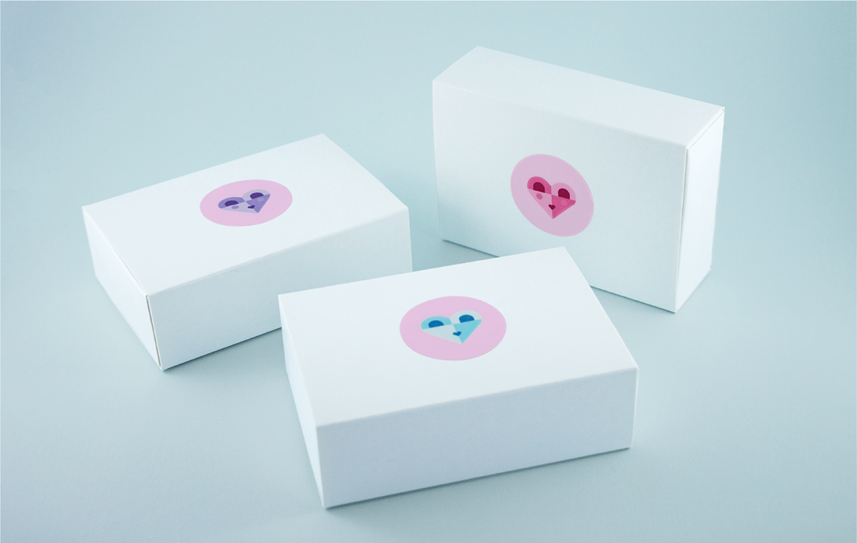
Puffy Love marshmallows are made to order and not sold in retail, so the packaging needed to be affordable, easily sourced in large quantities, and available at last minute. Other challenges included protecting the marshmallows from light and ensuring they kept their shape during shipping and were customizable for all flavours. We locally sourced minimal white boxes that fold and are inserted into a sleeve, which prevents the box from opening and losing its shape. To maintain a minimal look, we created stickers that simultaneously communicate the flavour and the brand. And instead of a label we designed card inserts that contain all of the information.


Photography
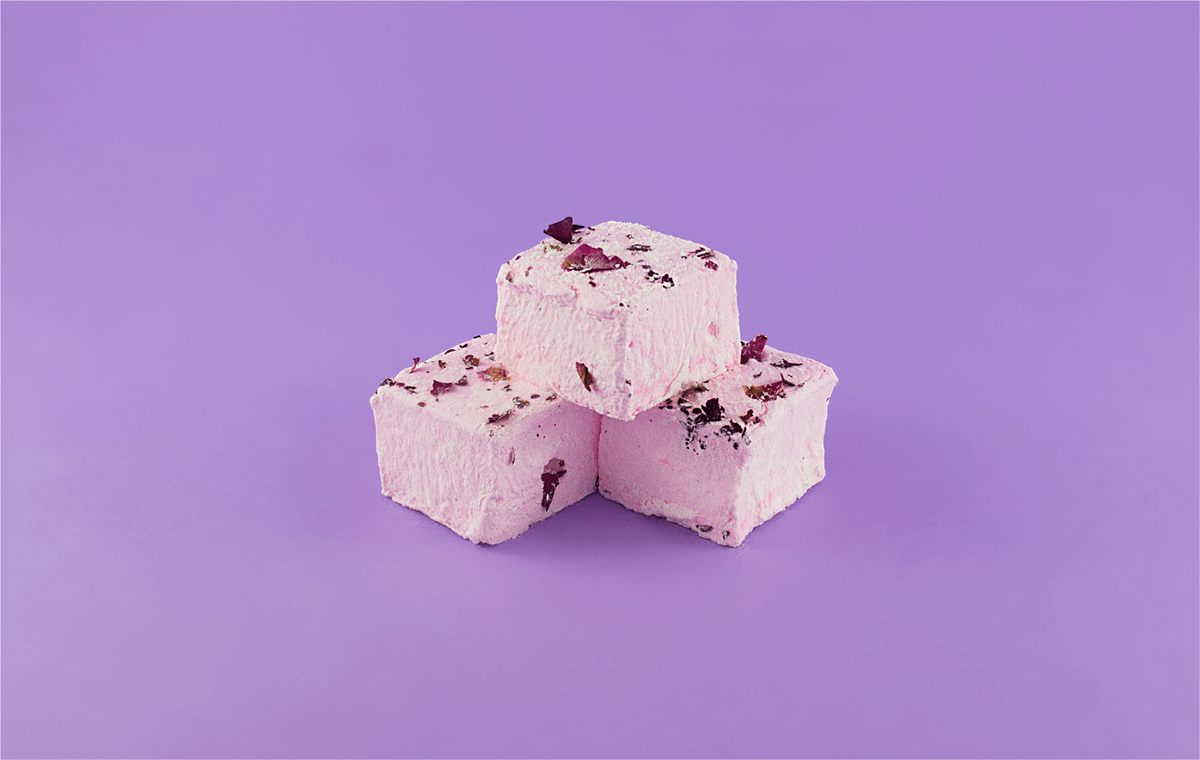
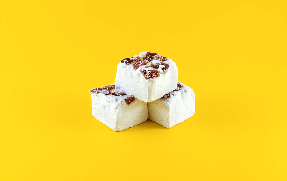
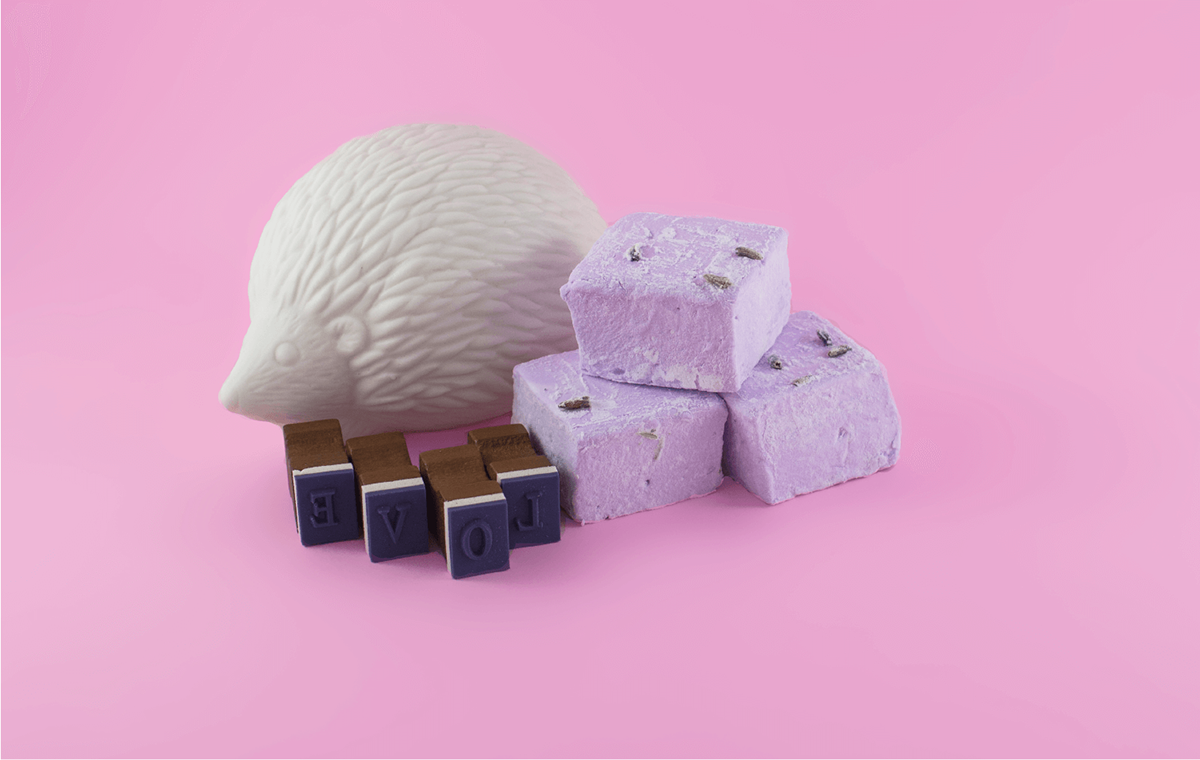
It was important to communicate the softness and airiness of the product and the playfulness of the brand through the photography. We accomplished this objective by presenting the marshmallows on pastel backgrounds with consistent compositions for all flavours and accompanying props that communicated the essence of the flavour in a playful way.


Print
The branded applications act as a way to promote the products and to engage with future customers. Some of these materials include business cards for the founder and a flyer to showcase the main flavours to shoppers. In addition, we created a patch that can transform apparel into a uniform.


