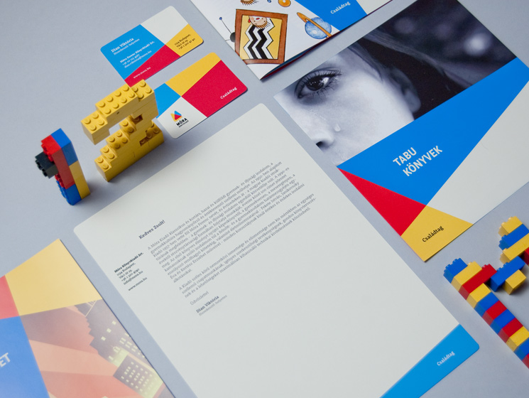
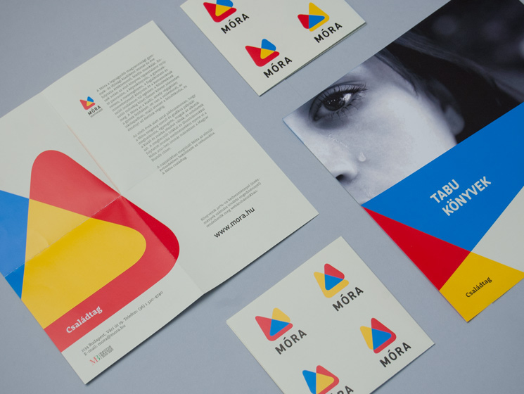
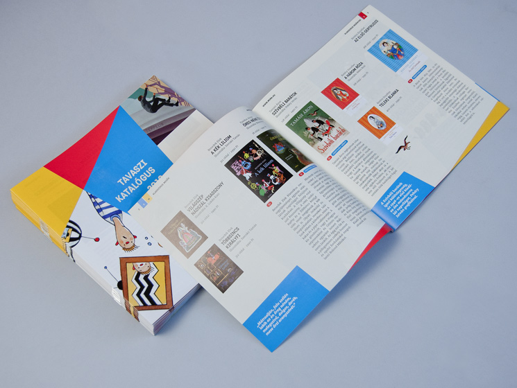
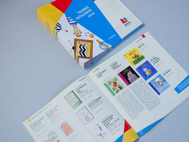
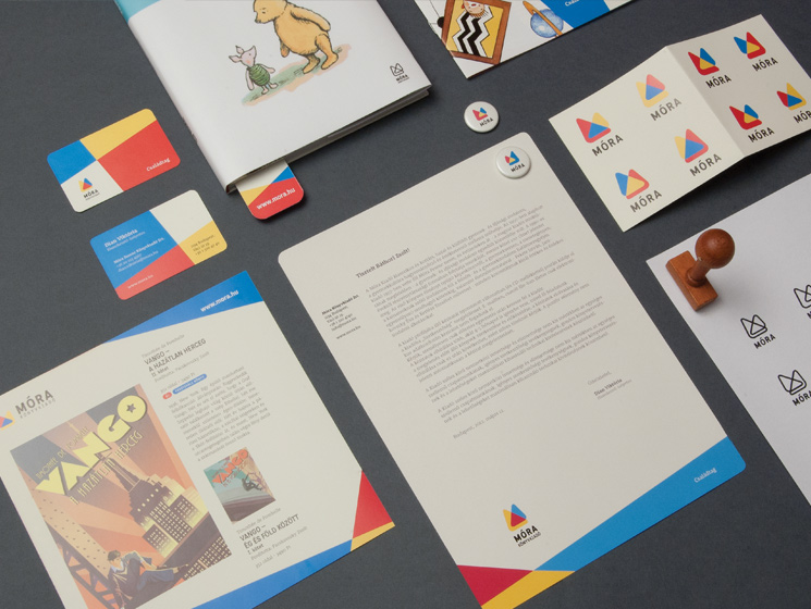
Móra Publisher visual identity
Móra Ferenc Ifjúsági Könyvkiadó (Móra Ferenc Publishing) is the largest youth publisher in Hungary. It was founded in 1952 and although it was a part of every Hungarian’s childhood the company never had a brand identity. If you ask anyone here in the country, they can recall a large number of Móra Ferenc books that became favourites in their childhood.
The only brand identification was that on the book covers they put the name Móra set in the title typeface of the book. The old solution was playful, was always somehow fresh, but the identification of the publisher in the market failed. The changing financial and political circumstances forced the publisher to move to a more unique form of identification. Many new youth publishers came to the market and Móra started to lose market-share.
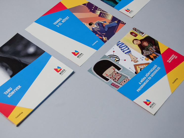
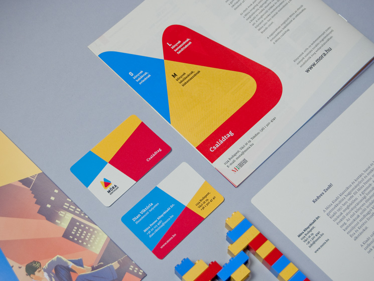
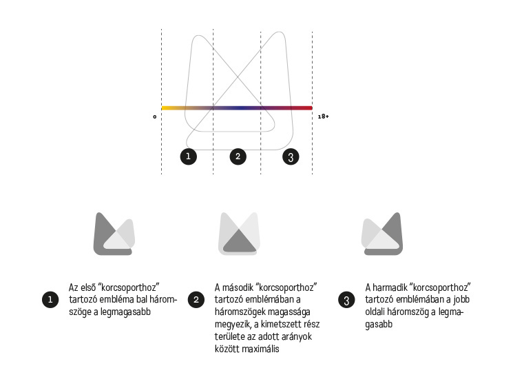
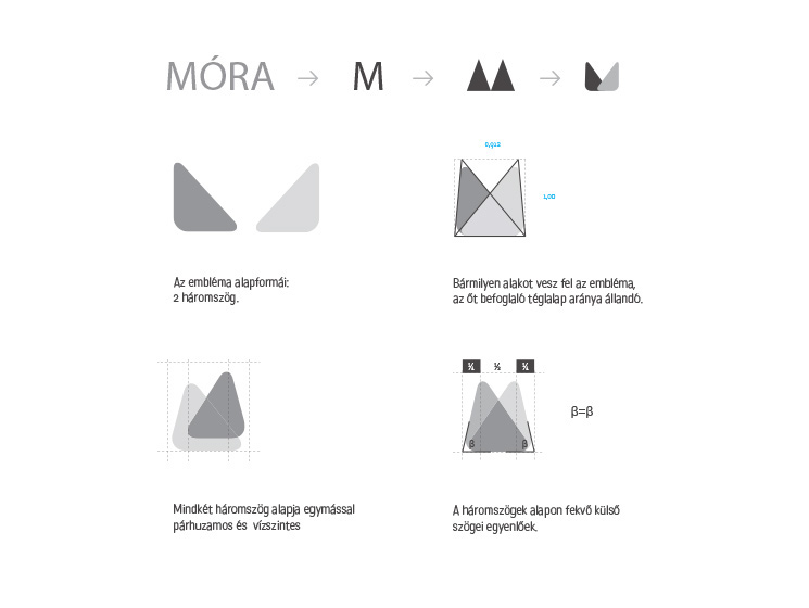
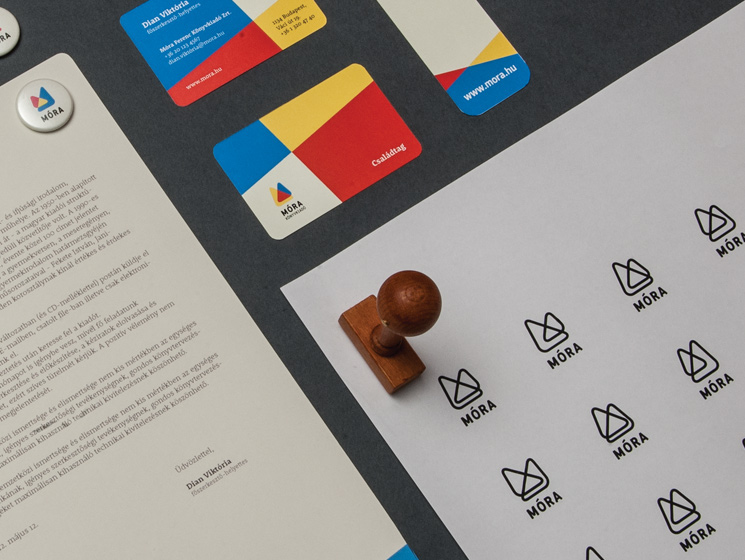
The new identity is a strong mark that changes from book cover to book cover, from business card to business card. The idea behind the emblem was to present Móra’s “M” letter as two triangles, with a size and position that can be vary but only inside strict rules. We created a large number of variations for the Móra emblem, with each a little different, although always the same.
Móra Ferenc Ifjúsági Könyvkiadó (Móra Ferenc Publishing) is the largest youth publisher in Hungary. It was founded in 1952 and although it was a part of every Hungarian’s childhood the company never had a brand identity. If you ask anyone here in the country, they can recall a large number of Móra Ferenc books that became favourites in their childhood.
The only brand identification was that on the book covers they put the name Móra set in the title typeface of the book. The old solution was playful, was always somehow fresh, but the identification of the publisher in the market failed. The changing financial and political circumstances forced the publisher to move to a more unique form of identification. Many new youth publishers came to the market and Móra started to lose market-share.
The new identity is a strong mark that changes from book cover to book cover, from business card to business card. The idea behind the emblem was to present Móra’s “M” letter as two triangles, with a size and position that can be vary but only inside strict rules. We created a large number of variations for the Móra emblem, with each a little different, although always the same.