


Our priority was to stay true to The Grown Up Chocolate Company’s brand while communicating very personal, handmade connotations.
Brand awareness is primarily held through the impact font, central to each sleeve design, and pink and brown colour palette taken from the logo, along with muted chocolatey tones throughout. The illustrative elements contrast with the bold graphic branding to allow the sender to communicate their signature touch through the customisation process.
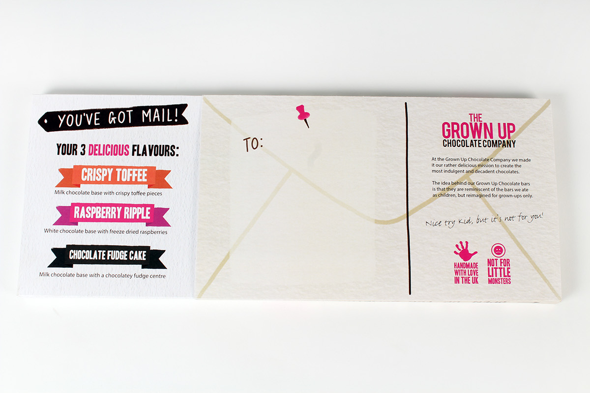
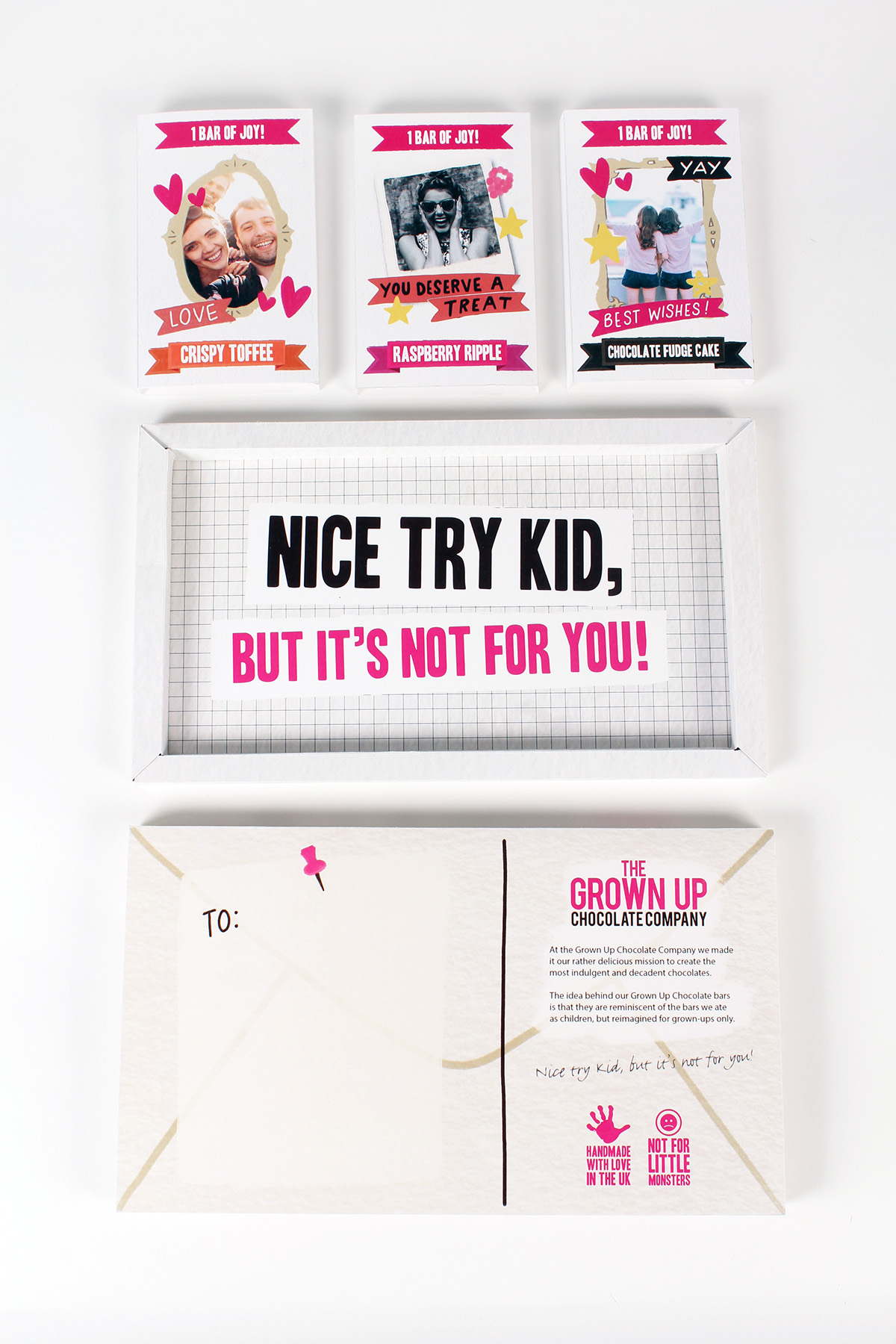
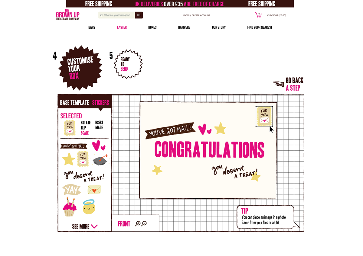
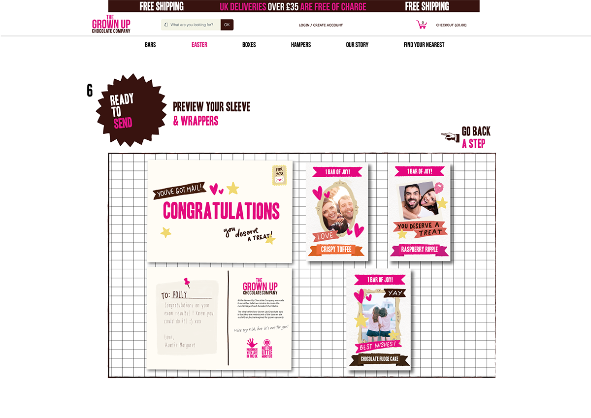
The postal theme has been carried through to the sleeve and box design to mimic an envelope. The digital sticker pack includes stamps and labels as well as occasion based phrases and motifs.
The “Open for a tasty treat” on the side of each sleeve alludes to what’s inside.


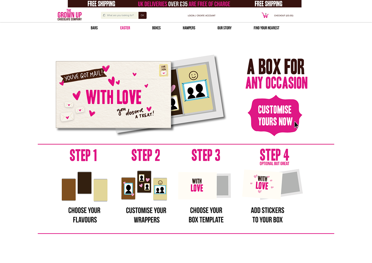
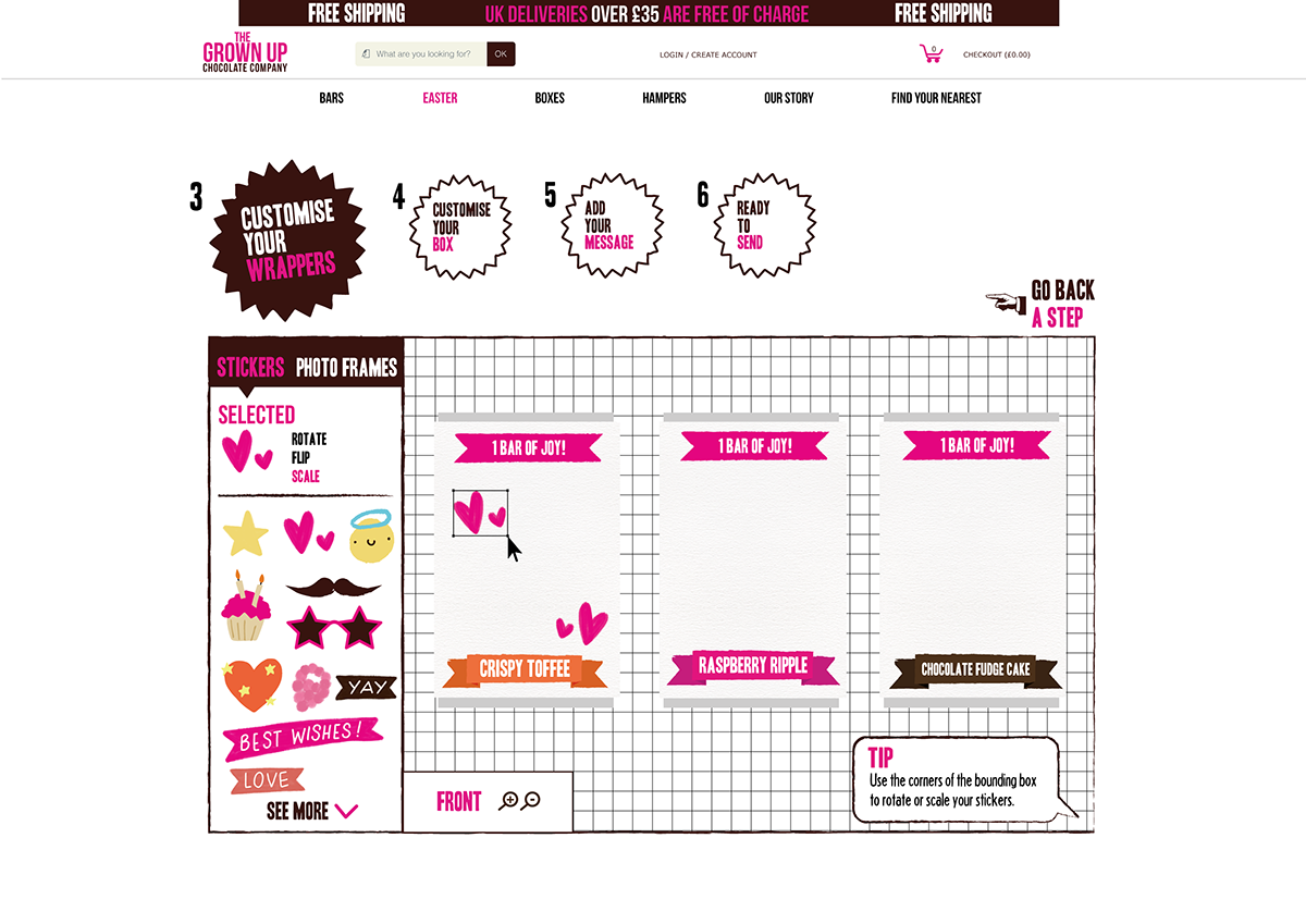
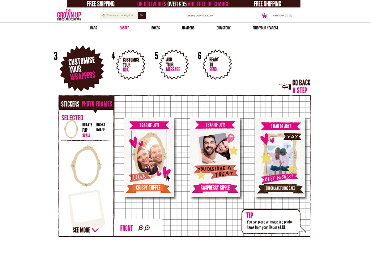
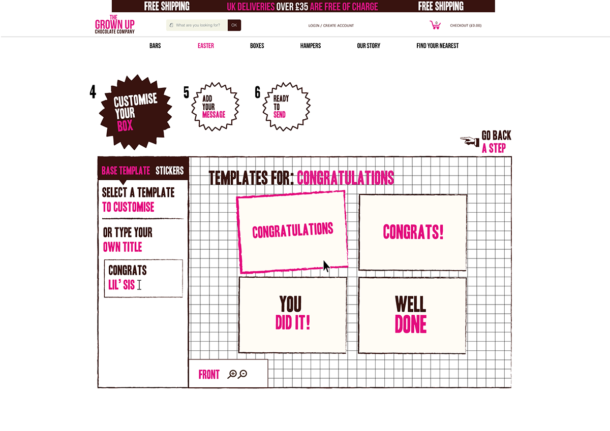
To demonstrate the highly customisable concept, here is a breakdown of the customer experience, and how they might use the digital sticker pack.
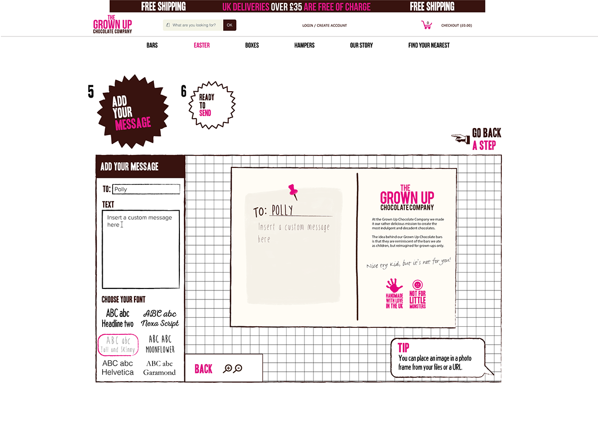
The landing page shows a coherent guide of the process before it starts, then takes the customer through the customising process logically. Within the process the user will have the option to add a “handwritten” note to the back of the sleeve design, to again maintain the personal element of our postal concept.
Elements from the sticker pack are used within the design to tie the packaging style to the website, again integrating the project into The Grown Up Chocolate Company’s brand image.


Illustrations by Polly Vadasz - twitter: @pollyvdsz www.pollyvadasz.co.uk
Graphic Design by Hattie Windley - hattiedesign.co.uk


