L.A. Weekly Covers by Bill Smith
In design school, I cut my teeth at the local paper, The Daily Collegian. I was art director there for a couple years. Really I wanted to be an illustrator, but I learned that my illustration sucked and I was actually a better designer and manager. It all sort of worked out. I loved the frenzy of putting out the news, and I liked having my own office, but I swore after graduating and moving to Los Angeles that I would not work for another newspaper. This, of course, lead me to…
L.A. Weekly, for those unfamiliar, is a free newsprint alternative tabloid. When I left, it was one of the largest on the continent, in both circulation and page count. I was art director for eight years, from 1995 to 2003, working with editorial as well as marketing. It was a fun and frantic place to be, especially around deadline, and I had the pleasure of working with some of the more talented people I’ll probably ever meet.
Here are a bunch of covers from the hundreds (maybe thousands) I did over the years. There were other great covers done by the associate art directors — Jeff Monzel, Marty Luko, Scott Dorobiala, Jennifer Alden and Dana Collins — but these are just ones I did. Some of the images are a little rough—newsprint doesn’t hold up too well. Apologies to the artists and photographers I couldn’t recall. I’d be remiss in not crediting Howard Rosenberg, Kathleen Clark and Debra DiPaolo who were the photo editors during these years and very influential in the artwork that was created and chosen. The dates are educated guesses. Let the nostalgia begin...
(In reverse chronological order.)
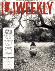
I interviewed artist Laura Aguilar for the Body Politic issue, and we used one of her images for the cover. This may have been my last cover as Art Director. I did a couple of comics covers afterwards as a guest editor. [2003]
A cover by alt comic legend Chester Brown. [2003]
A cover by the late Spain Rodriguez. [2002]
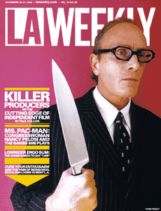
Larry Hirshowitz's photo of American Psycho producer Chris Hanley. [2002]
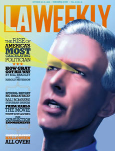
My drawing of Robo-Gray, former California governor. [2002]
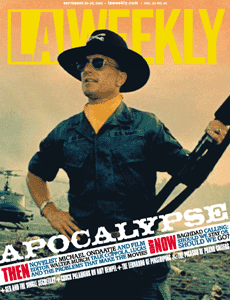
I love the smell of newsprint in the morning. [2002]
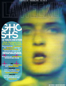
Feature on the music film 24 Hour Party People. Neville Brody-era inspiration. My favorite part about the design of this package was in the layout: Newsprint is annoyingly porous, so to have fun with the pullquotes for this feature titled “Ghosts of Madchester,” I mirrored them on the back of the page so they’d show up faintly, but right-reading in the layouts. It actually worked better than I’d expected, and I’m sure I’ll recycle the idea someday. [2002]
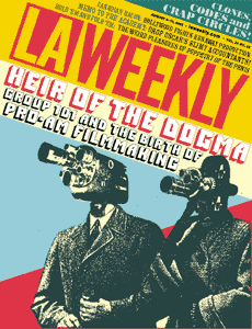
Professional/amateur filmmaker issue. I recycled the graphic from a poster I comped way back in college. Sometimes it pays to be a packrat… a lazy, recycling packrat. [2002]
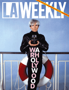
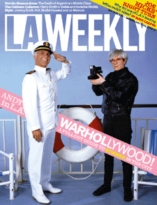
We used photos by Jim McHugh of that time when Andy Warhol guest starred on The Love Boat. [2002]
Richard Meltzer does his zombie impression, or makes the universal symbol for breasts. [2002]
Yes, I know I’m ripping off Tadanori Yokoo. Yes, I know it’s not nearly as good. [2002]
Quick xerography graphic for our music issue. Probably my head, assuming it fit on the glass. [2002]
Max Gerber set up a seamless and lights outside of Amoeba on Sunset and shot record collectors rounded up by his assistant as they came out of the store. Yeah, I know that’s Avedon’s shtick, but we did it at Amoeba. [2002]
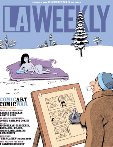
Another fantastic comic issue! Artwork by style-chameleon genius Bob Sikoryak. [2002]
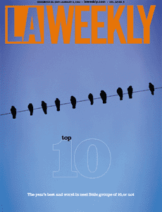
The top-10 list issue. It seems like year-end fluff, but these issues were a blast to work on. I had a hell of a time finding 10 birds on a wire, so I cheated. Photoshop, to art directors, is like heroin-coated crack with boobies. I apologize for writing “boobies” but it’s the way I feel. Now this site will show up on porn searches. I apologize for writing “porn”… [2001]
Tony Millionaire illustrates our year-end film issue. I realize this is an odd juxtaposition, or not… [2001]
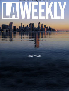
A cover I wish I never had to design. September 11, 2001 was a Tuesday, which was press day at LA Weekly. The following 24 hours would be a frantic group effort to replace the cover and news section with content more relevant to the shocking events of that morning. But immediately after going to press, the meetings and brainstorming began for the next issue, which many of us were hoping would be less reactive and maybe more contemplative, more analytical. I wanted to find an image that expressed loss as opposed to anger, not because the anger was wrong, but because by the time our issue came out the following Thursday, I thought perhaps some of the immediate instinctive responses would have dissipated.
Turns out we had enough anger for about a decade, but I still like this solution. I found the photo searching online. I was looking in obscure forums and blogs to find an image that would not get exposure in the thousands of outlets that would precede our next weekly issue. Also I was hoping to not pay exorbitantly if possible. The artist was an amateur photographer who lived across the river from the towers. He’d taken a series of shots out of his window of the skyline. This one was perfect for what I needed. Two minutes in Photoshop and done. I think I also added the cover line before presenting it to the Editor.
A funny note: I received a lot of kind words from readers and staff on that cover. We were all looking for symbols of grief or comfort. But one guy left me a phone message on Thursday morning that made me laugh for the first time in two days. In a voice that was a dead ringer for Jeff Spicoli he said something like: “Hey man, I wanted to tell you how much I really dig the cover. The photo is awesome. But I wanted to tell you that I think I caught a mistake. The towers are missing in the city, but, like, the reflection is still there in the water, and… oh, wait… oh… whoa. I get it. Oh, man. Whoa… Great cover, man.” [2001]
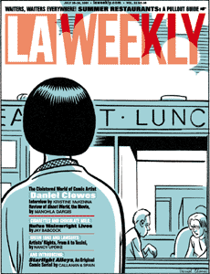
Dan Clowes helped me adapt these panels from Ghostworld for our restaurant issue about diner food. Left is the outside cover, and the right is the cover of the pullout.
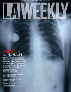
I got to edit Max Gerber‘s photo essay and interviews about children with heart defects. Six years later, we’re about to go to press with a hard-bound book of the same subject. [2001]

Ted Soqui covers a metal festival. [2001]
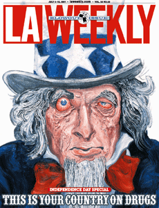
An entire issue dedicated to illegal substances. Then-associate art director Dana Collins and I treated the art assignments more like curating an exhibit, resulting in some fantastic visuals. Robbie Conal illustrated the cover. [2001]

Ted Soqui shot Shaq and Mark Madsen hamming it up. [2001]
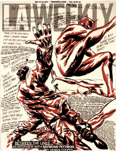
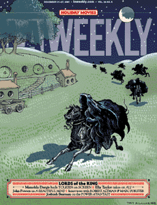
One of my all-time favorite Weekly covers, art created by Raymond Pettibon. [2001]
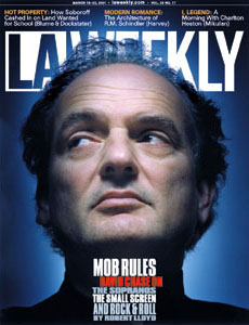
Sopranos creator David Chase gets his throat cut, typographically. From the style, I think this image might've been by Platon. [2001]
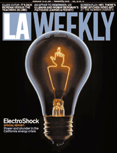
California’s energy crisis. This was a very popular cover, getting reprinted in a few design annuals. The Village Voice also purchased the illustration from me to use on their own energy scandal cover. My spin on "Put a bird on it." [2001]
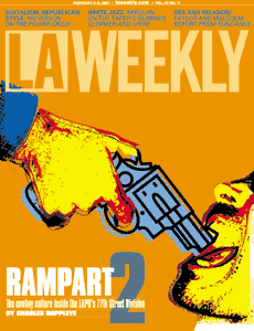
More xerography. Rampart district police scandal. [2001]
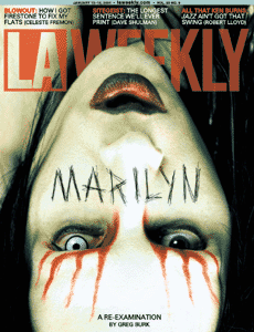
This just seemed appropriate. [2001]
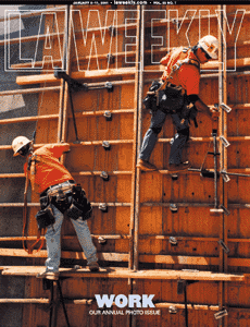
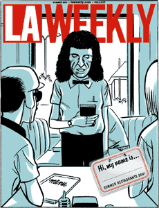
Annual photo issue. This is the first one I edited too. I hope I'm not wrong in guessing that this photo was by Slobodan Dimitrov. [2001]
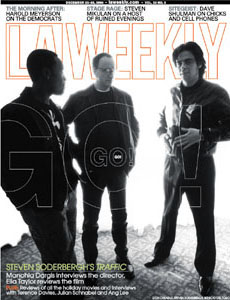
Photo editor Debra DiPaolo snapped this candid shot at a press junket for the film Traffic. If you’ve never been to a junket, it’s like a slow-motion feeding frenzy except sharks don’t ask stupid questions and the only parasites to be found at a feeding frenzy are remoras – vastly preferable to publicists. Coming away with something that doesn’t look like paparazzi garbage can be a challenge. DiPaolo waited for a smoking break, then ditched the flash for natural light to steal this shot of the director and co-stars. [2000]
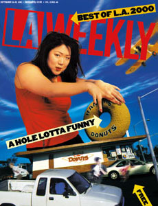
Margaret Cho shot by Kathleen Clark posed for this Best of L.A. composite cover. [2000]

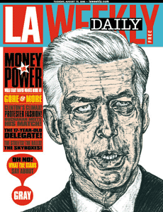
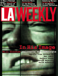
In 2000, Los Angeles hosted the Democratic National Convention. For that week, the Weekly went daily. Each cover was illustrated by the great Robbie Conal. Subjects included: Al Gore, Tipper Gore, California Governor Gray Davis (left) and Joe Lieberman (right). Then-editor-in-chief Sue Horton and the rest of the editorial staff did an amazing job and I couldn’t have gotten through it without former associate art director Jeff Monzel who put his own work on hold to come back and help us out for the week. [2000]
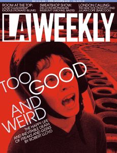
A farewell to Freaks and Geeks story. [2000]
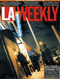
Outside of Boardner’s bar in Hollywood – a favorite haunt of the L.A. Weekly staff, shot by Virginia Lee Hunter. [2000]
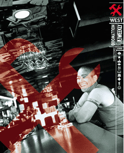
One of dozens of special supplements we created. This one was for the city of West Hollywood. If I’m not mistaken, Slobodan Dimitrov took this photo. [2000]

The cover of our annual photo issue shot by Larry Hirshowitz. [2000]
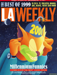
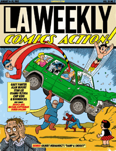
Anthony Ausgang created this painting for our first annual comics issue. I edited and designed the comics issue for four years. Always looked forward to the art and stories that came from these issues. I have several dozen clean copies of the last two or three in storage, so if you want one or both, send me your address and a few bucks or stamps for postage (they’re heavy) and I’ll send you an issue, I can’t bring myself to recycle them. (Scroll down for more comics issues.) [1999]
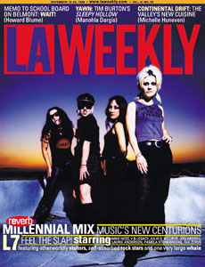
L7 shot by Debra DiPaolo. L7 trivia: Guitarist/vocalist Donita Sparks used to work in the Weekly‘s production department. [1999]
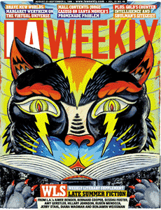
Illustration for our books issue by Rob Clayton. [1999]
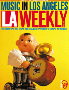
A tin wind-up toy served as my cover model for our semiannual music issue. [1999]
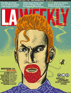
Illustration for a literary issue by Geoffrey Grahn.

Cover for Ted Soqui’s photo essay on taxi dancers.
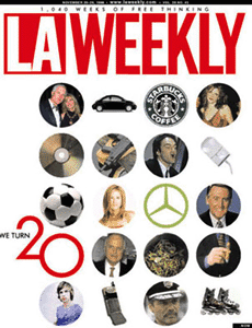
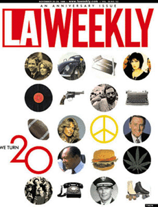
This is a double cover that we did for the paper’s 20th anniversary. The idea was to take symbols of Los Angeles from 1978 and, when you turn the page to cover 2, compare them with their 1998 equivalents: Coppola to Tarantino, vinyl to CD, coke to caffeine… one of the punchlines was that Vin Scully repeats, unchanged. [1998]
Tulsa Kinney was the cover model for this tongue-in-cheek homespun design. Tulsa is now editor and publisher of LA's best art magazine, Artillery. [1998]
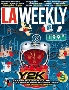
Remember Y2K? Illustration by Mike Lee, who is now a designer of beautiful custom furniture. [1998]

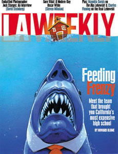
The Jaws parody cover was painted by amazing (and amazingly fast) artist Jason Farris, who did a number of covers and illustrations for the paper during my tenure. The top artist is lost to my bad memory, but both were terrific collaborators and did great work given the demanding concepts and tight turnarounds. [1998]
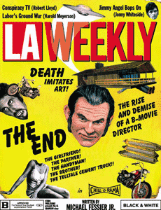
Alex Munn created the art for this B-movie poster spoof. [1997]

We had no good art for our ballot guide issue, so I created a Rube Goldberg illustration of the voting process. It was fun to write the descriptions for each of the steps. All art directors want to be writers, all editors want to be art directors, and all writers want to be homeless. [1996]
I loved this image, shot by Ted Soqui at the ’96 DNC. Very Wizard of Oz. It carried a subversively negative message about Clinton, the Dems, and the electoral process. [1996]
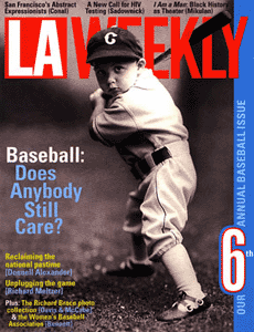
Another annual baseball cover. [1996]
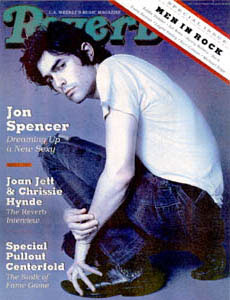
Editors Sue Cummings and Judith Lewis had the funny idea of spoofing the Rolling Stonecover of Liz Phair for one of our Music pullouts. Their partner in crime was John Spencer, who mimicked Phair’s sultry pose. As a young designer I always dreamed of working at Rolling Stone… this is the closest I ever came <sigh>. [1994]

An earlier Liz Phair cover with hand lettering, featuring the REAL Liz. [1993]


