36 Days of Type 2017
Another Year, another 36 Days of Type. After I got so much great feedback from everyone on my series from last year, I decided to expand on it this year.
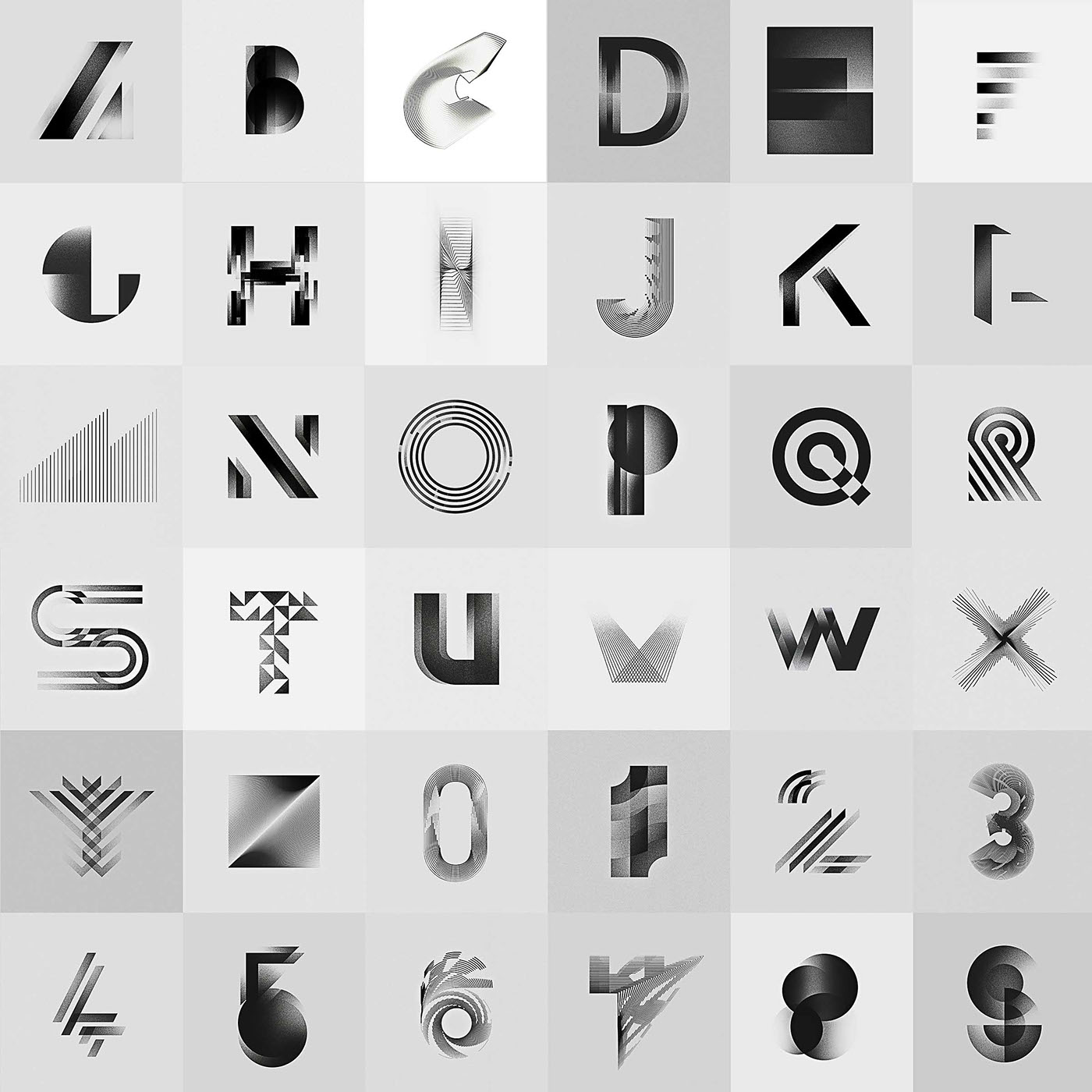
The idea was to keep the monochrome colours combined with experiments on letterforms and their legibility from last year, while creating something new and improving my work.
All the while practising my work ethic.
It was once again a great deal of fun participating alongside with so many other great creatives around the world, discovering and learning from them. I am happy two of my entries got featured by the @36daysoftype Instagram account.
For this post I decided to try out the new «Grid» feature of Behance.
Click on the images to view them in higher quality. I Hope you like it!
Click on the images to view them in higher quality. I Hope you like it!
The letters


And here are the numbers


The whole series in black and white